

GMAD · 2025 · Packaging · Guidelines · Standardisation
Organise, transform, standardise and simplify: GMAD’s new packaging.
GMAD, a giant of the joinery supply sector, asked us to create its new packaging and the guidelines for every future extension. We created the concept for the master packs, the full family and the implementation manual, with colour standards, typography, dielines and formats.
- Client
- GMAD · joinery supply distribution
- Year
- 2025
- Scope
- Master pack concept, family roll-out, packaging guidelines, colour standards by supplier, typography, grid, dielines, formats and sub-brand application
- Group company
- BDDB.ag
The challenge
The GMAD line spans very different products, from contact adhesives and glues to hardware, handles and drawer slides, made by several suppliers in cardboard, plastic, metal and flexible packaging. Each pack followed its own path, and the brand got lost on the shelf.
At the point of sale, two messages had to be clear at once: what the product is and whose it is. And the solution had to work in any format, with any supplier, and also in low-colour versions to cut costs.
The finished packaging
-
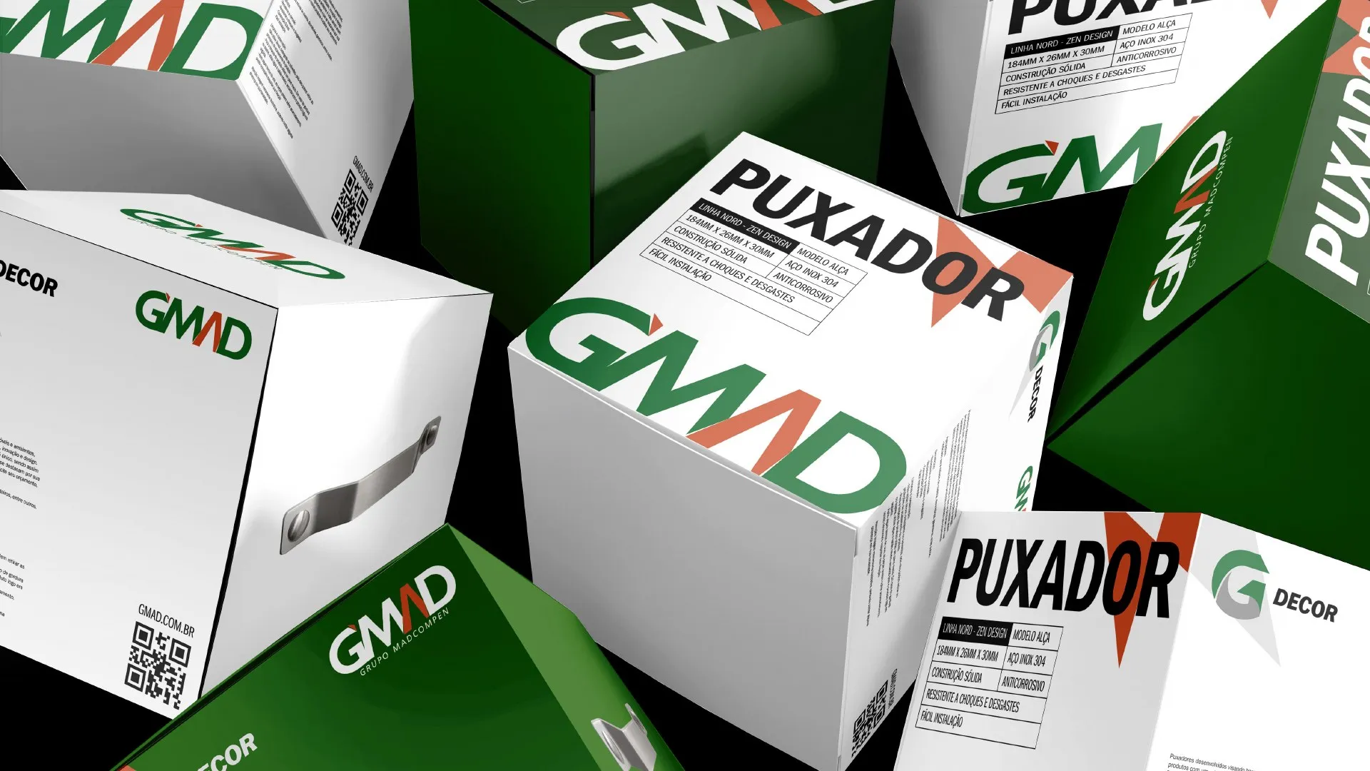
Handle boxes with the brand element at large scale. -
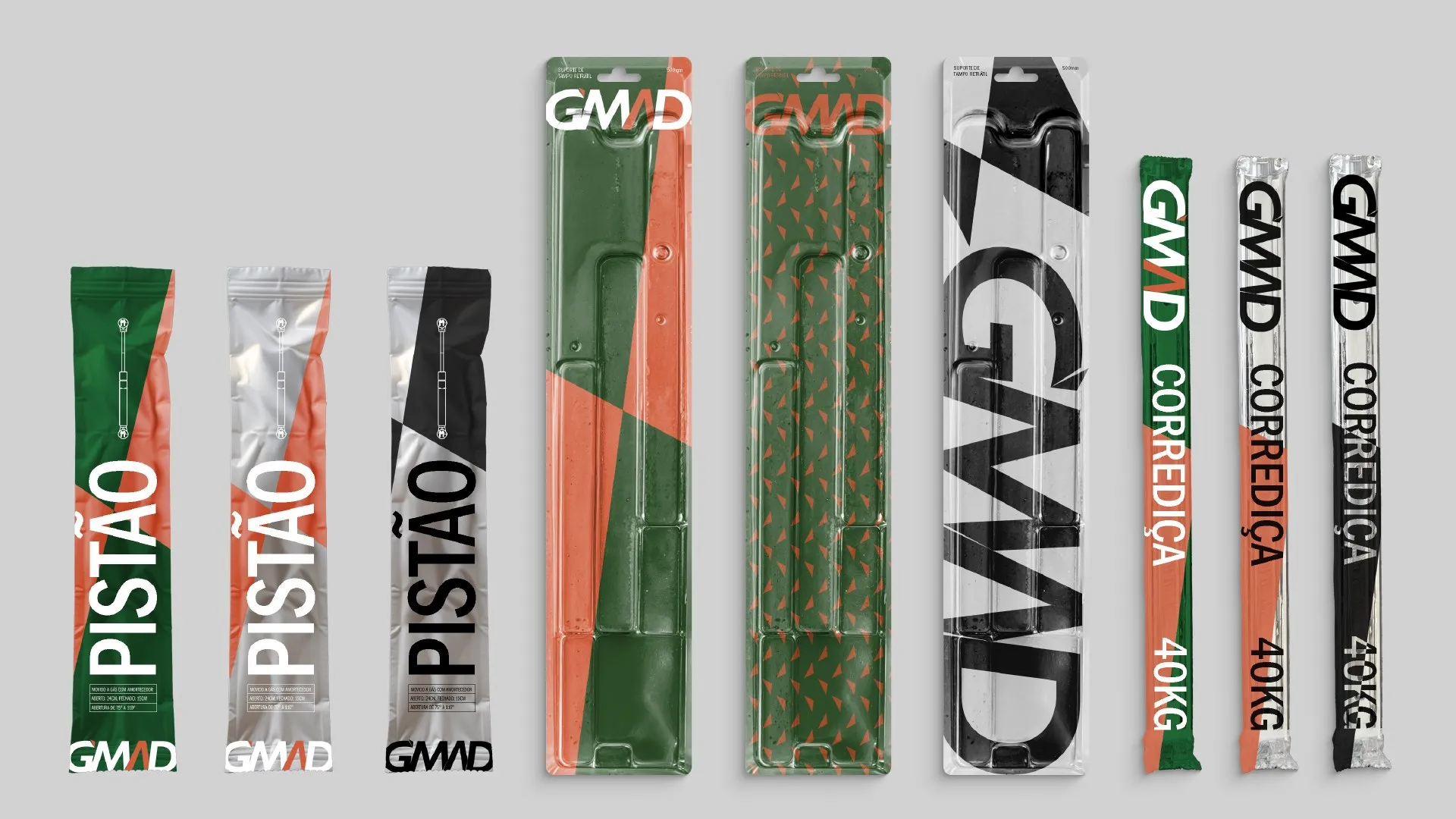
Gas strut, retractable table support and drawer slide: one language in full-colour and low-cost versions. -
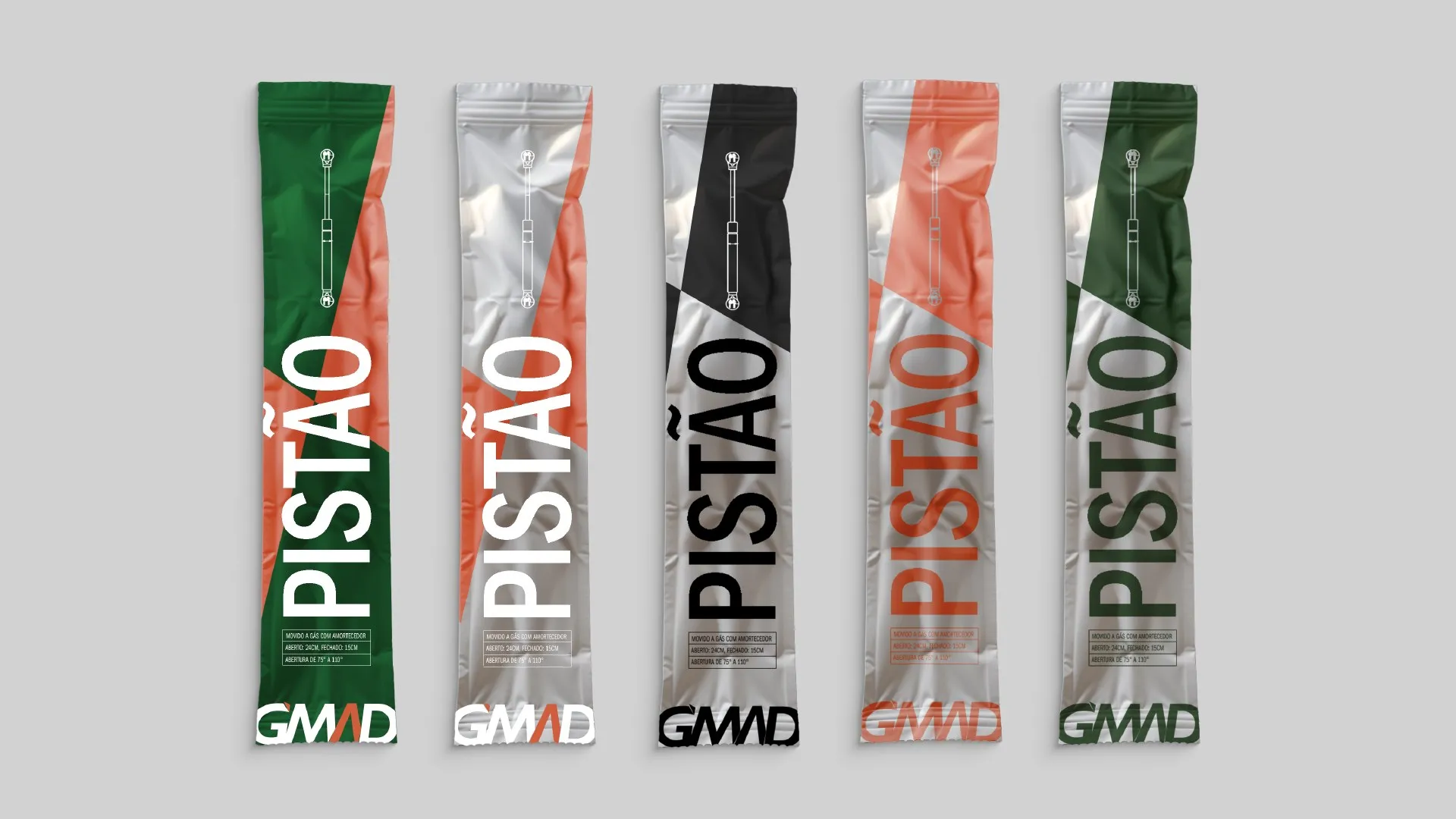
Gas strut in five colour versions, for different printing costs. -
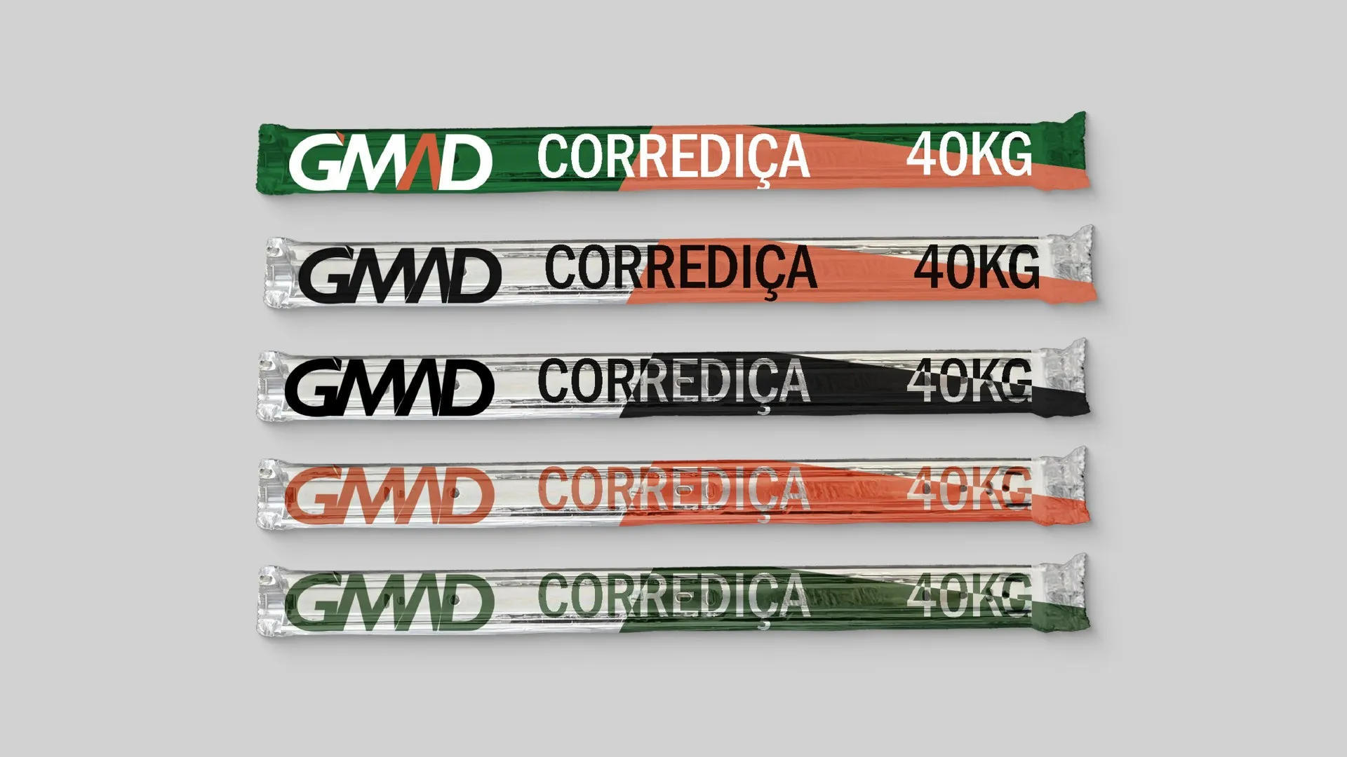
Drawer slides: the product name always stands out. -
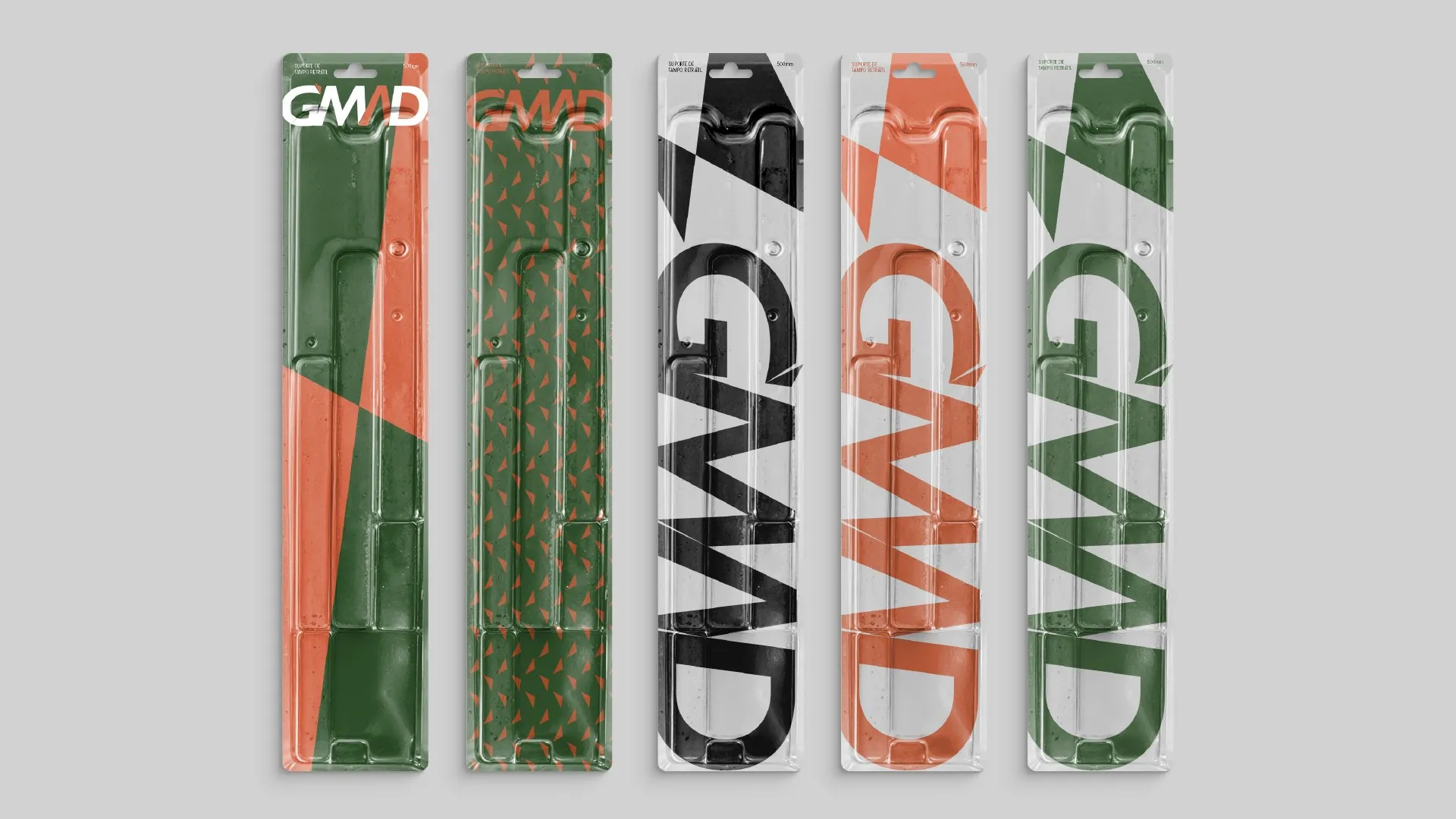
Blisters for the retractable table support. -
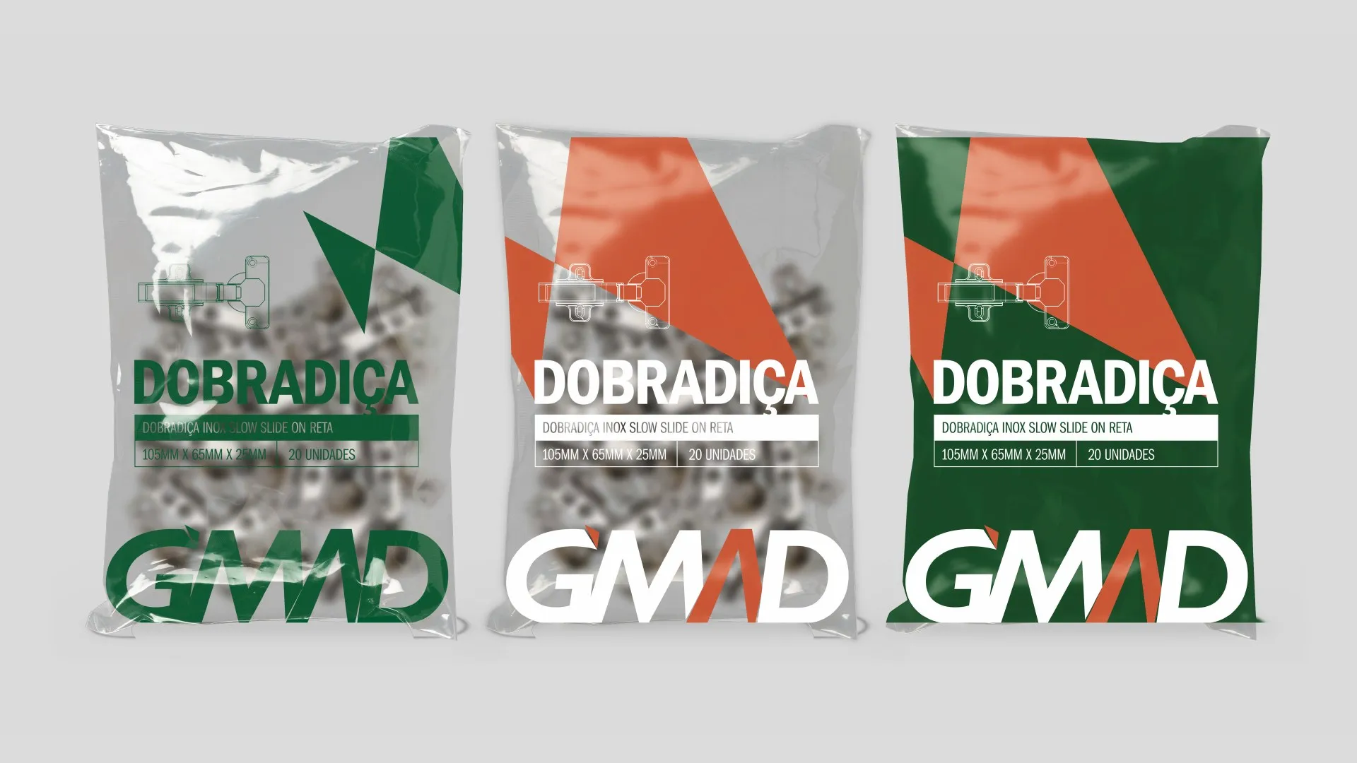
Hinges in clear flexible packaging. -
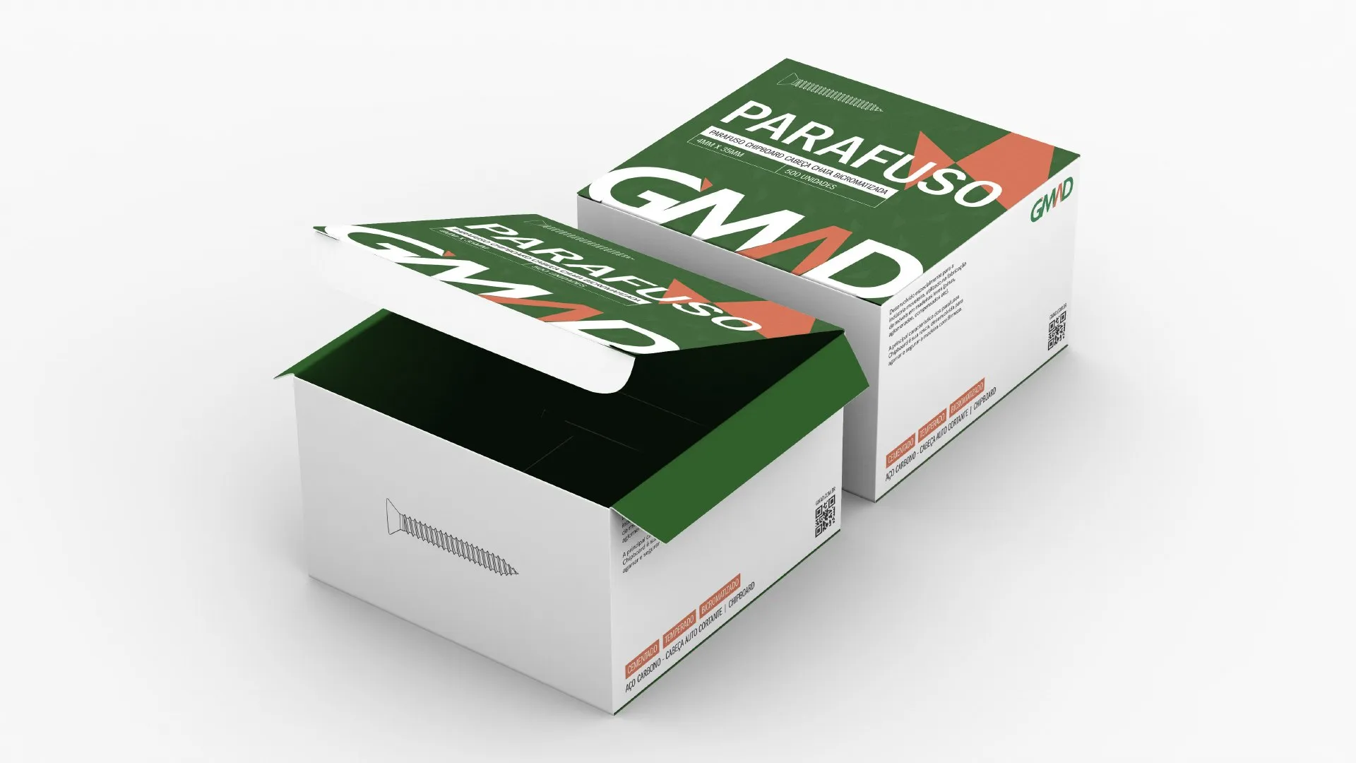
Screw box. -
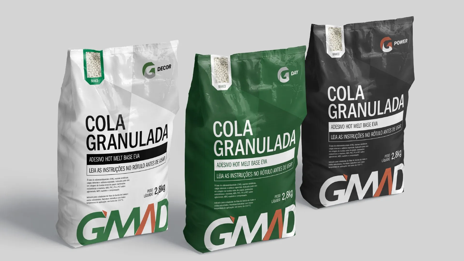
Granulated glue bags in white, green and black versions. -
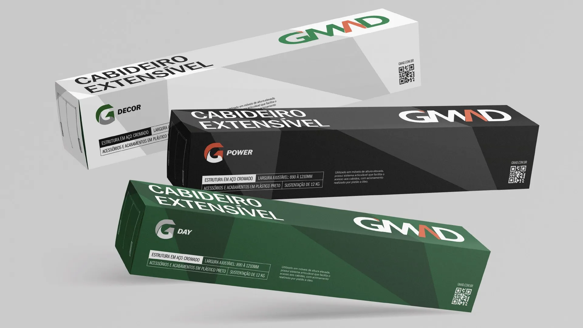
Extendable clothes rail in the G Decor, G Power and G Day sub-brands. -
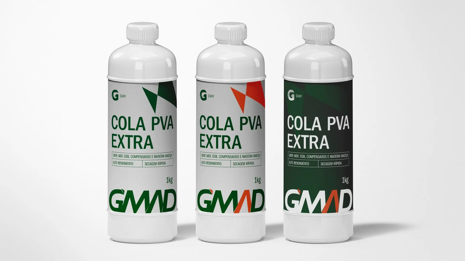
PVA Extra glue. -
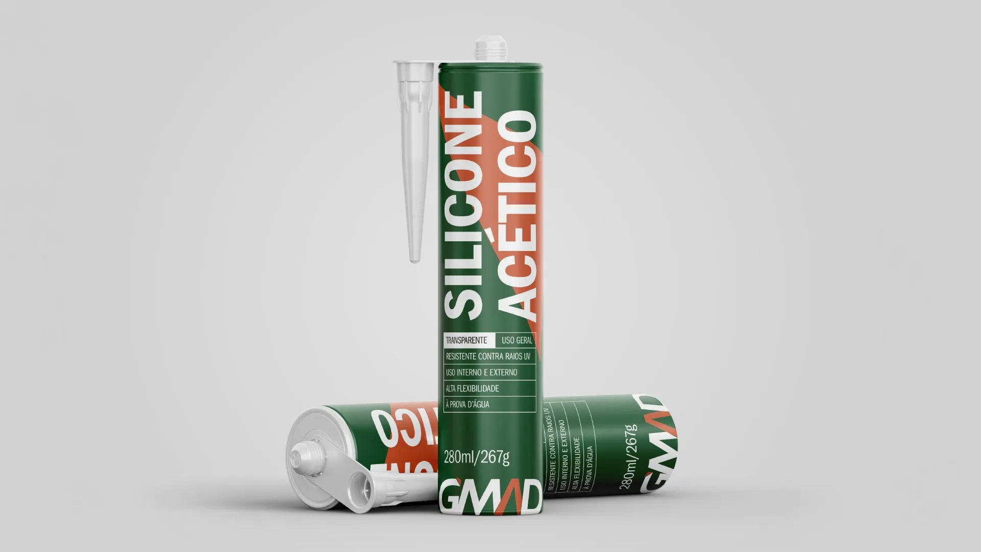
Acetic silicone sealant cartridge. -
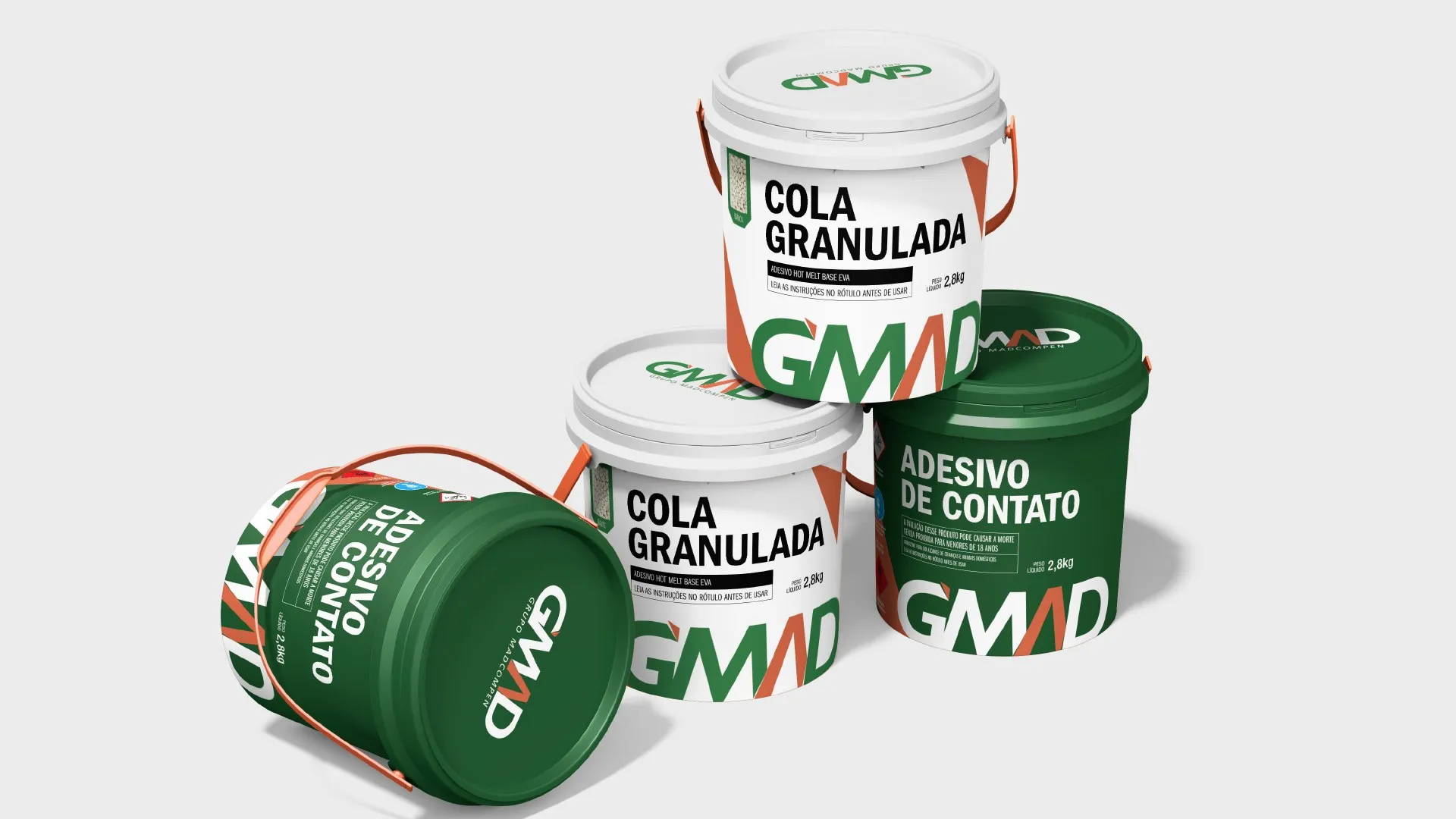
Granulated glue and contact adhesive tubs. -
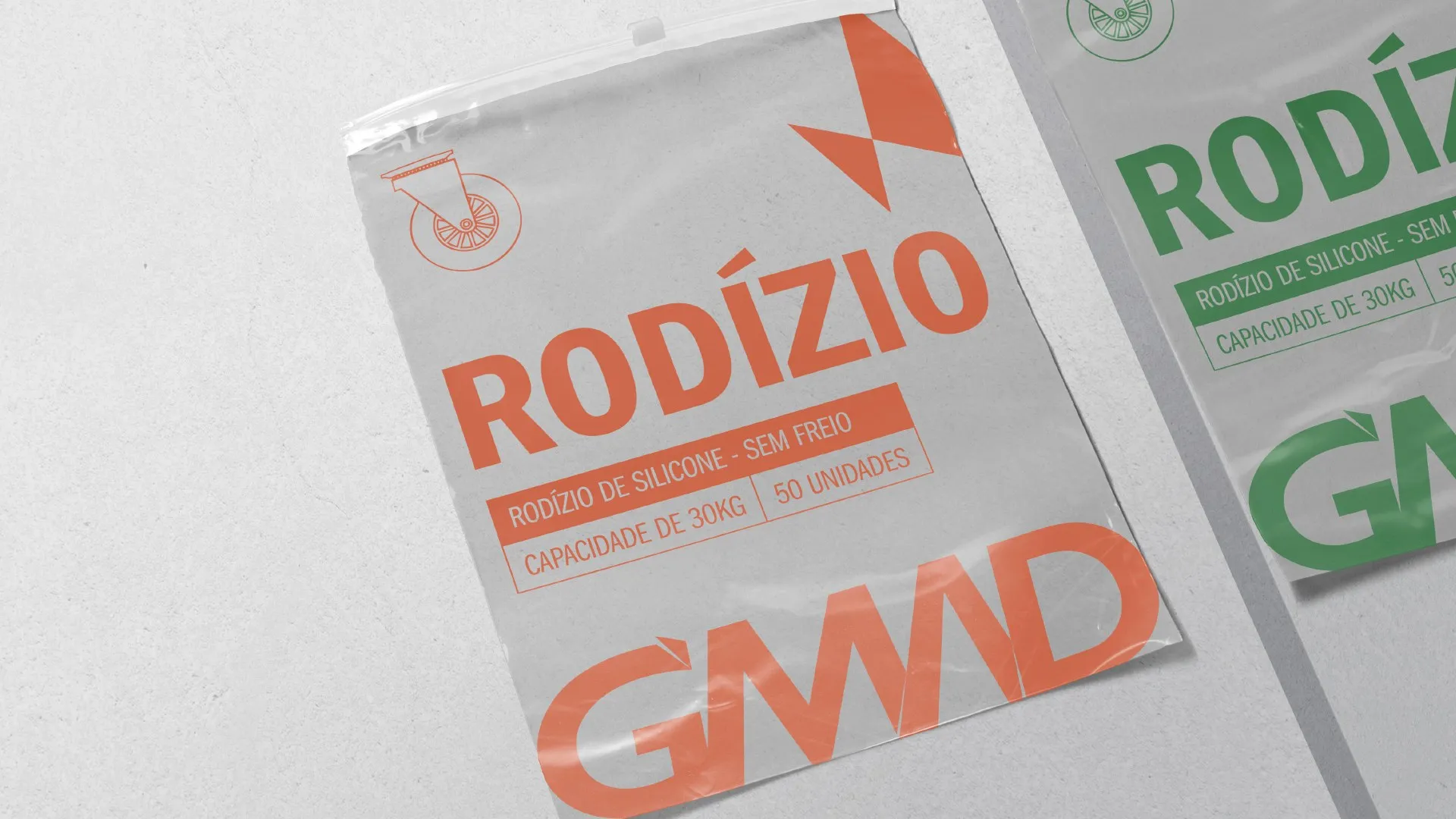
Castors in flexible packaging. -
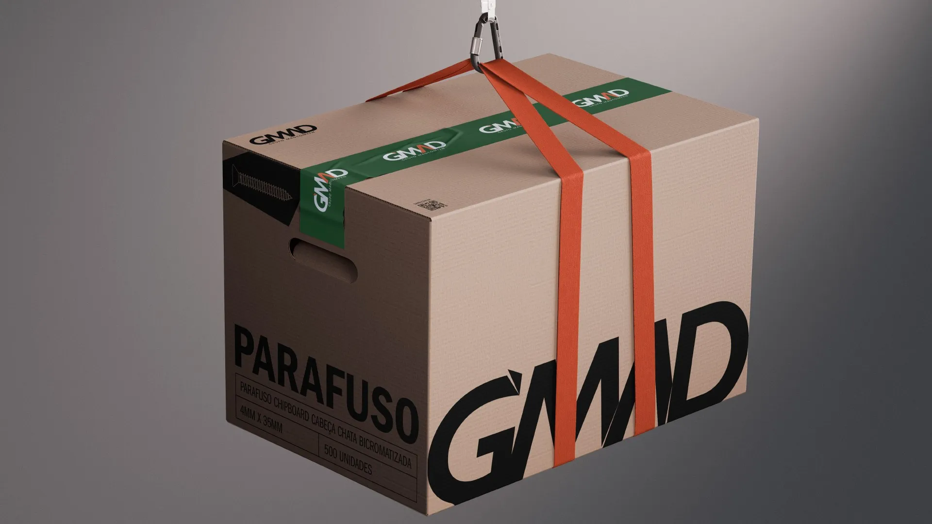
Cardboard box and branded tape. -
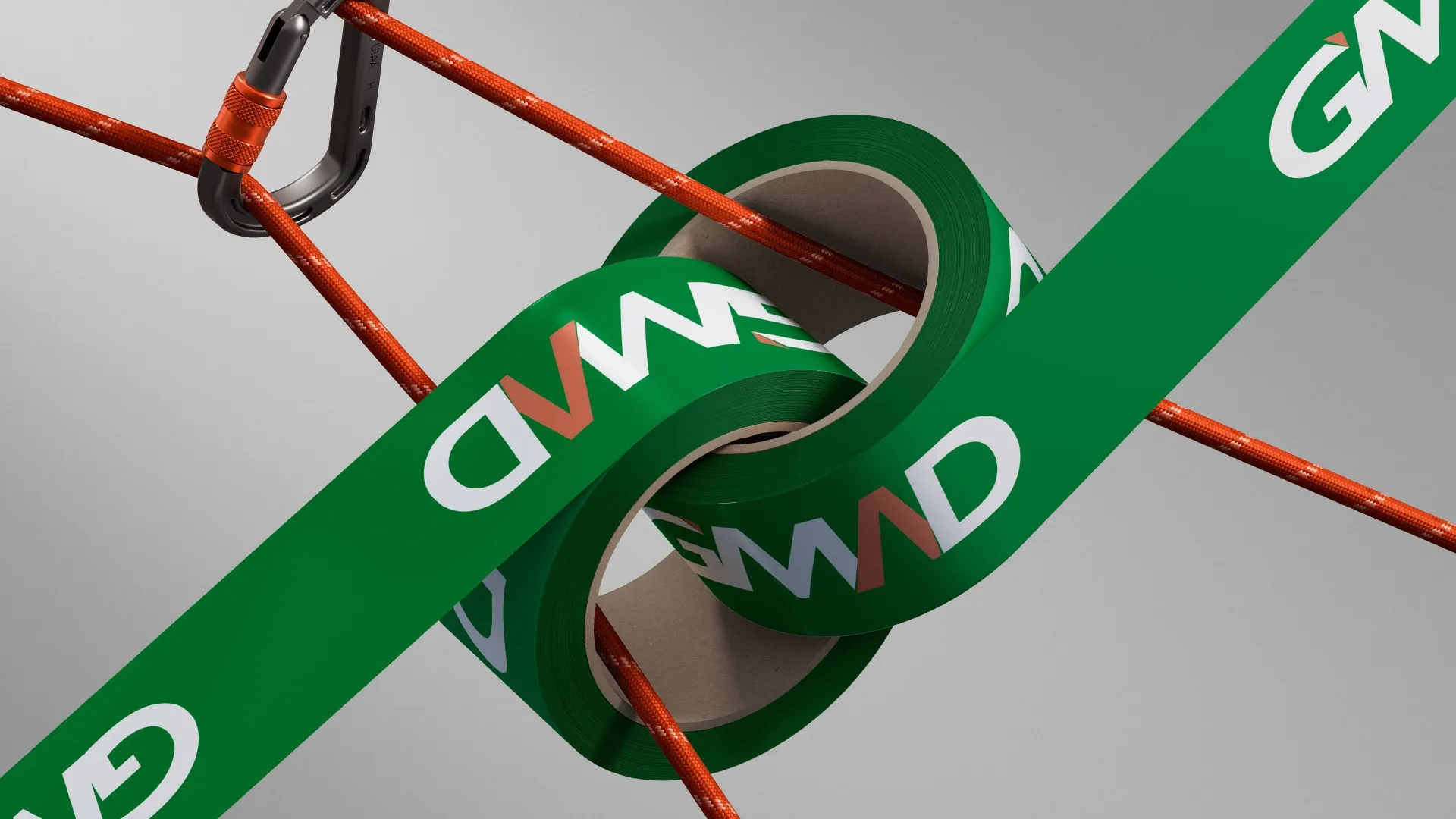
Strap with the logo and the graphic element.
What we did
- 01
Concept
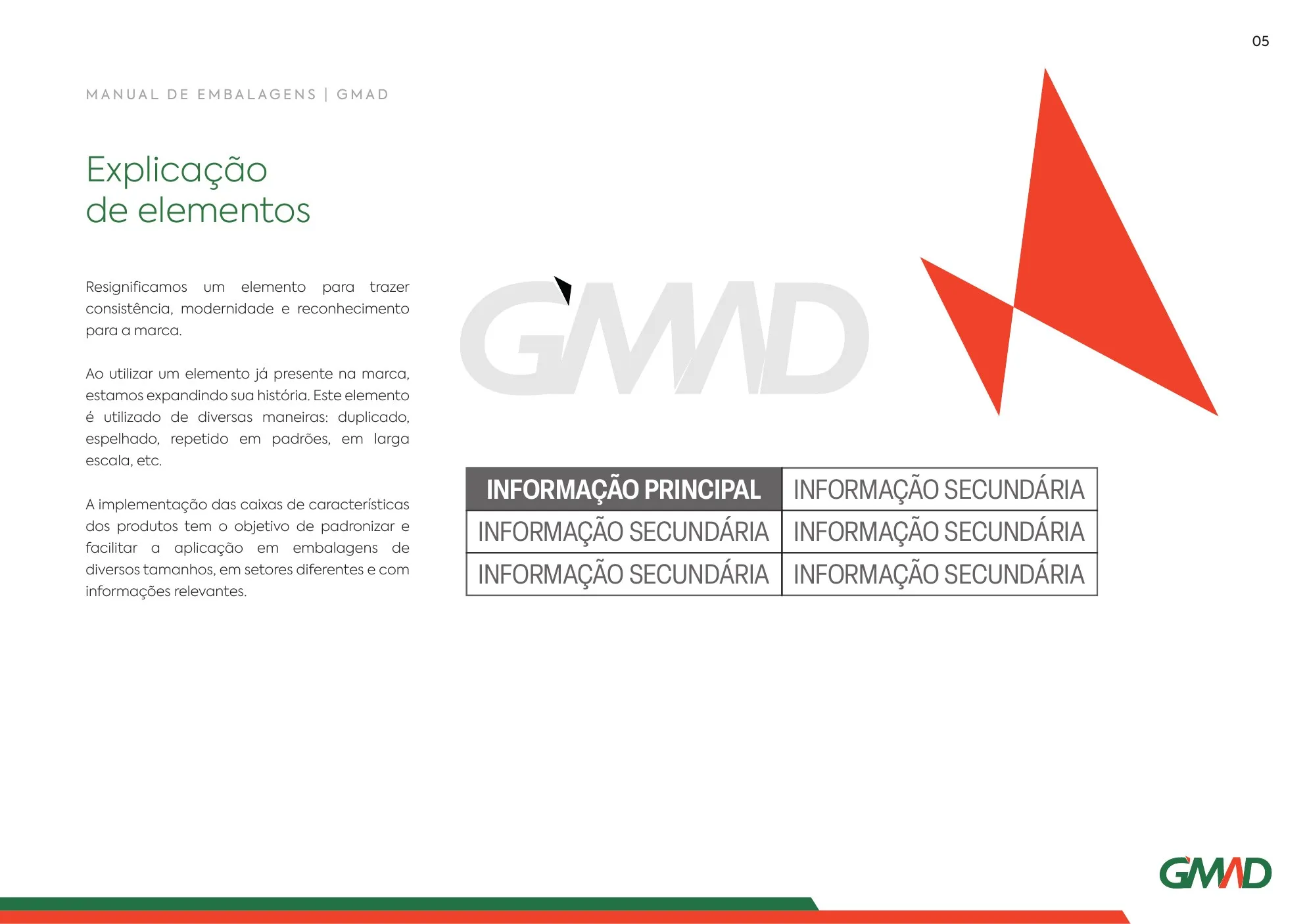
We gave new meaning to an element already in the brand, the triangle in the logo, and made it the hero of the packaging: doubled, mirrored, in patterns and at large scale.
- 02
Master packs
We designed the reference packs and a grid read in a Z: first what it is, then the key information and finally whose it is.
- 03
Roll-out
We took the system to boxes, blisters, bags, tubs, cans, cartridges and labels, with fewer-colour versions to lower printing costs.
- 04
Guidelines
We brought it all together in an implementation manual: colours calibrated by supplier and material, typography, grid, dielines, formats and sub-brands.
The packaging guidelines, page by page
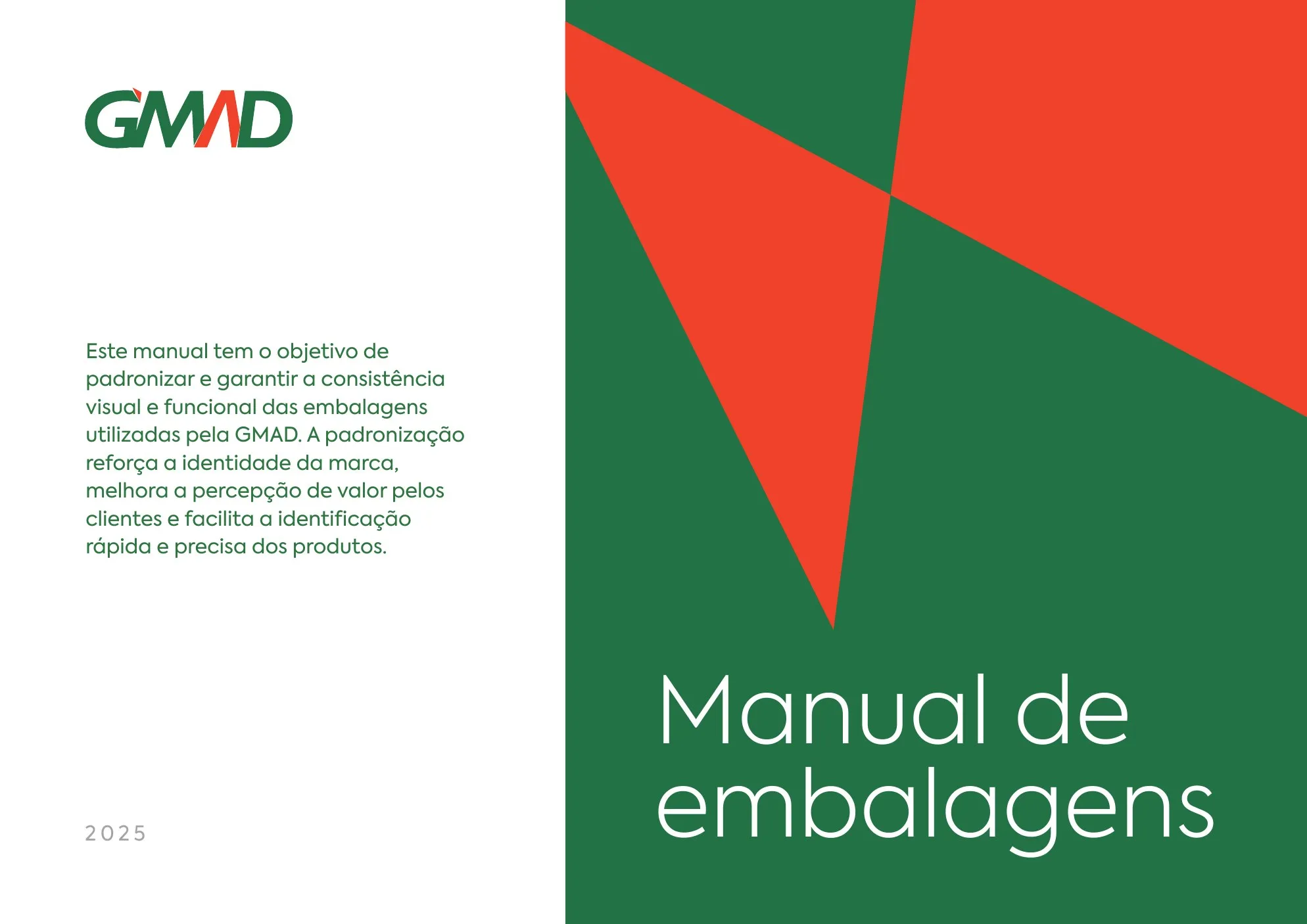
A technical and visual document for everyone who creates, reviews and prints GMAD packaging, whether a cardboard box, a plastic tub or a flexible pack.
- Conceito
A brand element, given new meaning
The triangle in the logo became the packaging graphic, and the feature boxes standardise information at any pack size.
- Tipografia
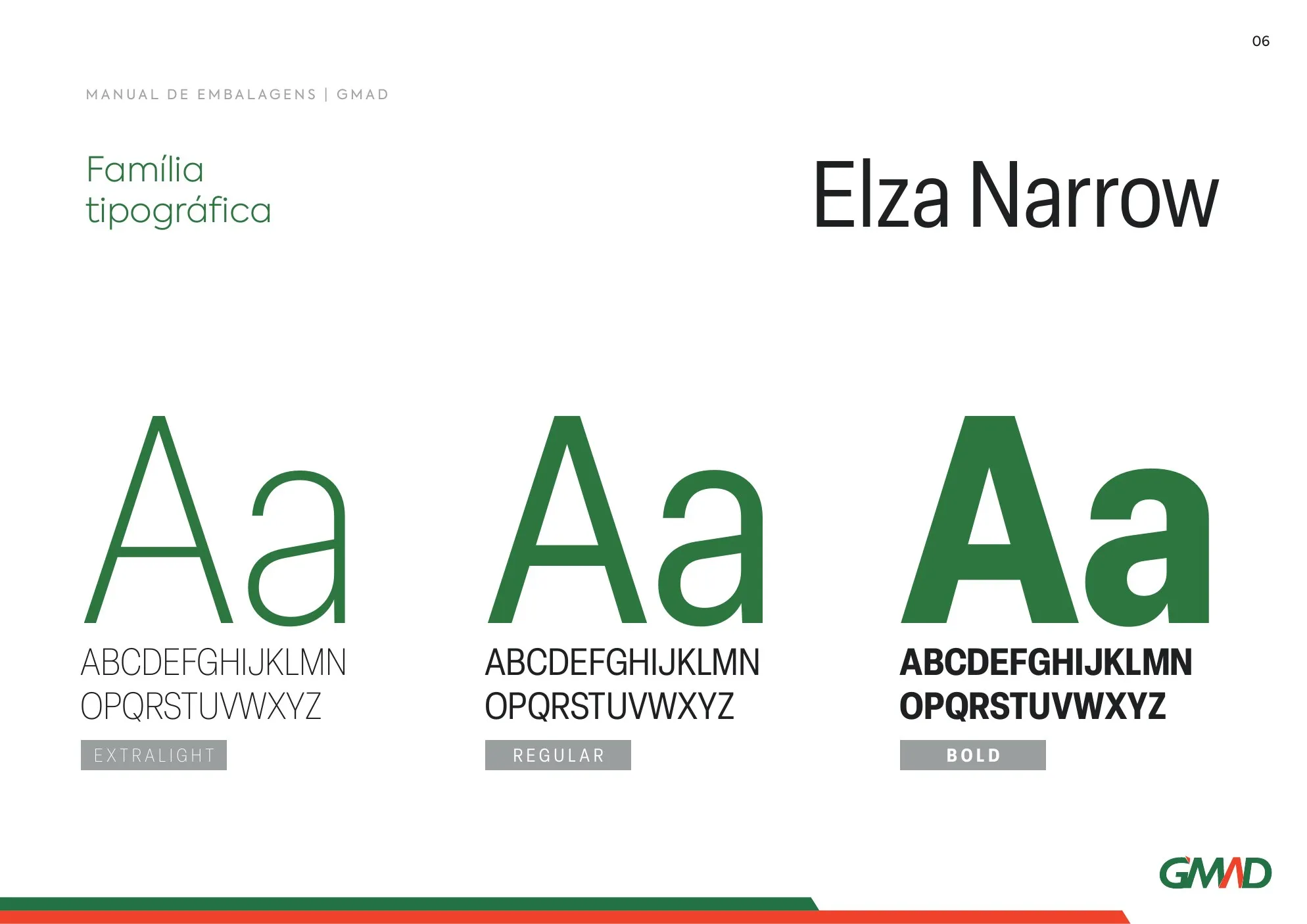
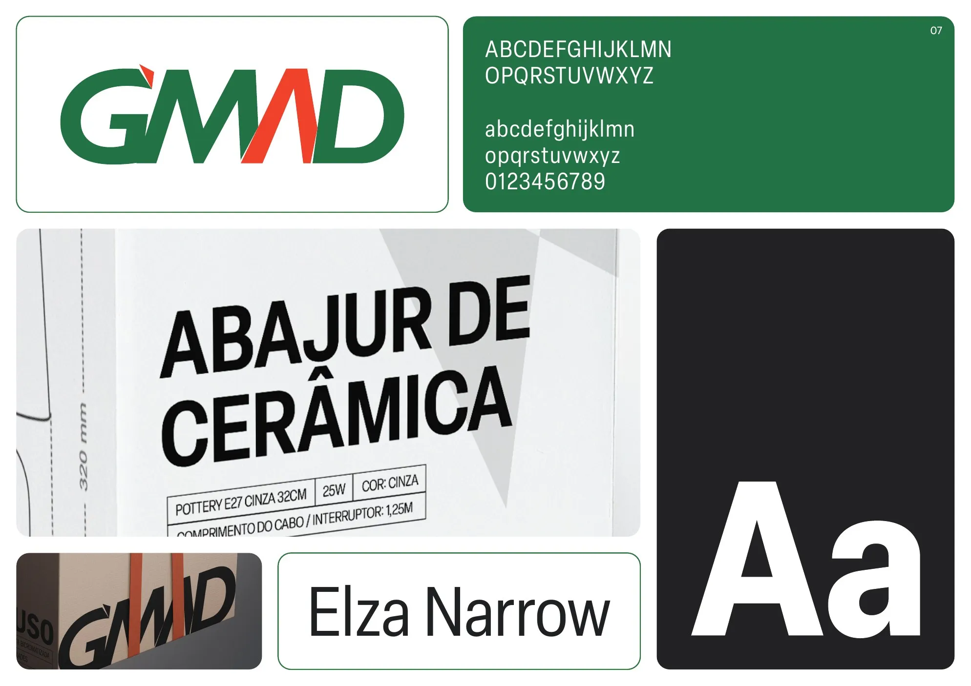
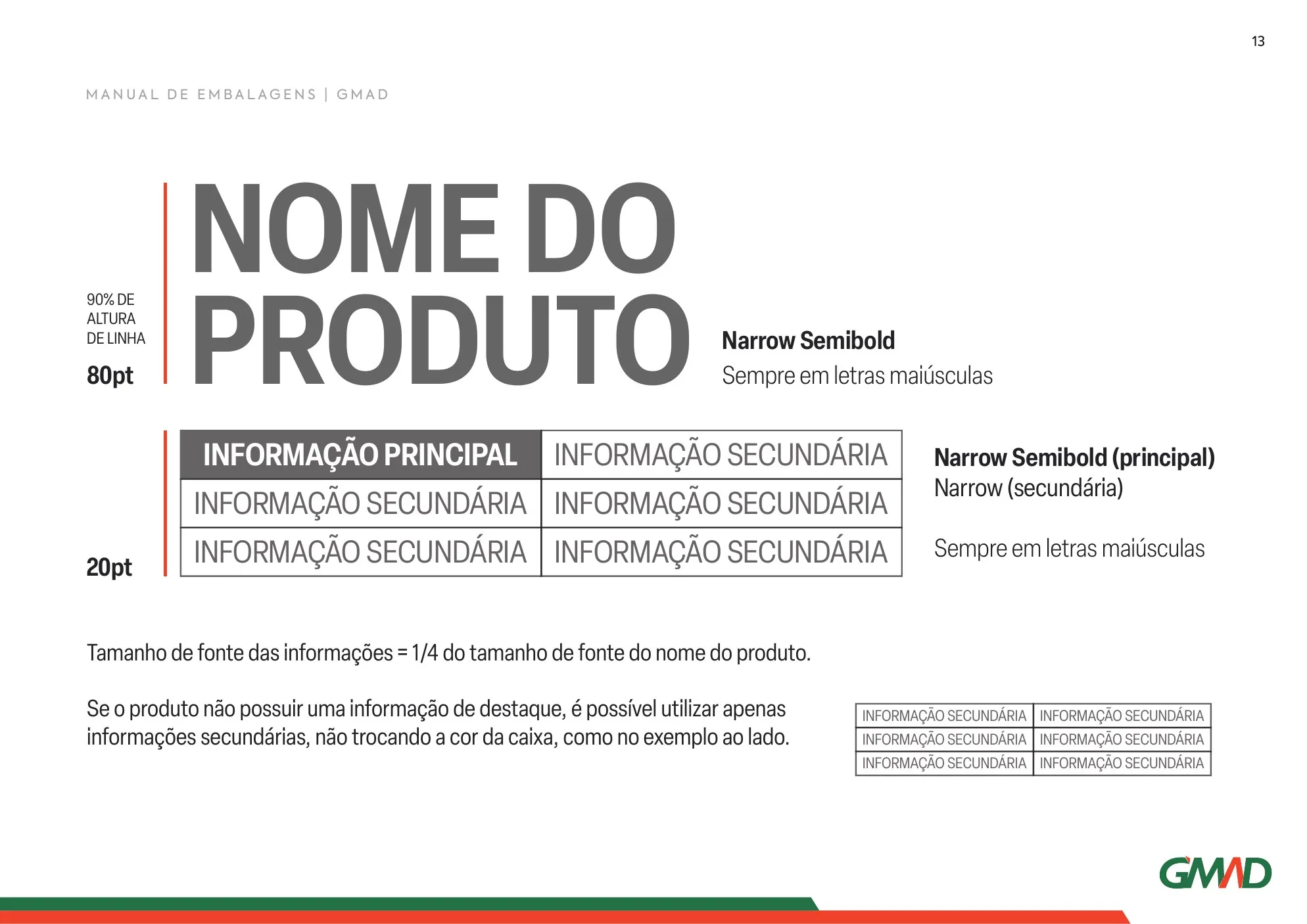
One type family for everything
Elza Narrow in three weights keeps product names large and legible, even on the narrowest packs.
- Cores
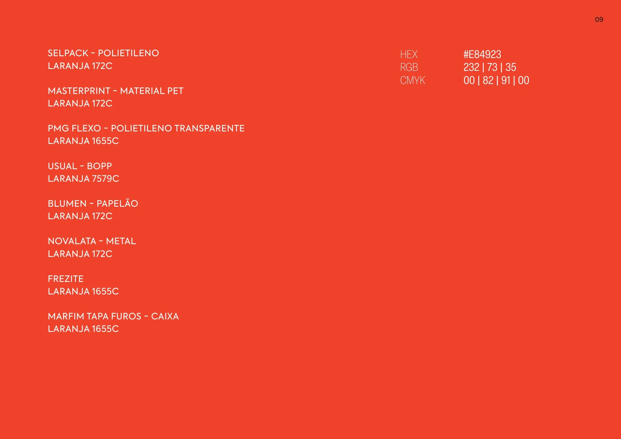
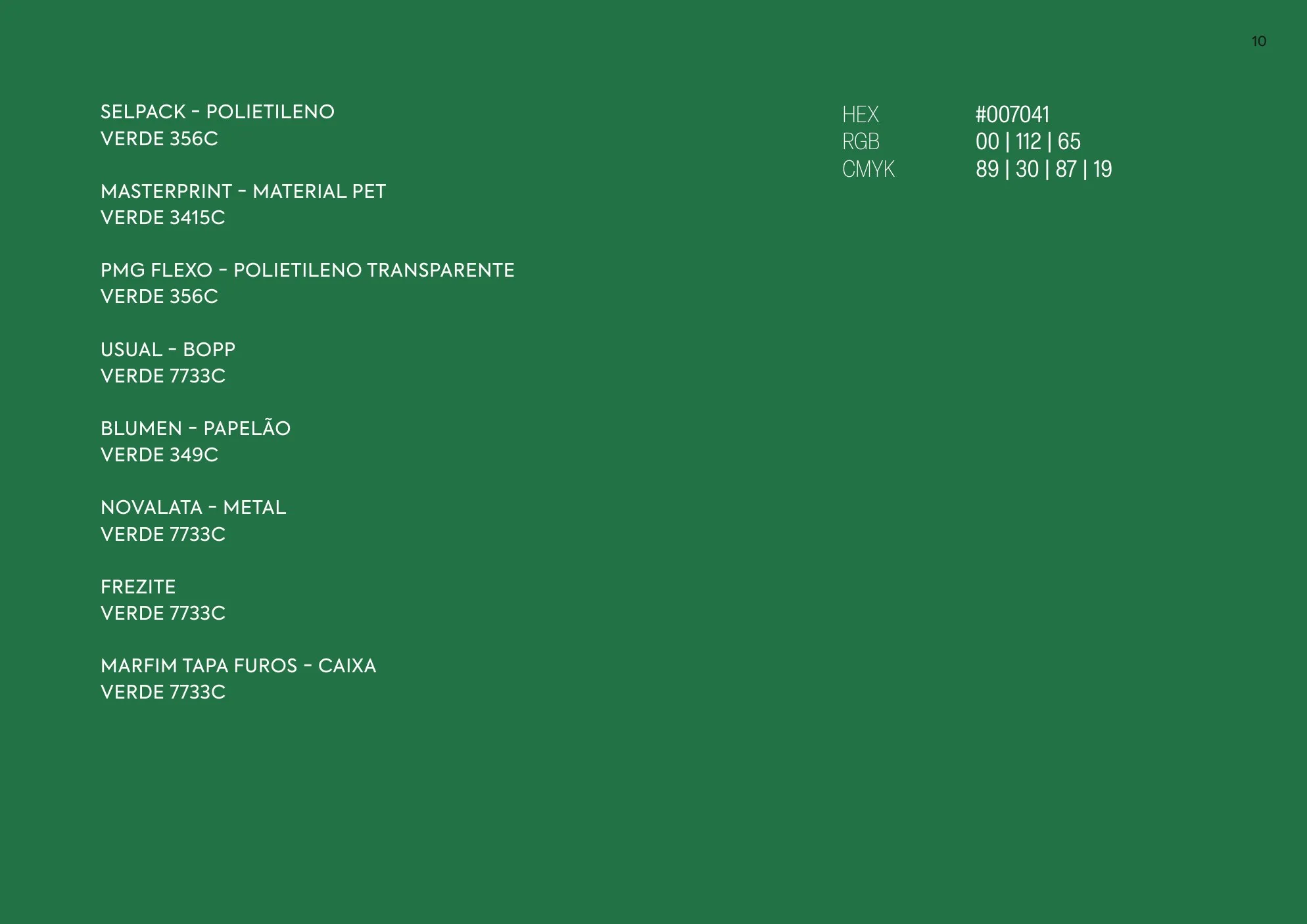
Colours calibrated by supplier
GMAD’s green and orange got the right Pantone reference for each supplier and material, from polyethylene and PET to cardboard and metal.
- Grid
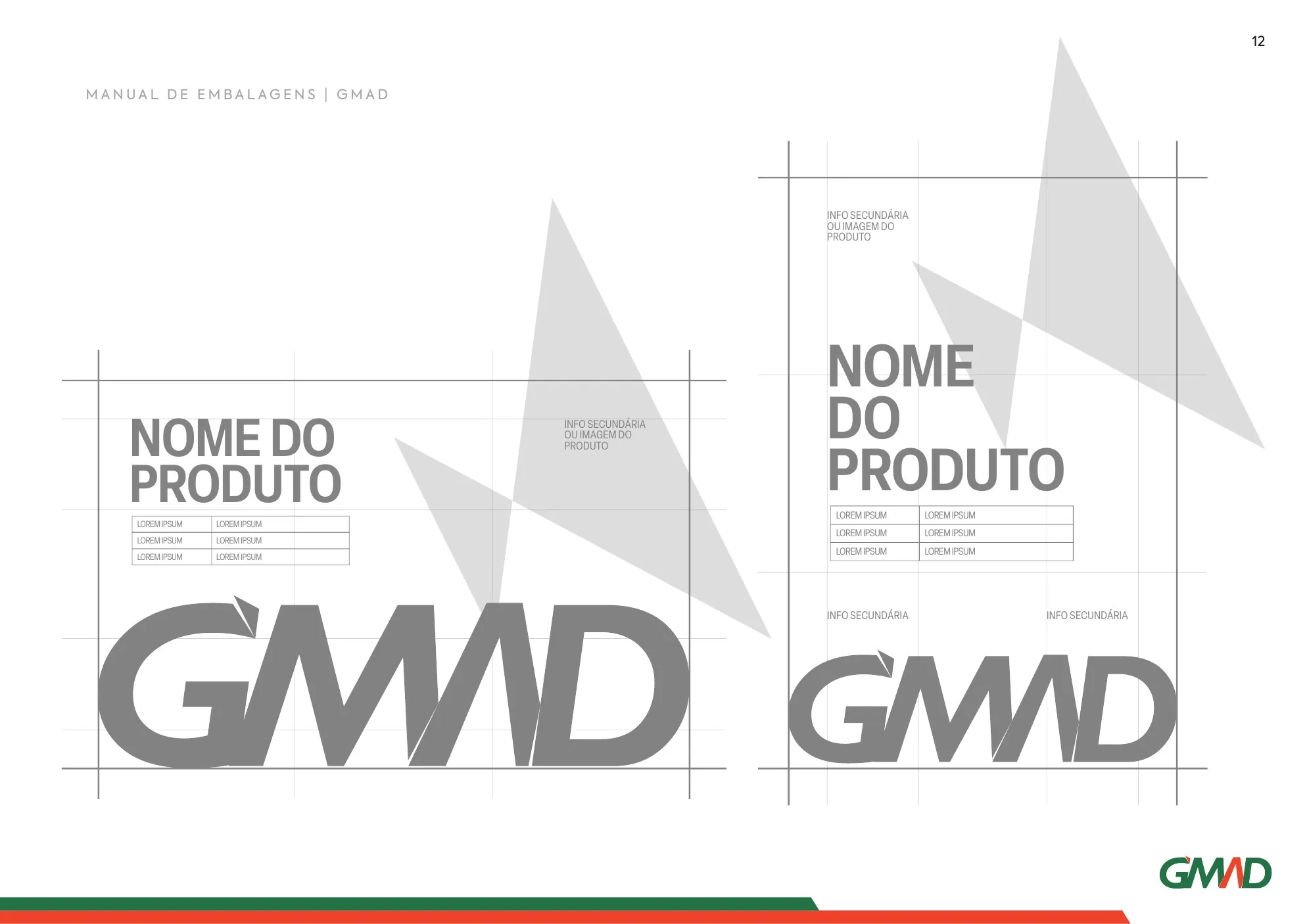
Construction grid
Fixed proportions between product name and information, in a structure that adapts to vertical and horizontal packs.
- Facas
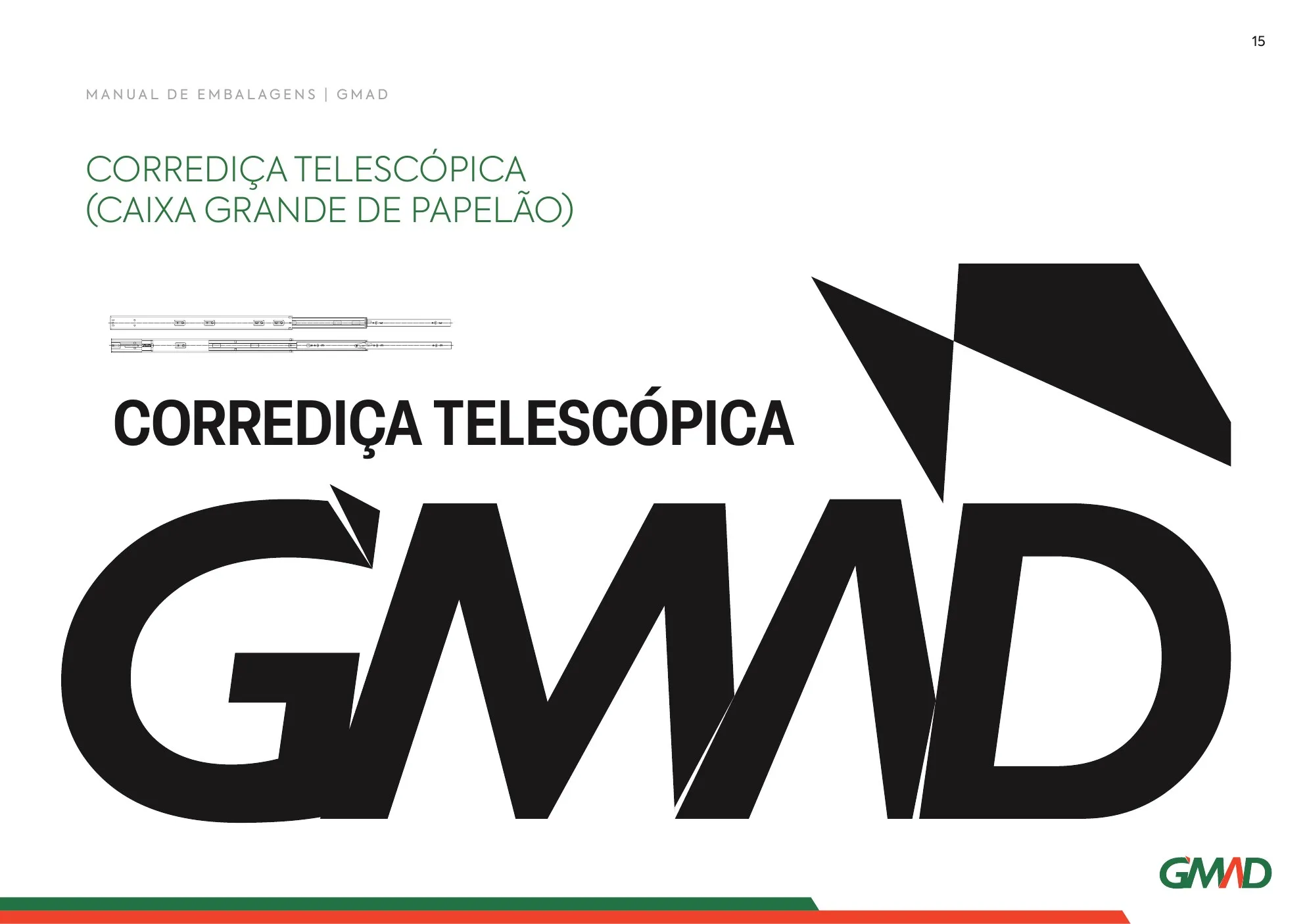
Dielines and formats
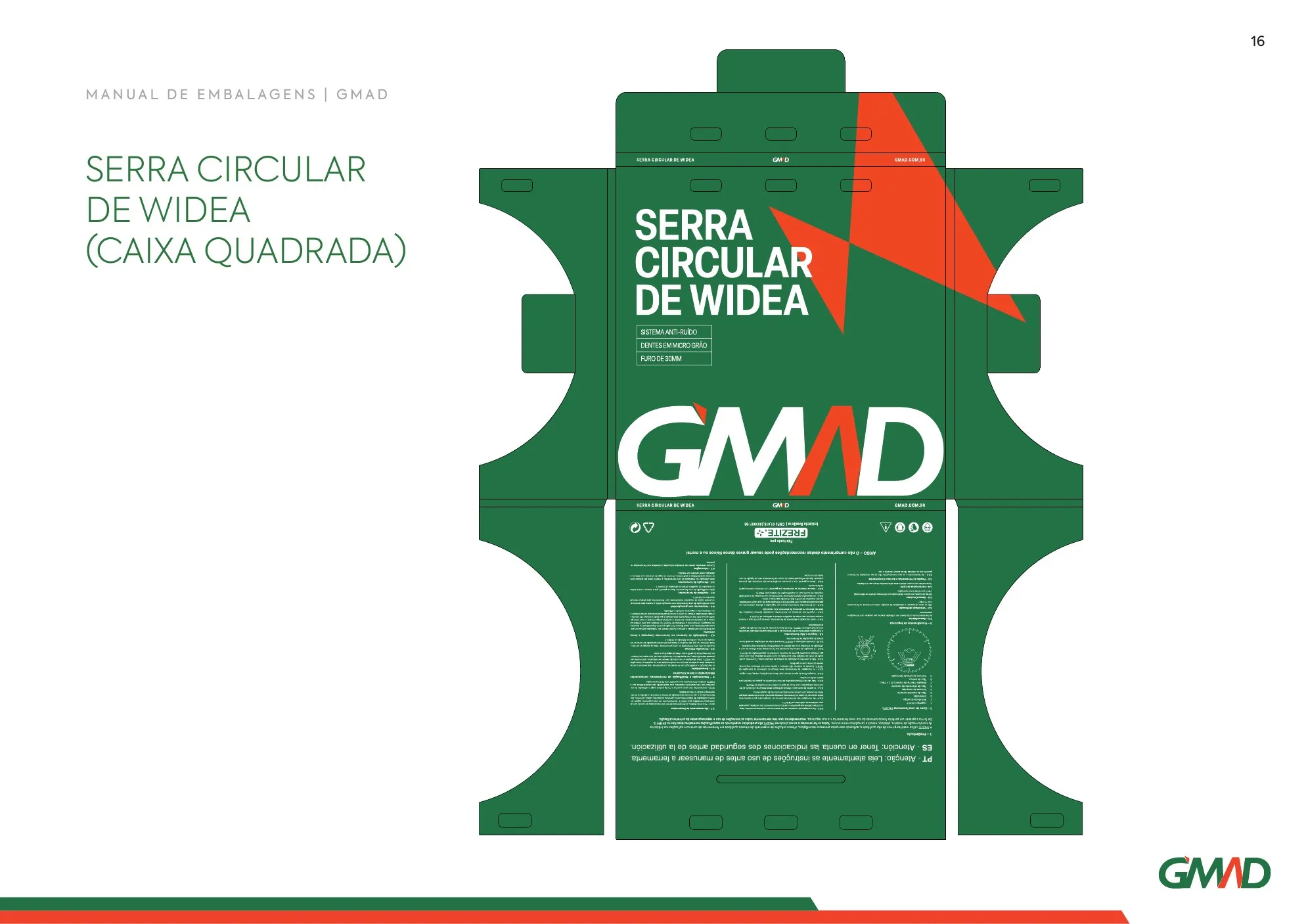
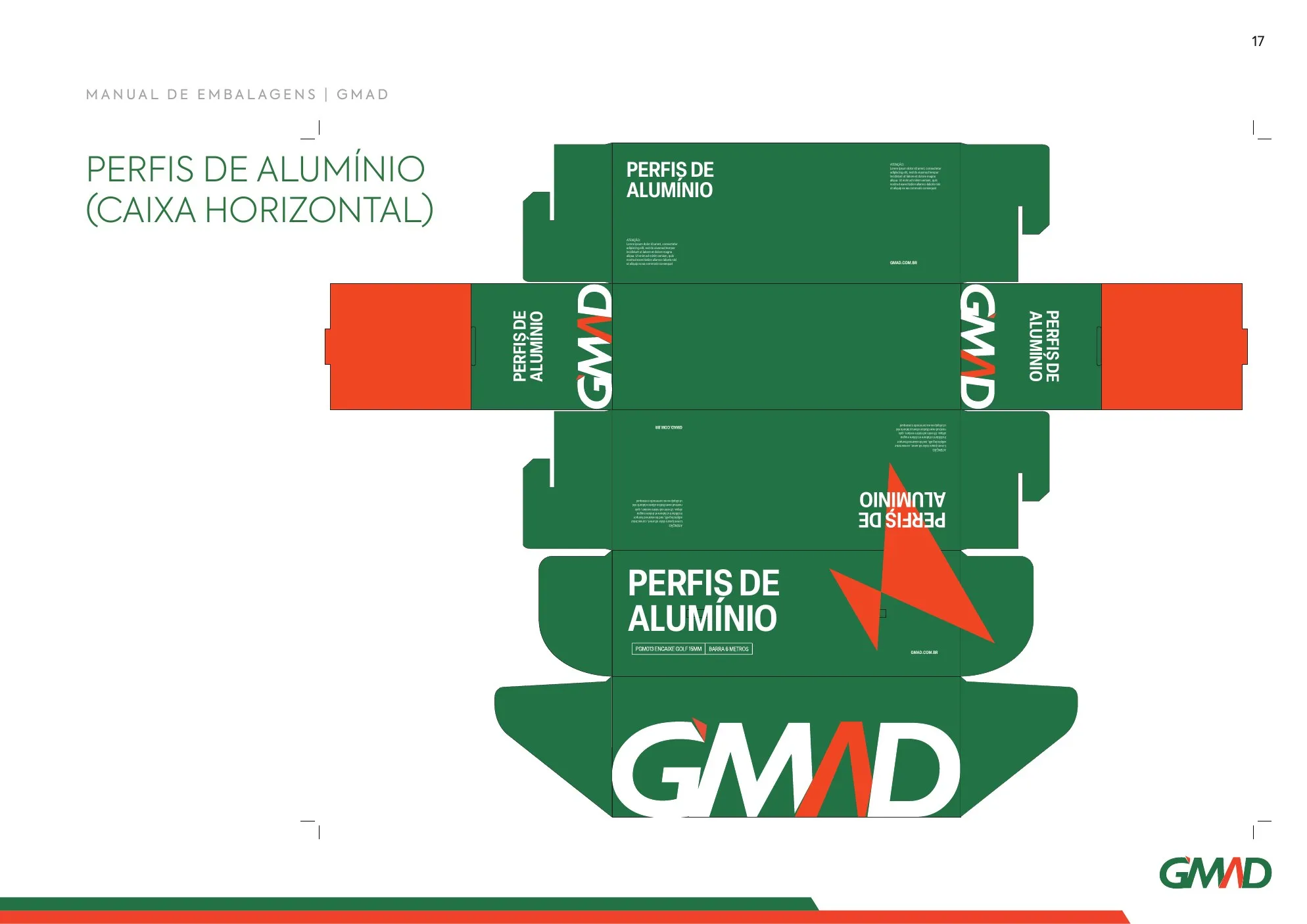
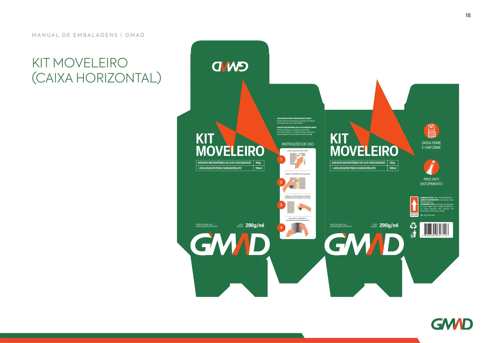
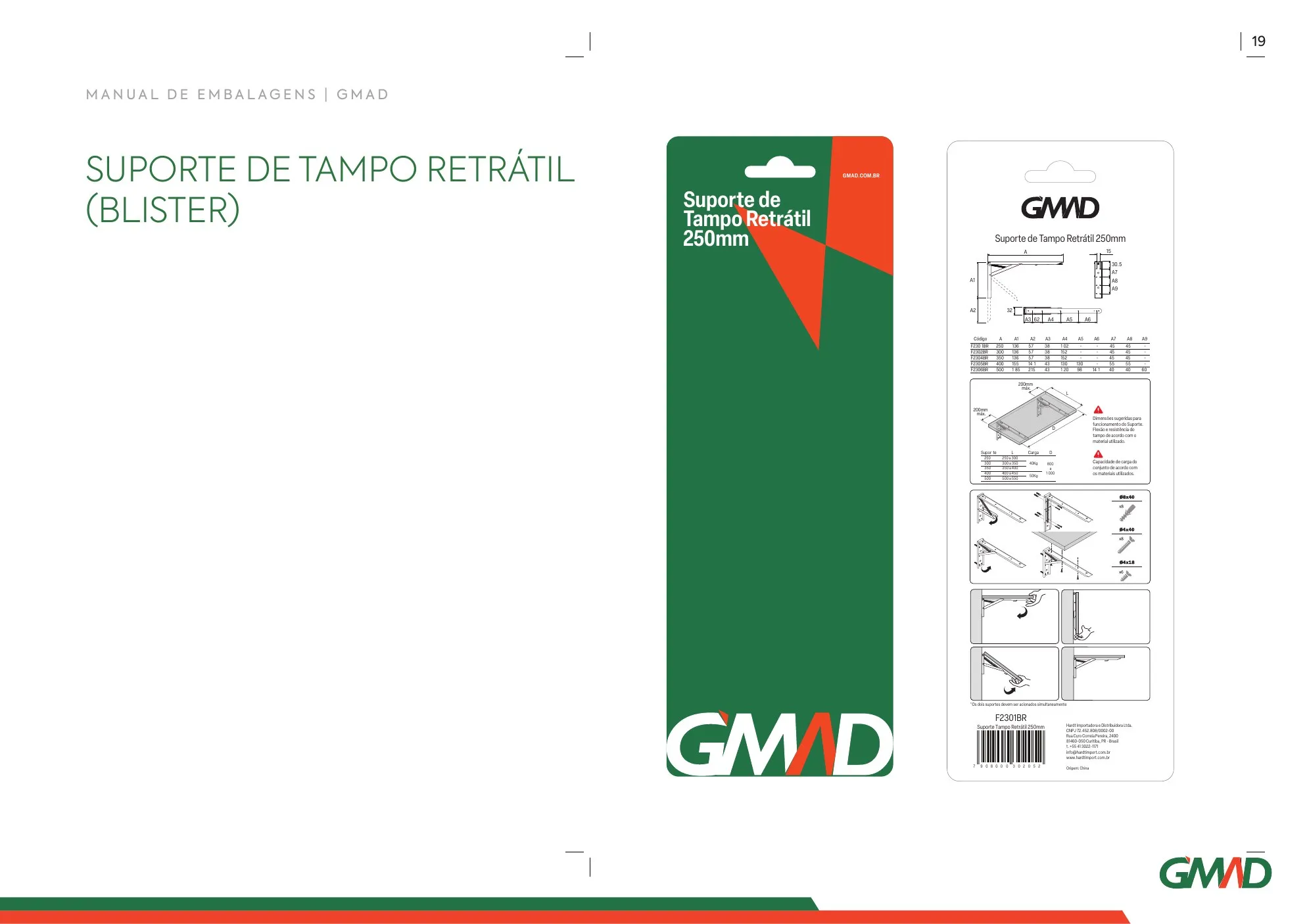
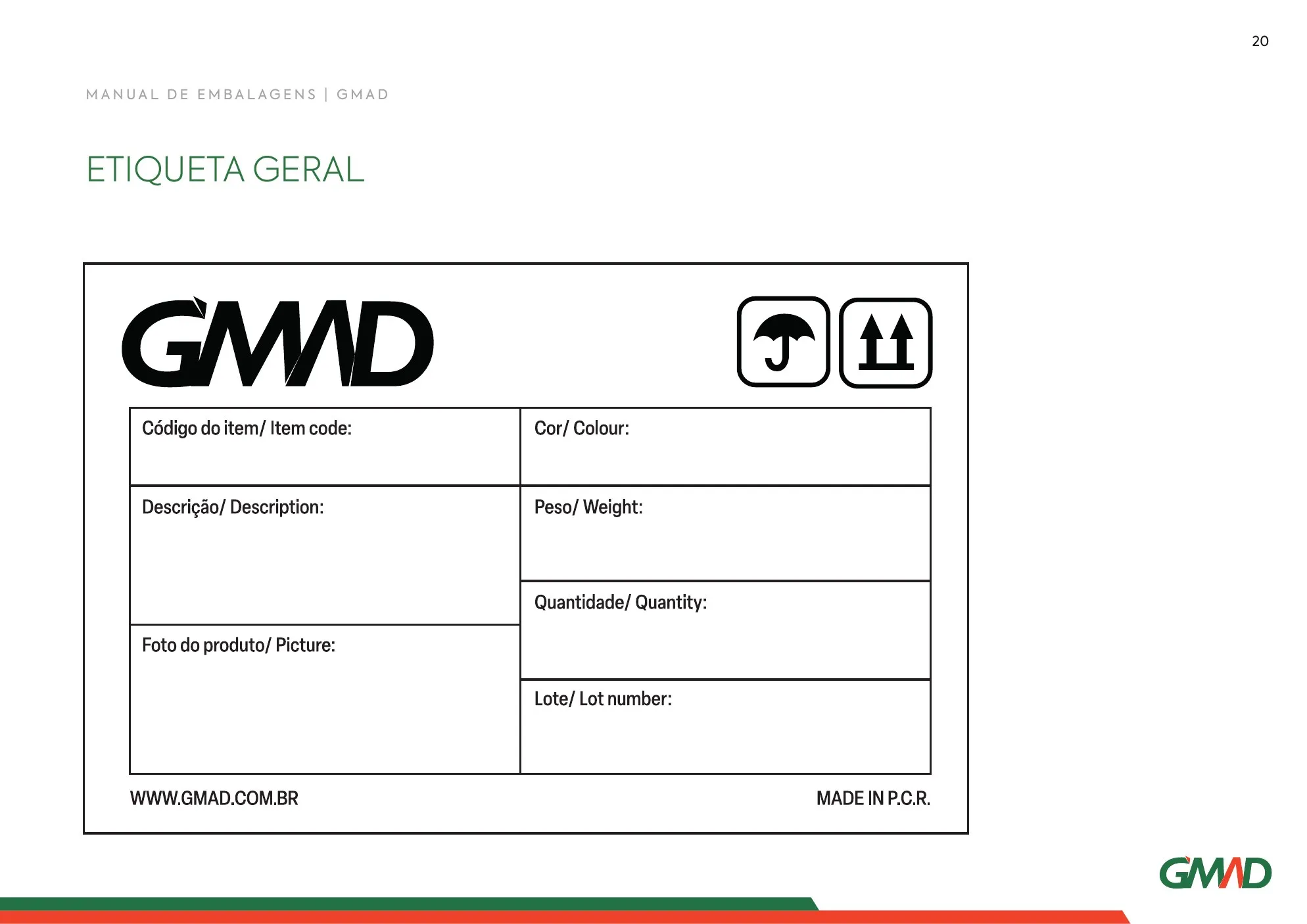
Each packaging style has its own dieline: large cardboard box, square box, horizontal boxes, blister and general label.
- Rótulos
Labels for every type of pack
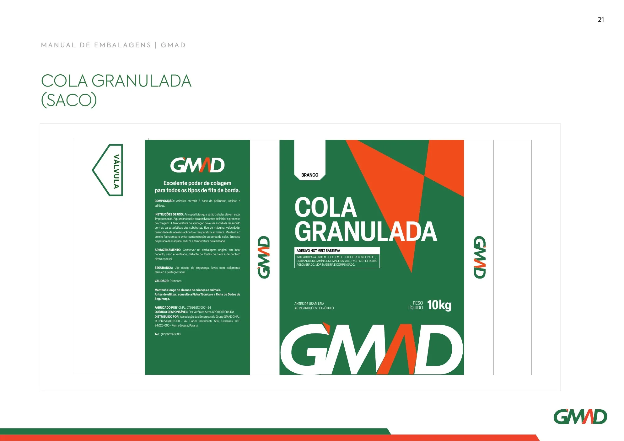
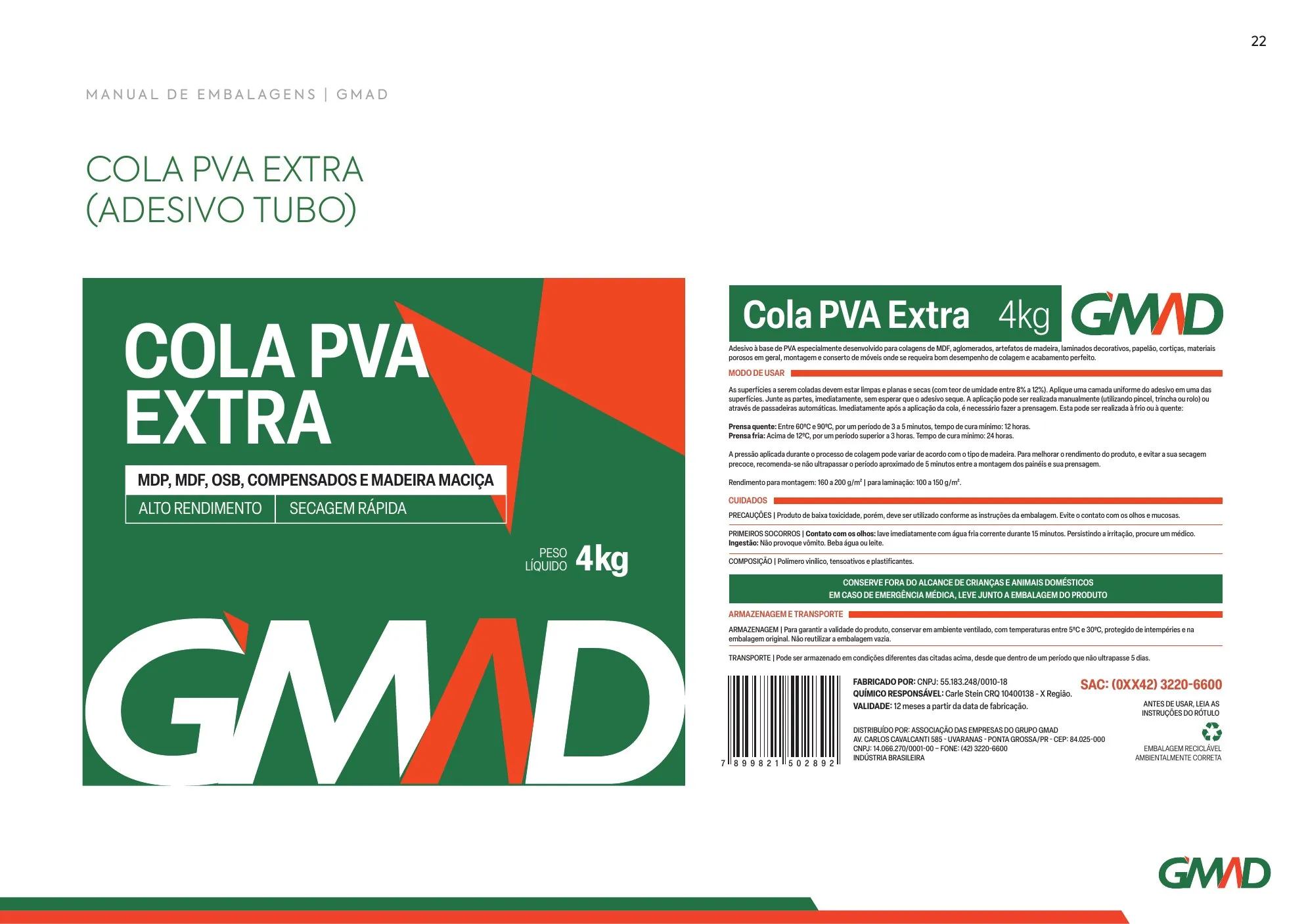
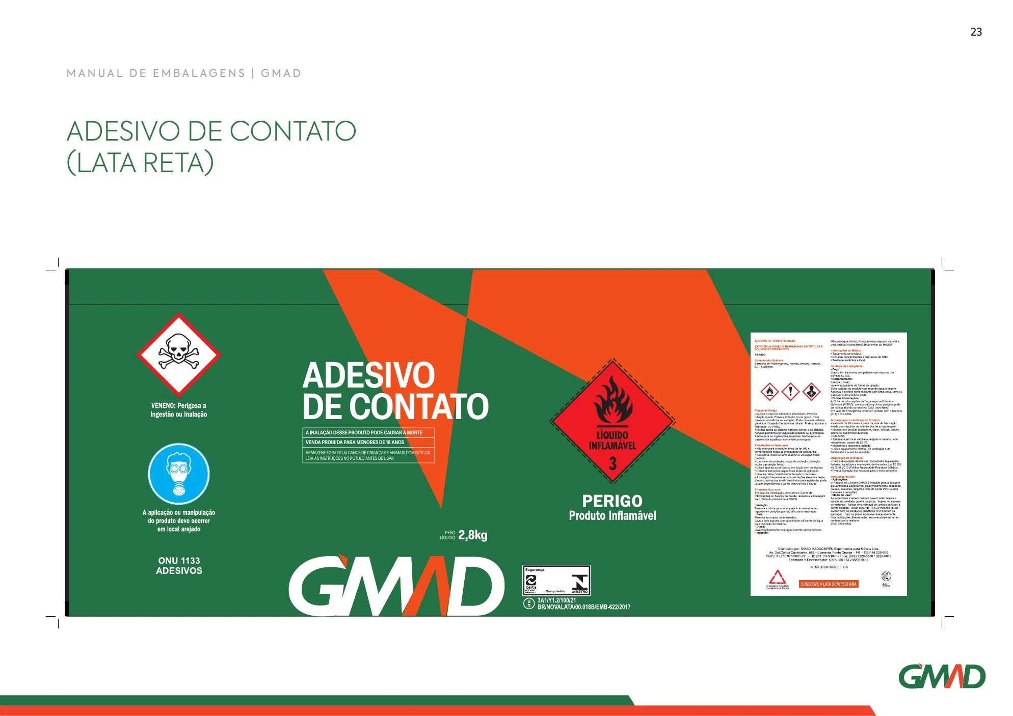
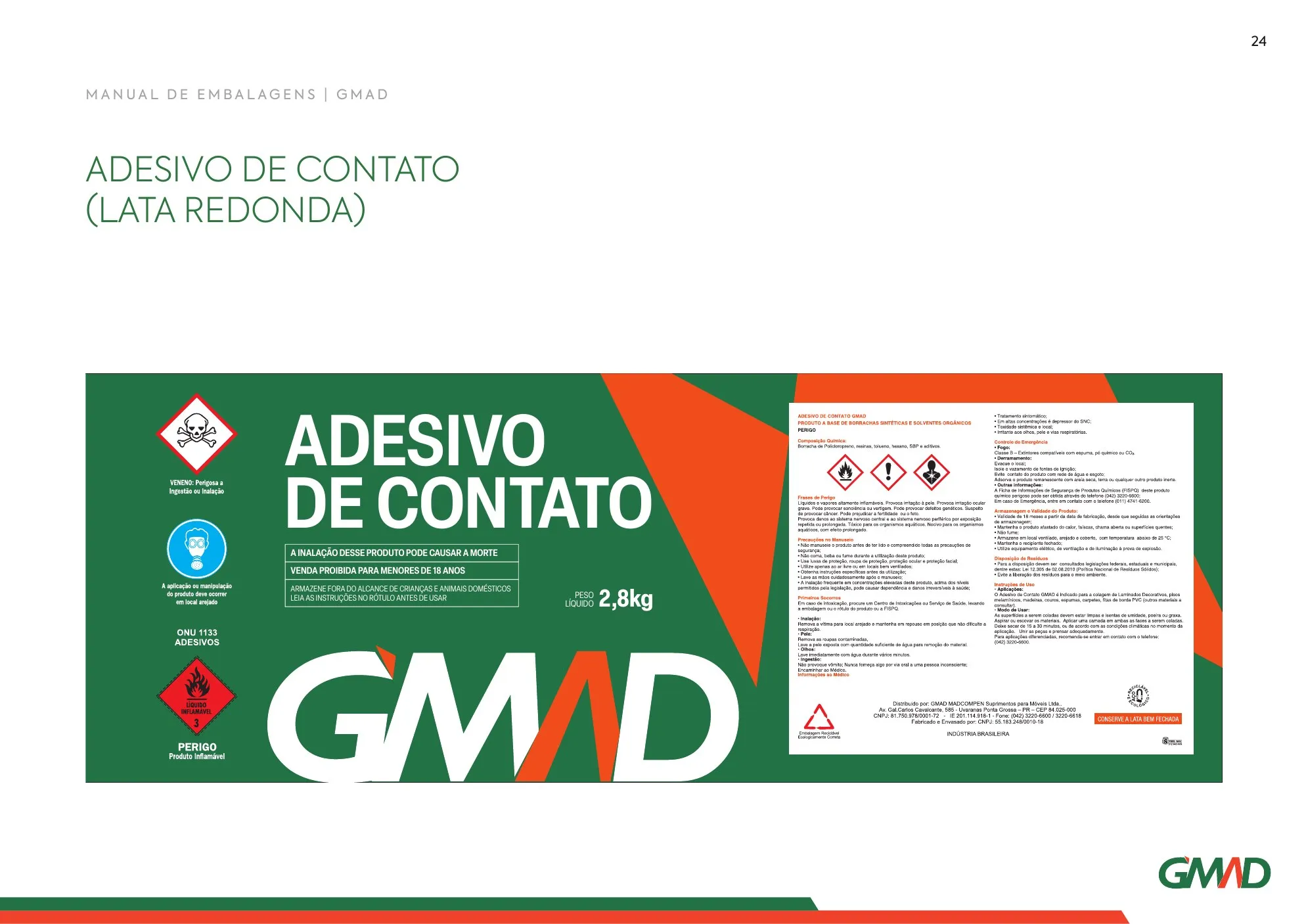
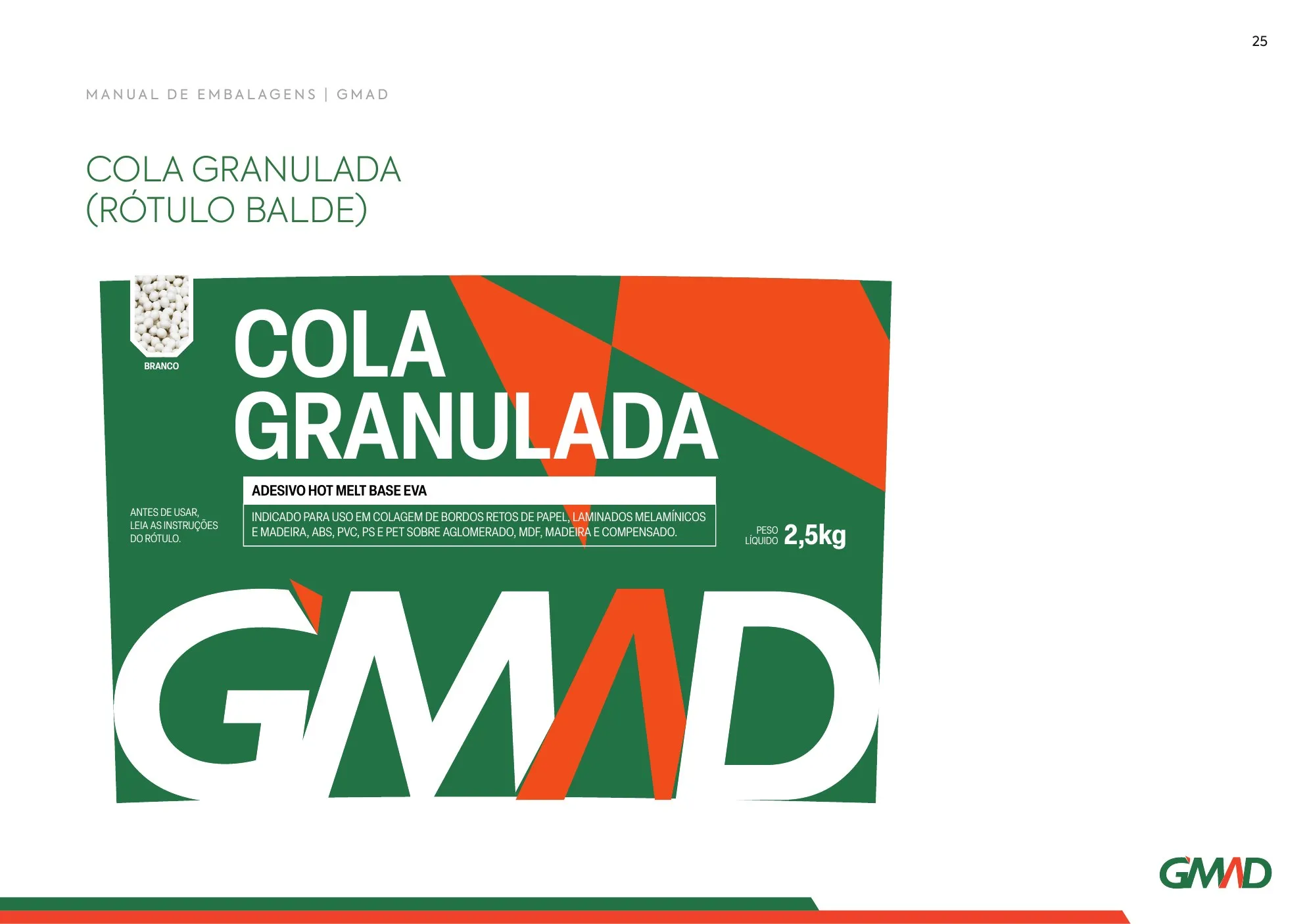
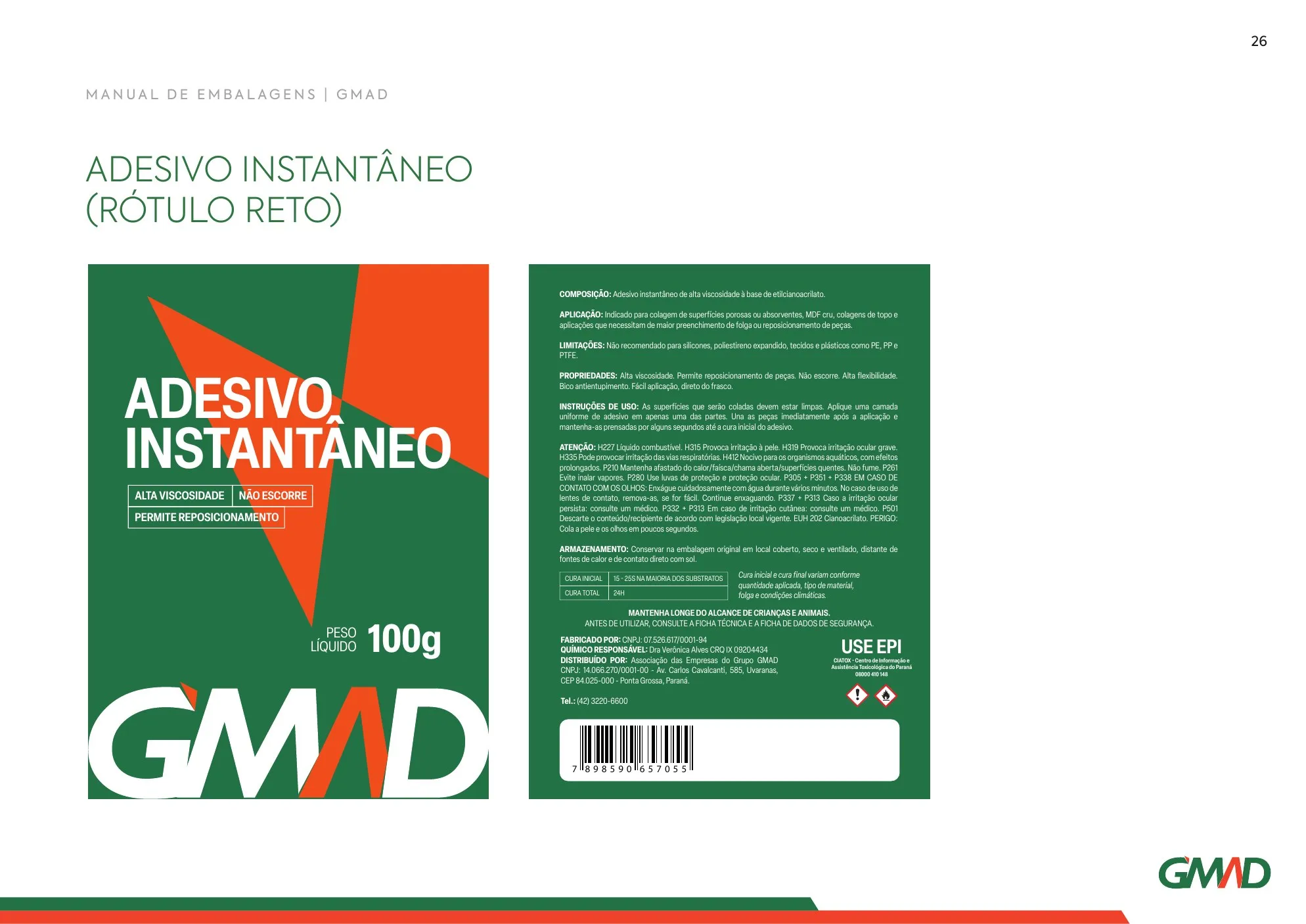
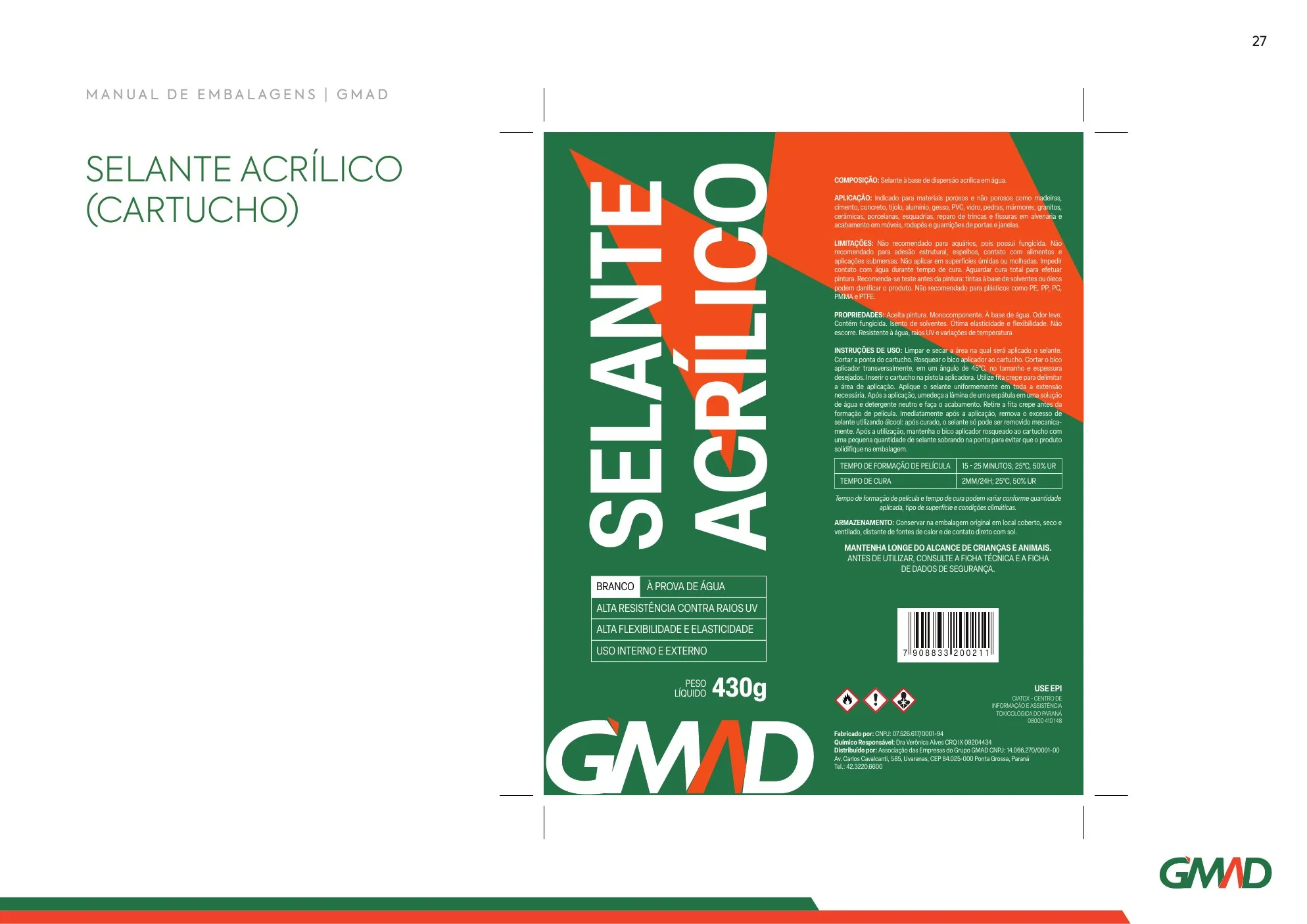
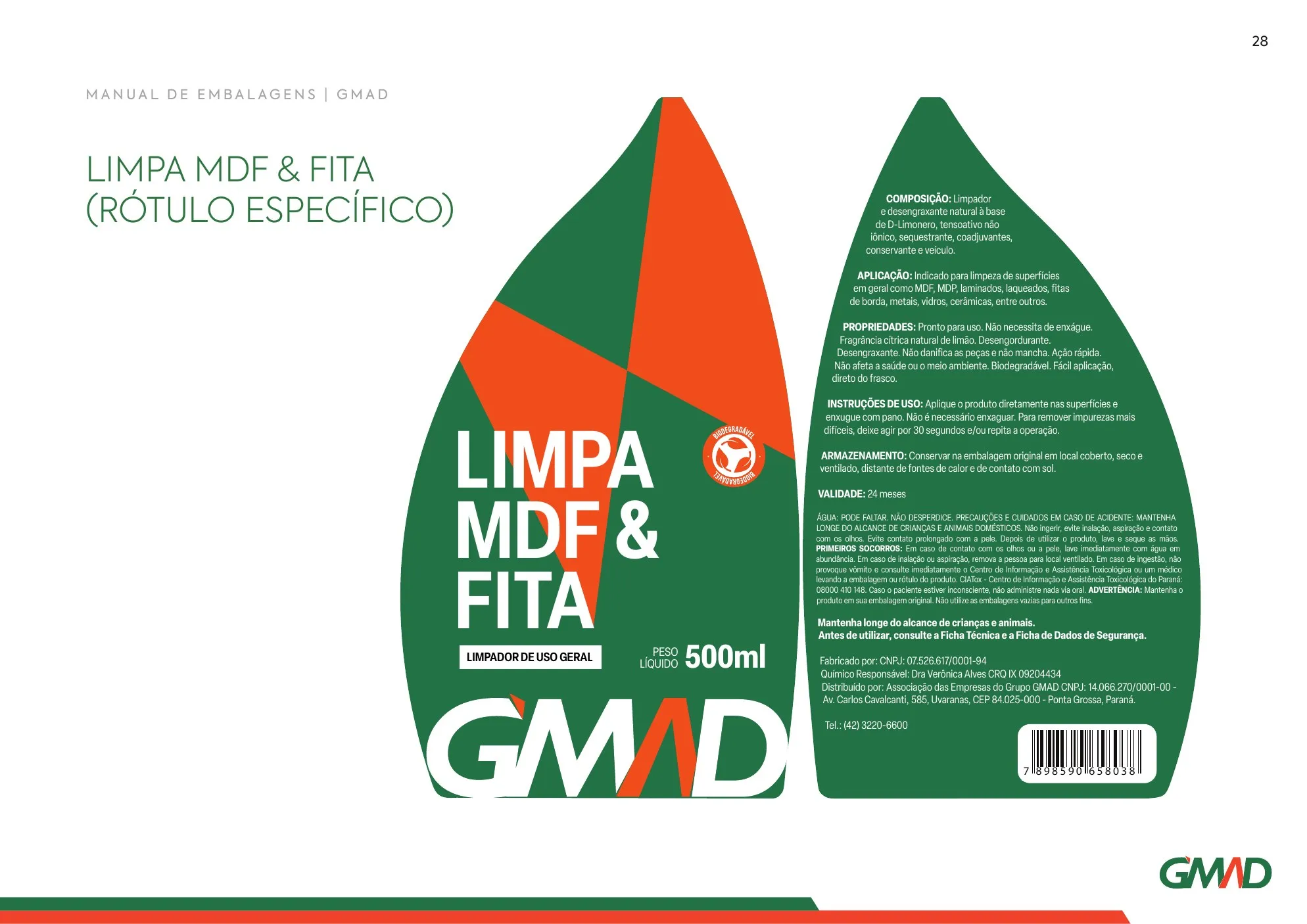
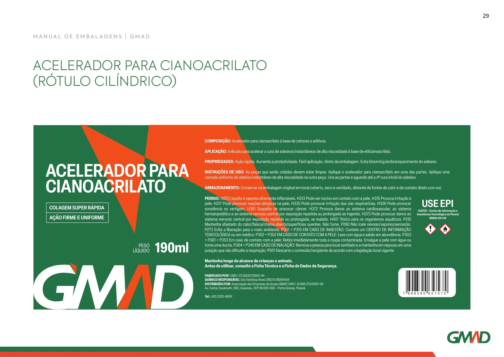
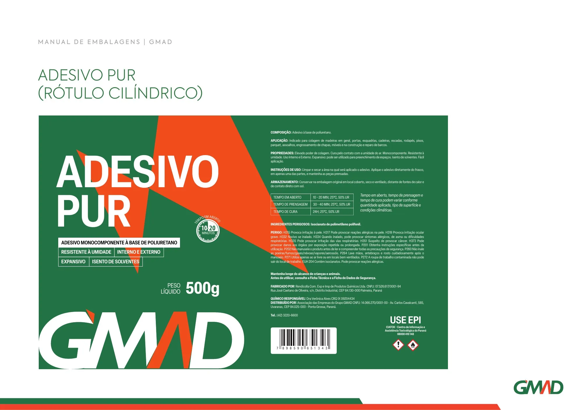
Bag, tube, straight and round can, tub, cartridge and special labels follow the same system, with pictograms and mandatory information in the right place.
- Submarcas
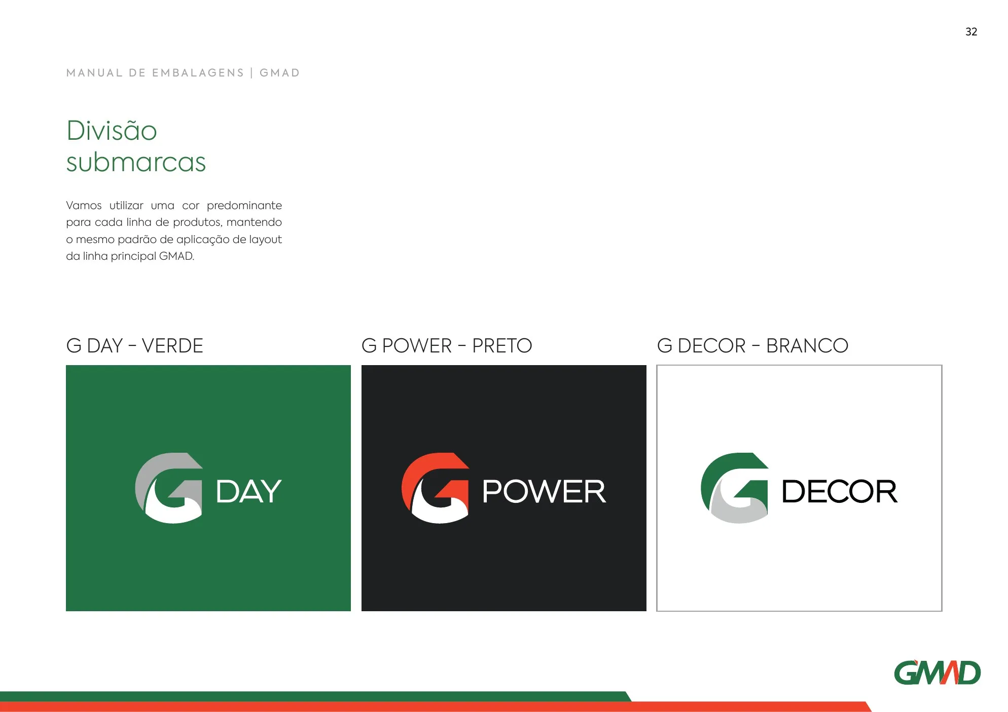
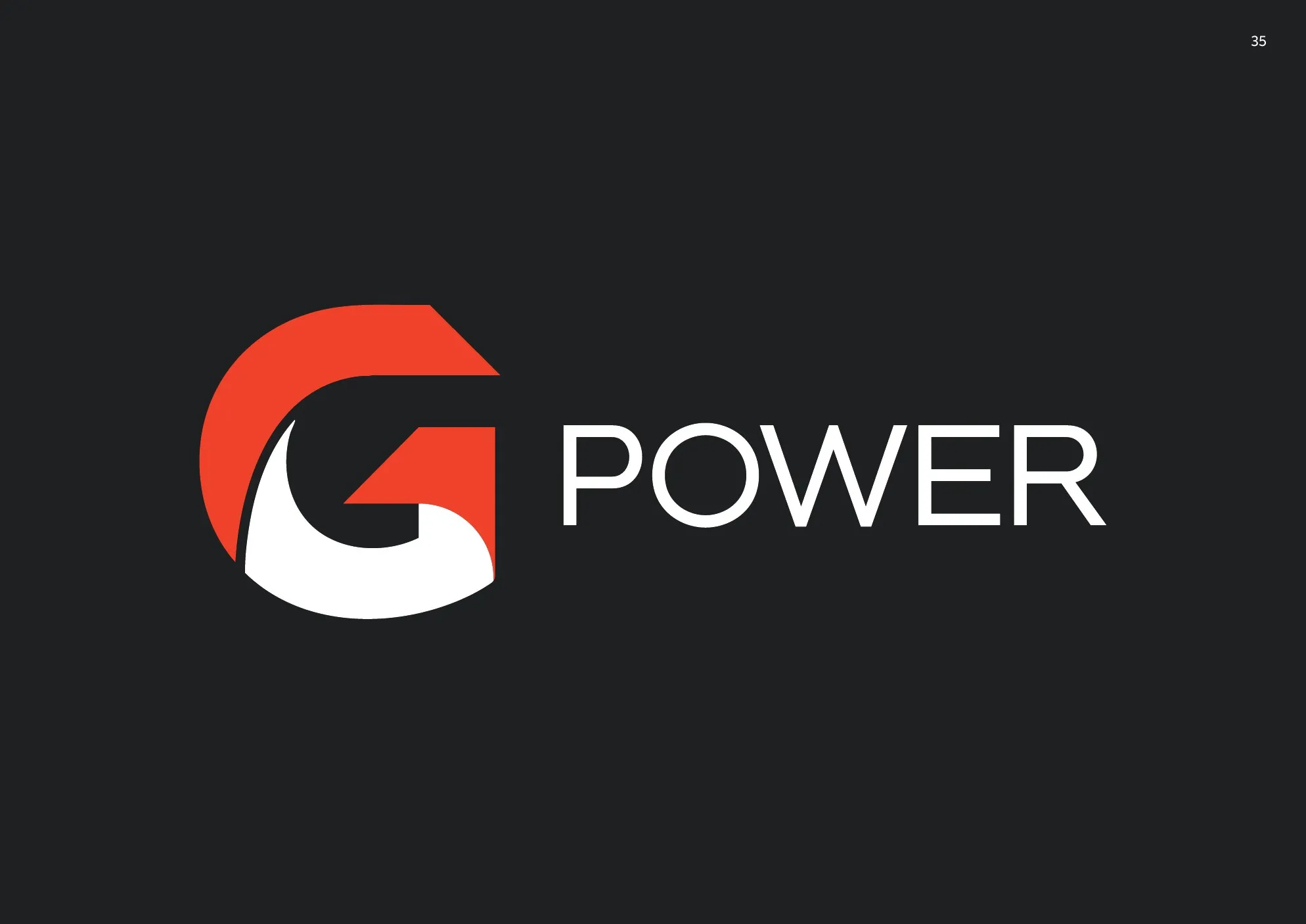
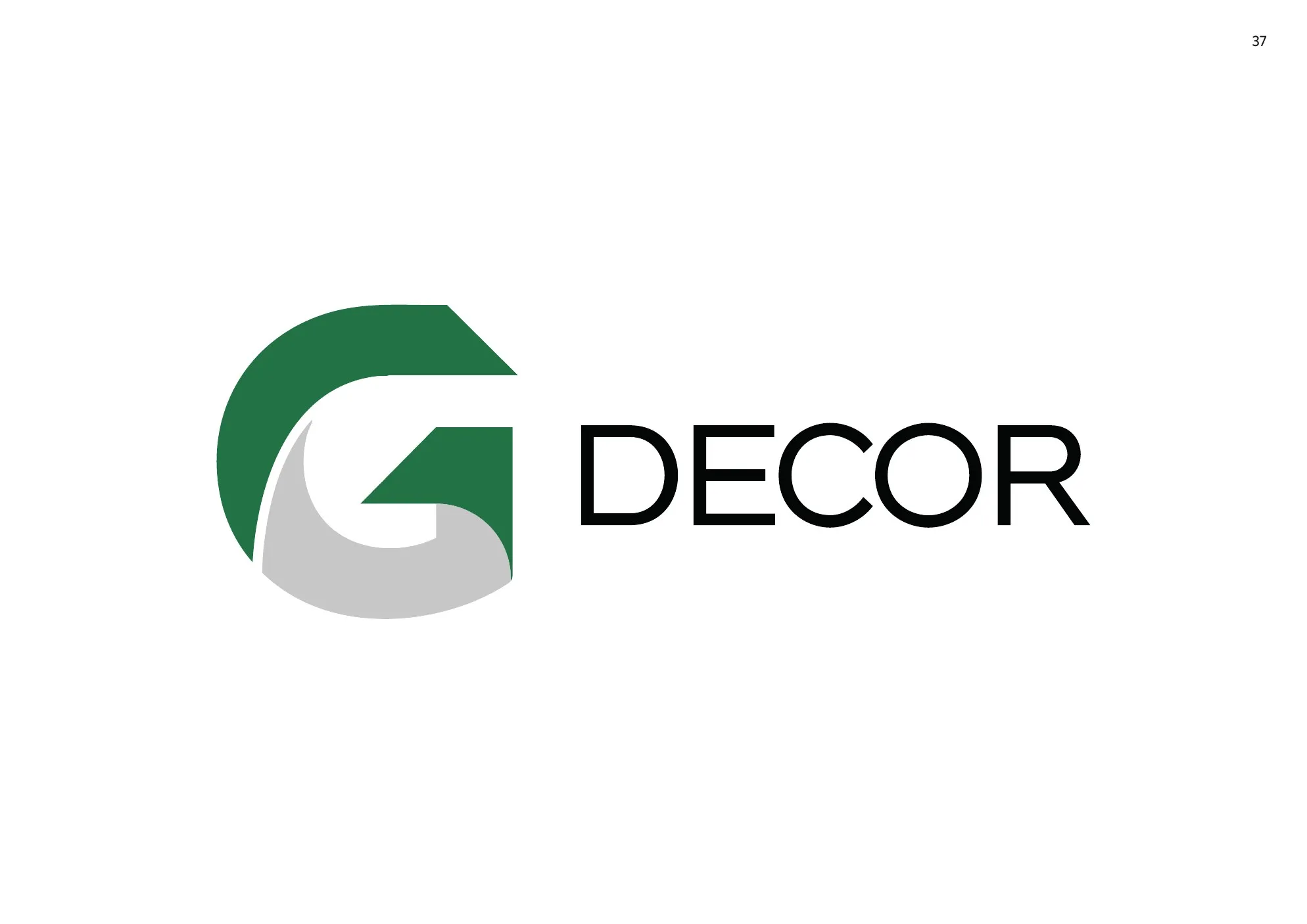
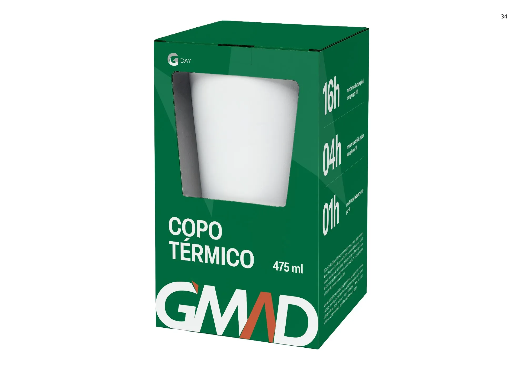
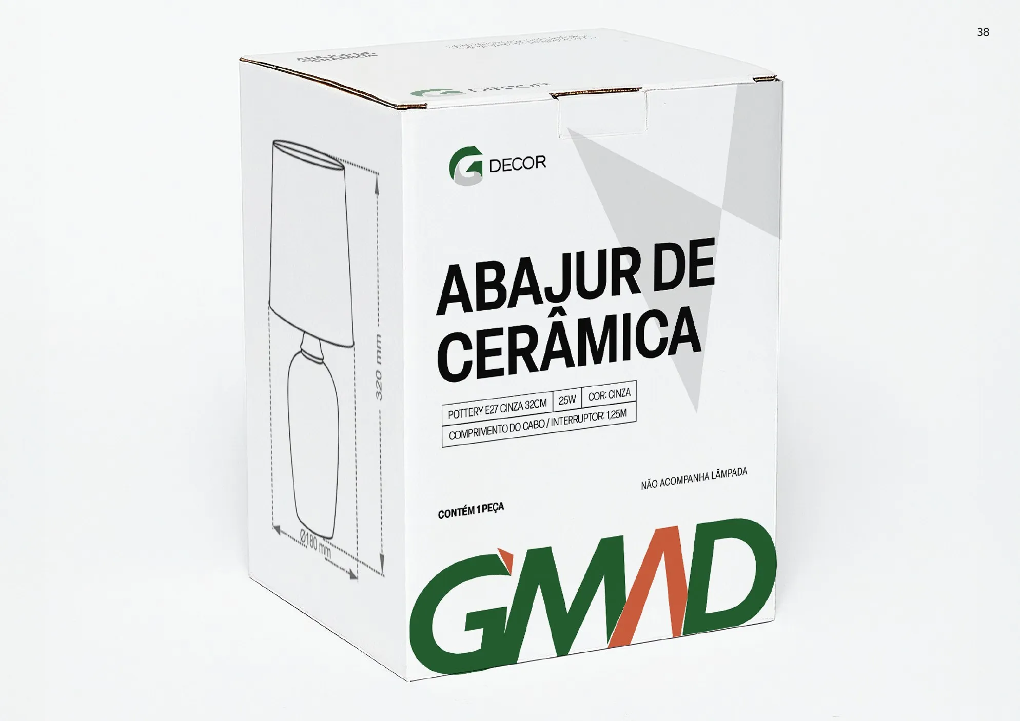
G Day, G Power and G Decor
Each product line got a dominant colour, green, black or white, keeping the same layout standard as the main line.

A positioning view
For a private label sold next to many others, packaging is the main medium. When every product speaks the same way, customers recognise GMAD from afar and trust the whole line.
The guidelines turn that result into a process: any supplier or designer can create a new pack without losing consistency, including versions that are cheaper to print.
- 2025
- new packaging and guidelines
- 3
- sub-brands: G Day, G Power and G Decor
- 8
- suppliers and materials with calibrated colours
Why hire the group for a project like this
In this case, BDDB.ag created GMAD’s packaging and packaging guidelines.
-

BDDB.agLed this case
Master pack concept, family roll-out, dielines and packaging guidelines.
Meet BDDB.ag -

RISE Films
Product photos and videos for catalogue, e-commerce and point of sale.
Meet RISE Films -

PLUS & MORE
Activations and point-of-sale materials to launch the new line.
Meet PLUS & MORE
Does your product line speak one language on the shelf?
Tell us the challenge. A partner will reply and outline the path, from packaging concept to supplier guidelines.
← All cases