
MOVMIX · 2010 · 2025 · Branding · Relift · Visual identity
The brand born with the company, refined for leadership.
In 2010, BDDB.ag created the MOVMIX brand when the company was starting out renting forklifts. Fifteen years later, it had become a reference in aerial work platforms, and we came back for the relift: the same brand, more precise, cohesive and ready to grow.
- Client
- MOVMIX Rental · aerial work platforms
- History
- Brand created in 2010 · relift in 2025
- Scope
- Brand diagnosis, logo relift, symbol, typography, colours, pattern, stationery, uniforms, campaigns and fleet application
- Group company
- BDDB.ag
The challenge
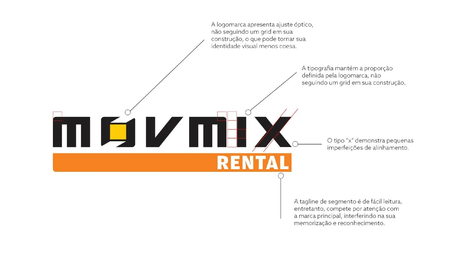
MOVMIX grew: it started with forklifts, studied the market in the US and Europe, built a training centre and specialised in aerial work platforms. The brand followed that story but built up small inconsistencies.
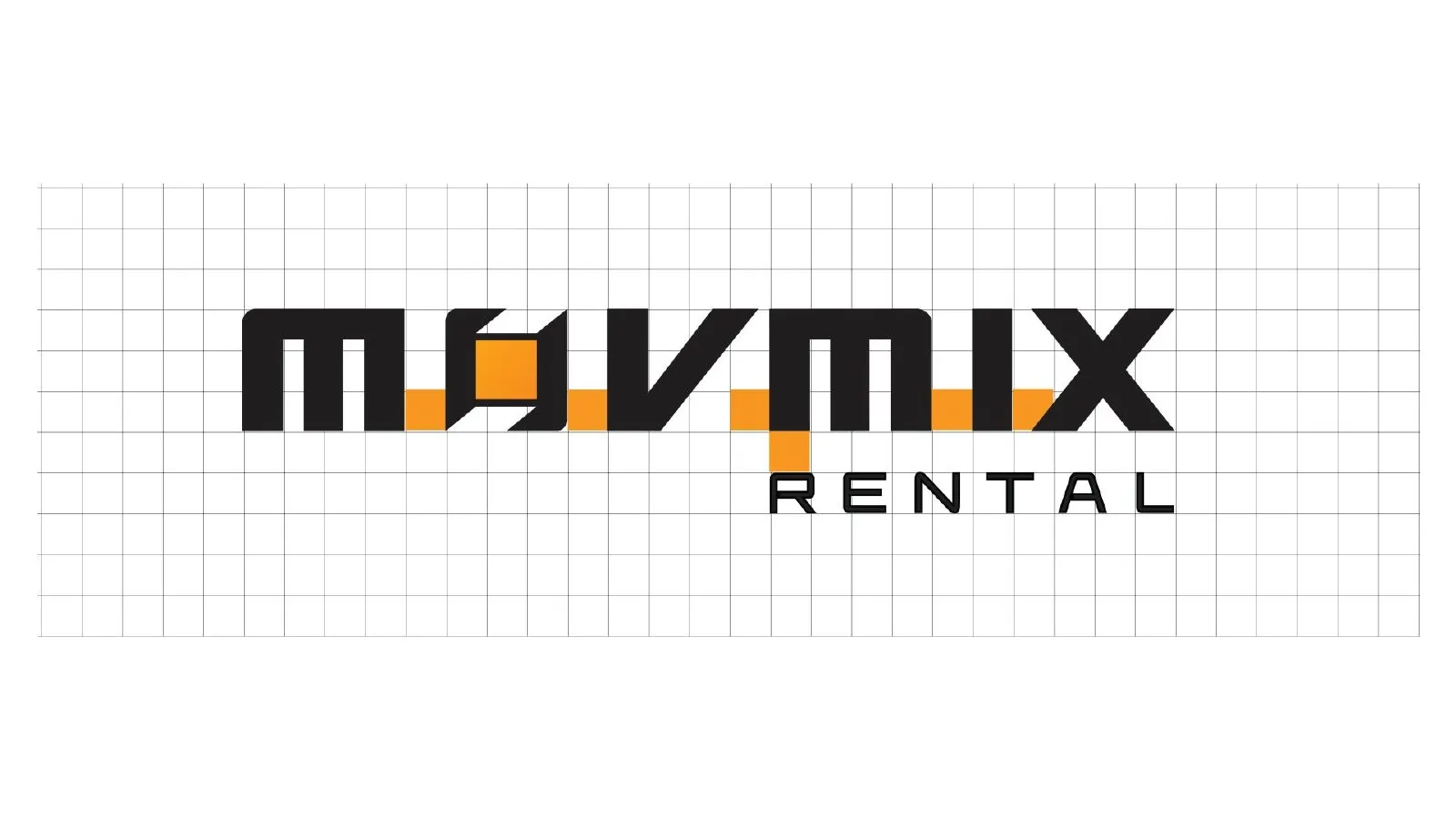
The logo had optical tweaks without a grid, the typography followed no rule, the “X” had alignment flaws and the word RENTAL competed with the name. The goal was to fix all of this without losing 15 years of recognition.
What we did
- 01
Diagnosis
We analysed the 2010 logo point by point: grid, proportions, alignment and hierarchy between name and tagline.
- 02
Relift
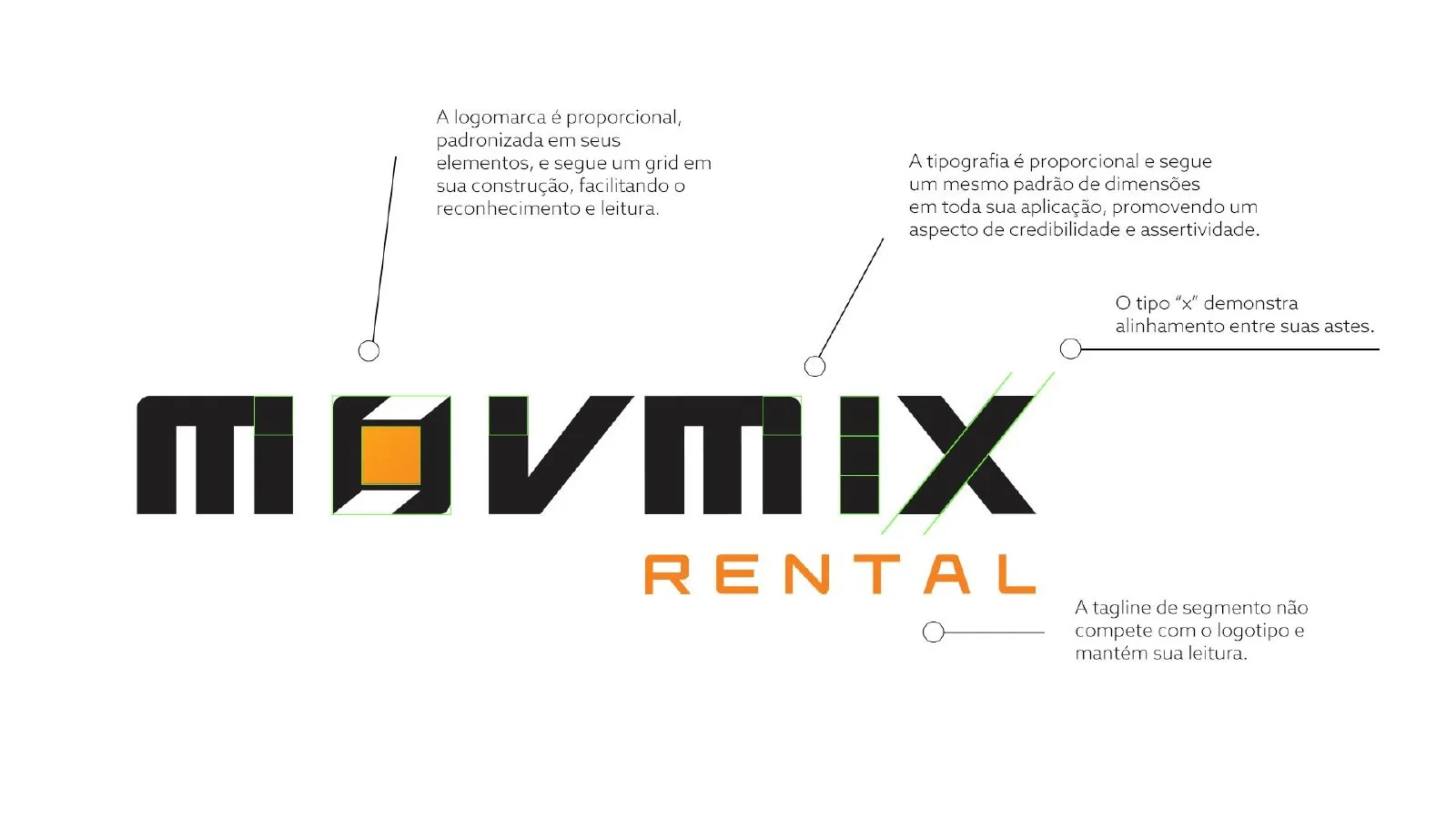
A grid-based redraw, no more two-line logo, the yellow removed and orange as the main colour.
- 03
System
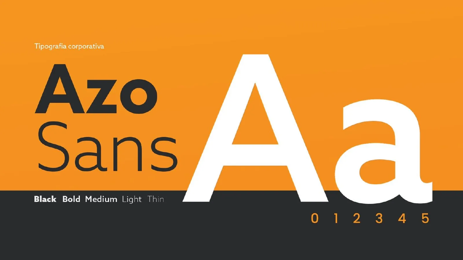
Symbol, pattern, Azo Sans typography and the line “Quality in motion”.
- 04
Applications
Stationery, façade, uniforms, campaigns, digital and the platform fleet.
Before and after the relift
The brand was redrawn on a grid: standardised proportions, aligned stems and the RENTAL tagline at a lighter weight so it doesn’t compete with the name.
The new brand system
A brand that is simpler to apply, from business card to a 20-metre platform.
- Símbolo
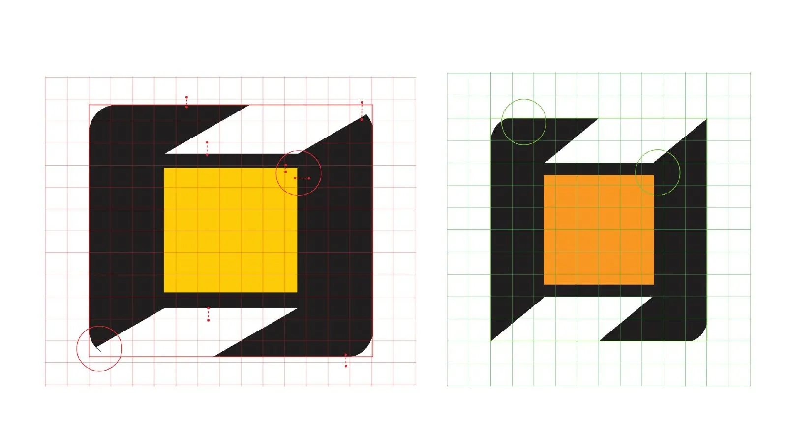
The “O” that became an icon
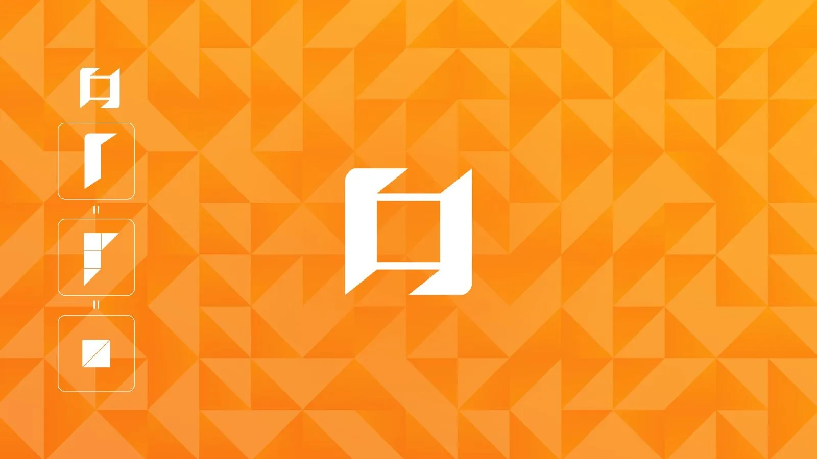
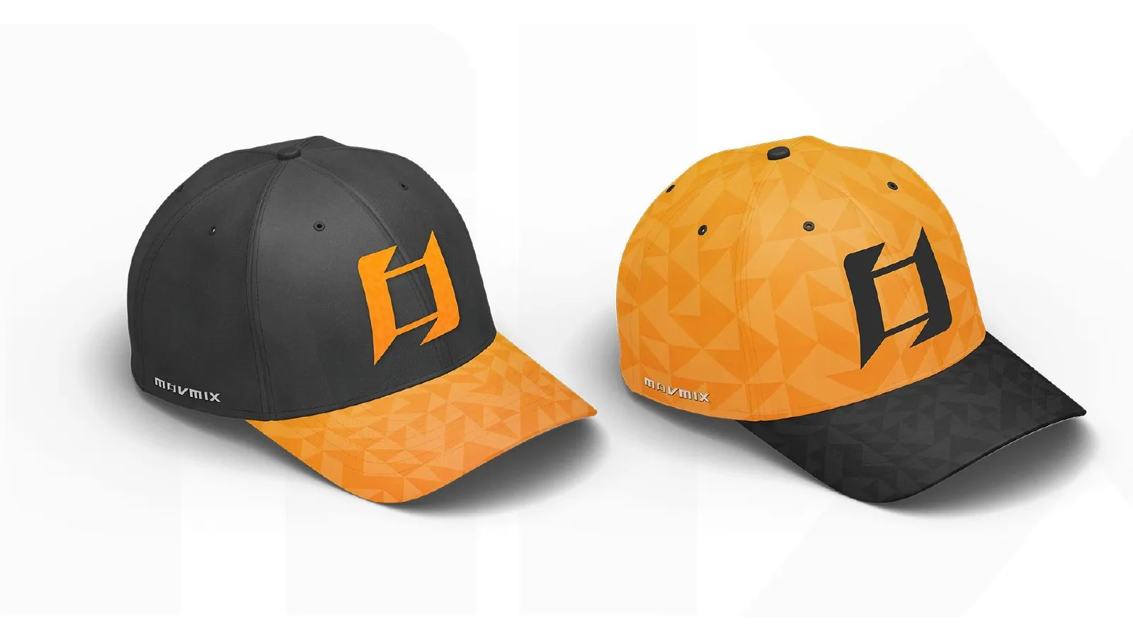
The square inside the “O” became the brand symbol: it works on its own in avatars, caps, patterns and on the machines.
- Sistema
Versions, typography and colours
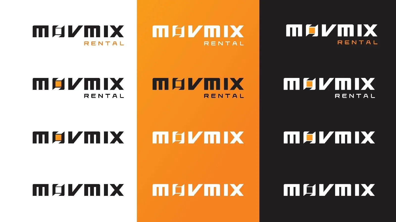
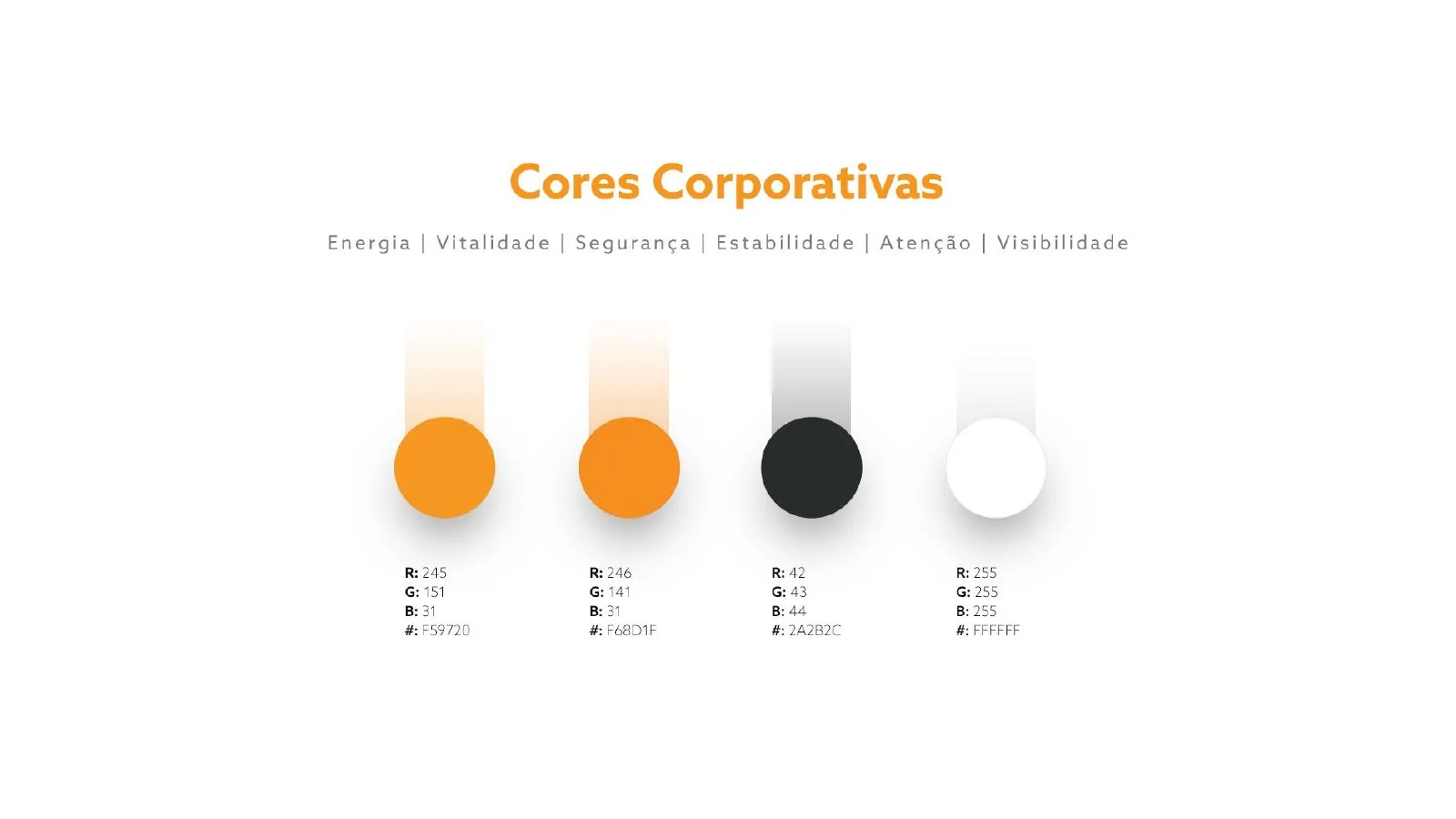
Versions for light, dark and orange backgrounds, the Azo Sans family and a lean palette: orange, graphite and white. The yellow is gone.
- Papelaria
Stationery and façade
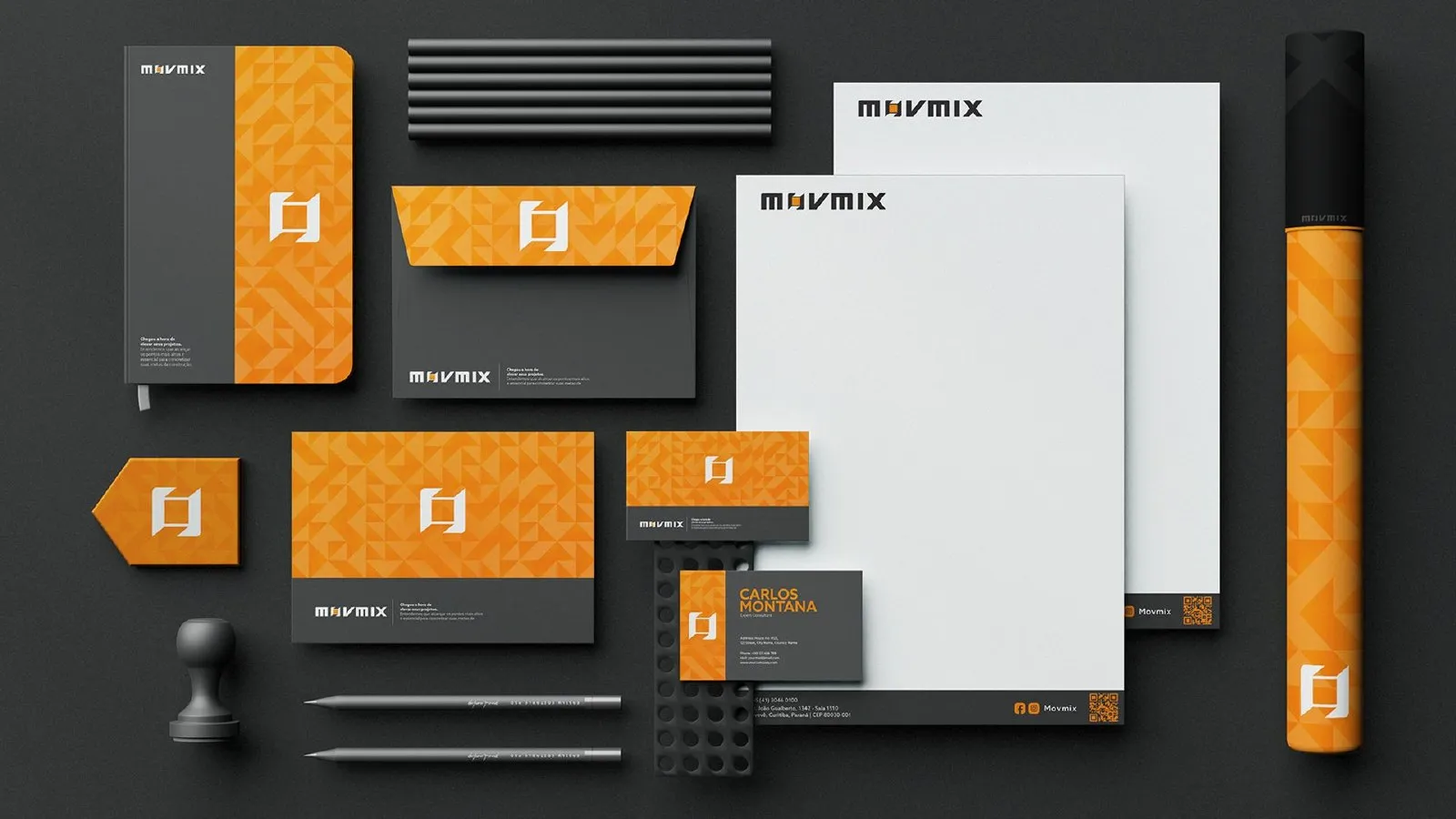
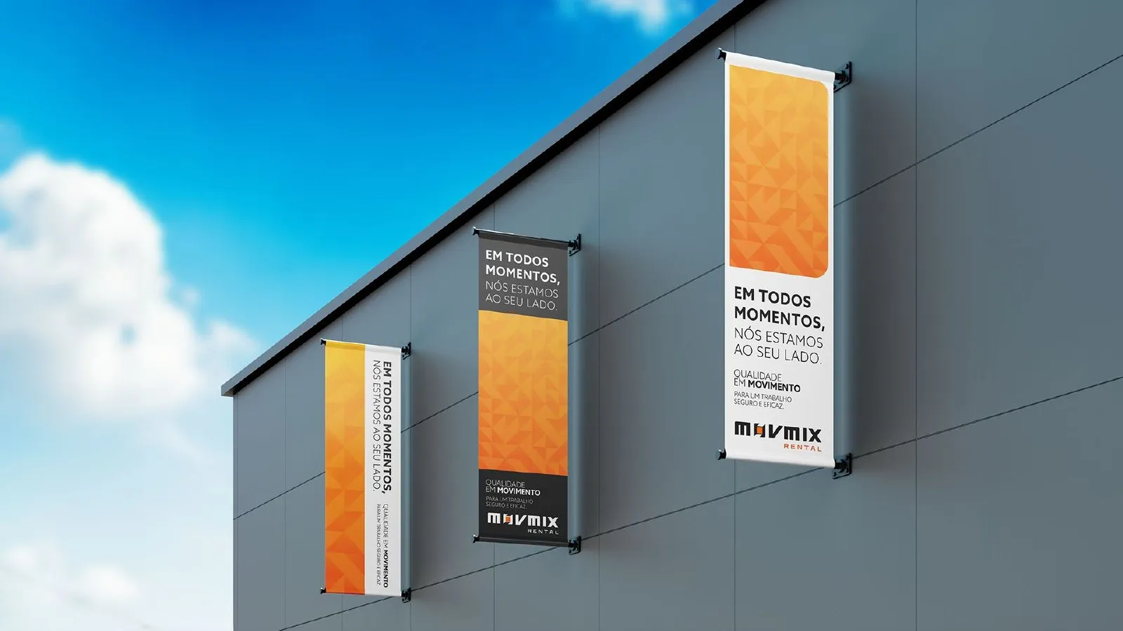
Business cards, letterhead, envelopes and headquarters signage with the new identity.
- Equipe
Uniforms and field materials
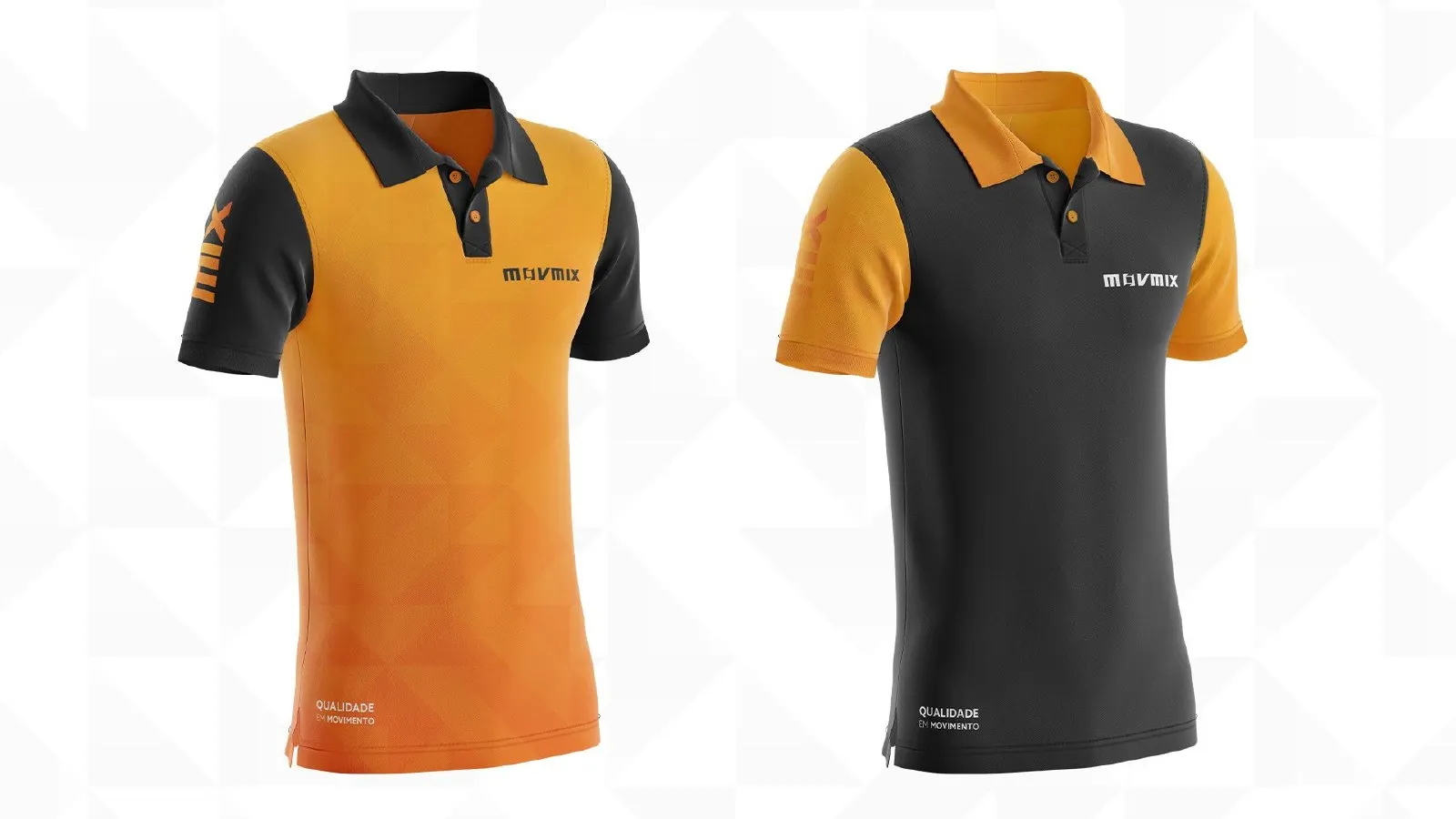
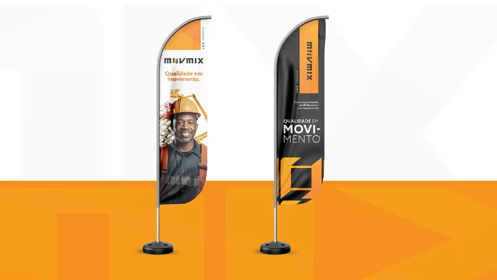
Caps, polos and wind banners for the team and the job sites, where the brand is really seen.
- Campanhas
Quality in motion
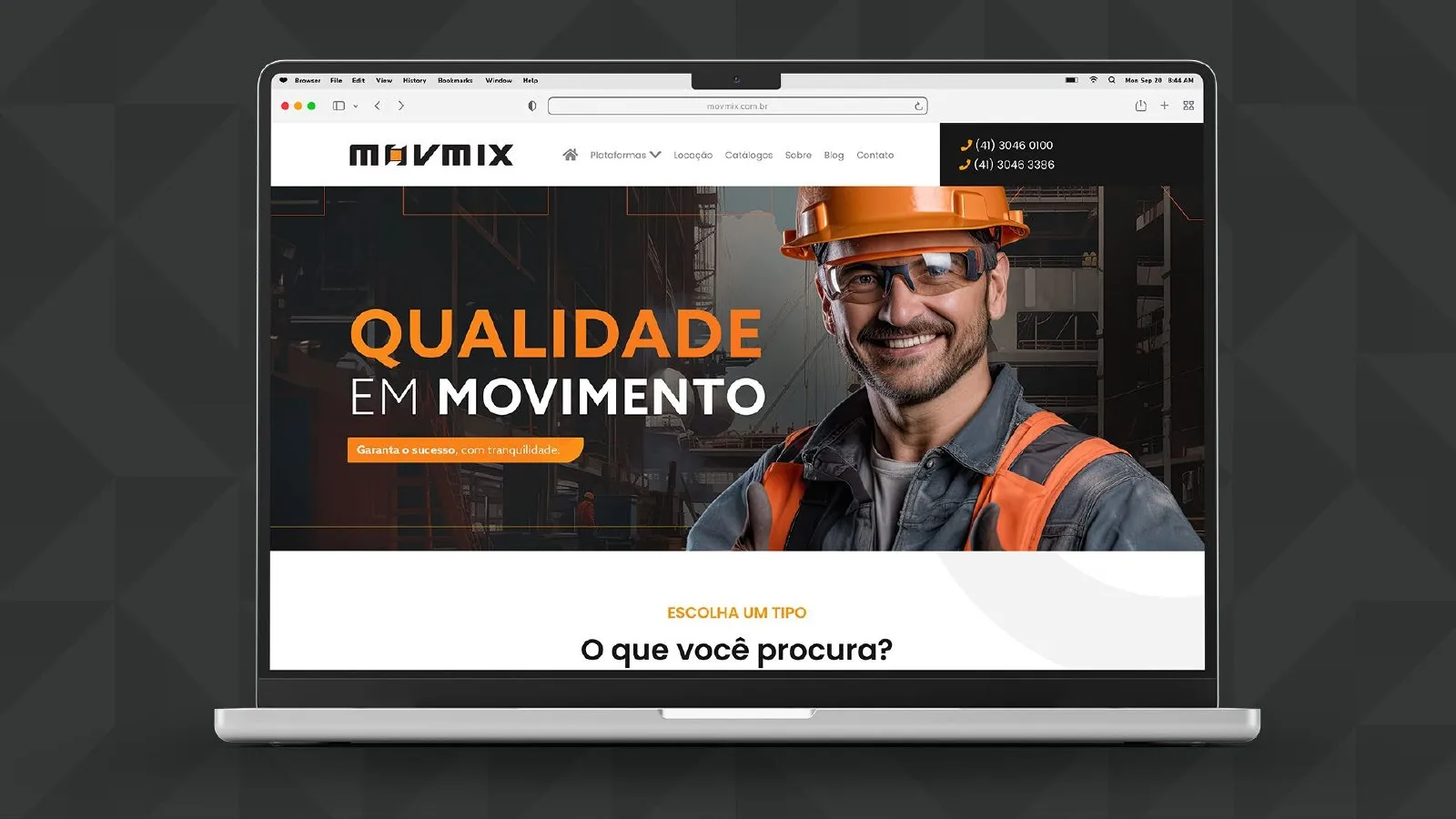
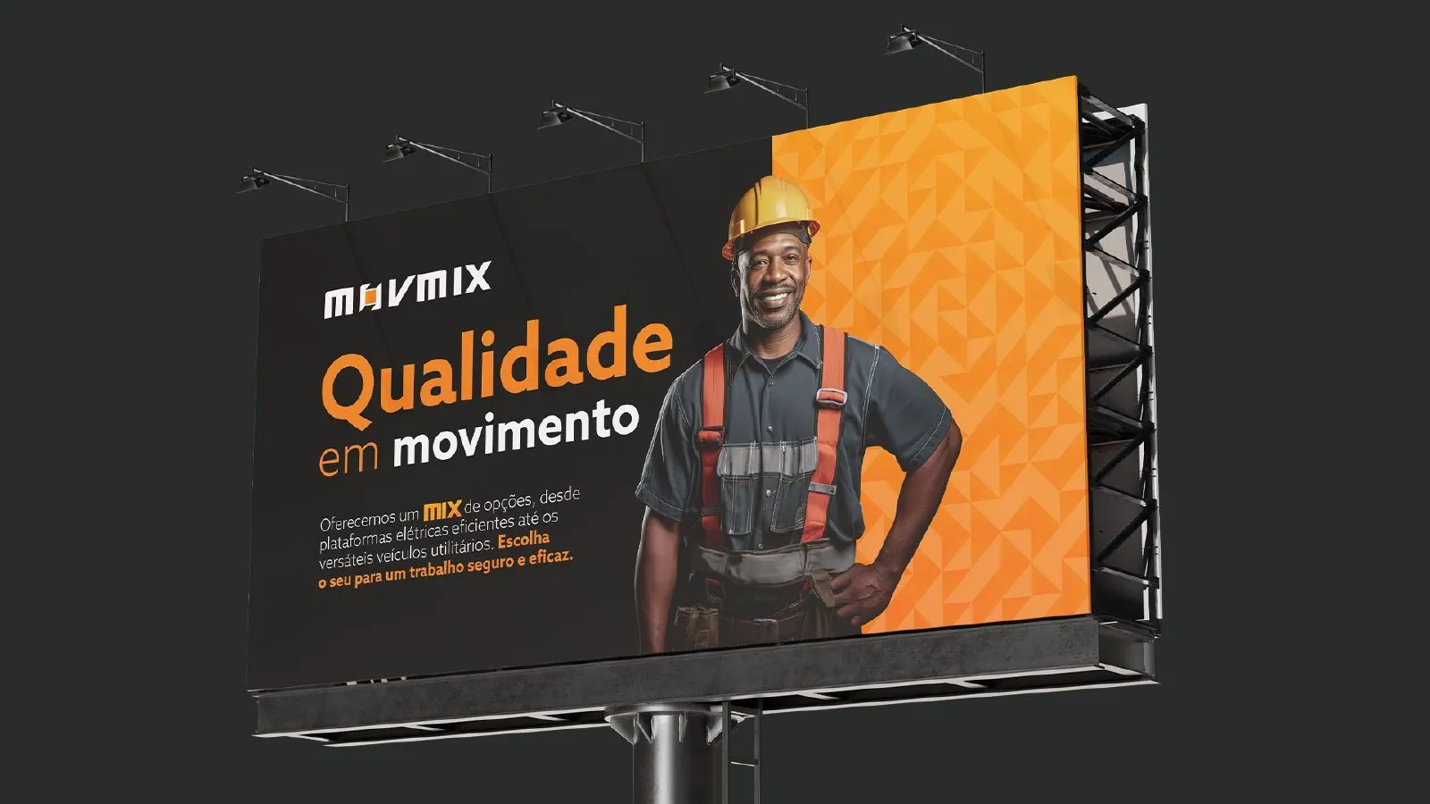
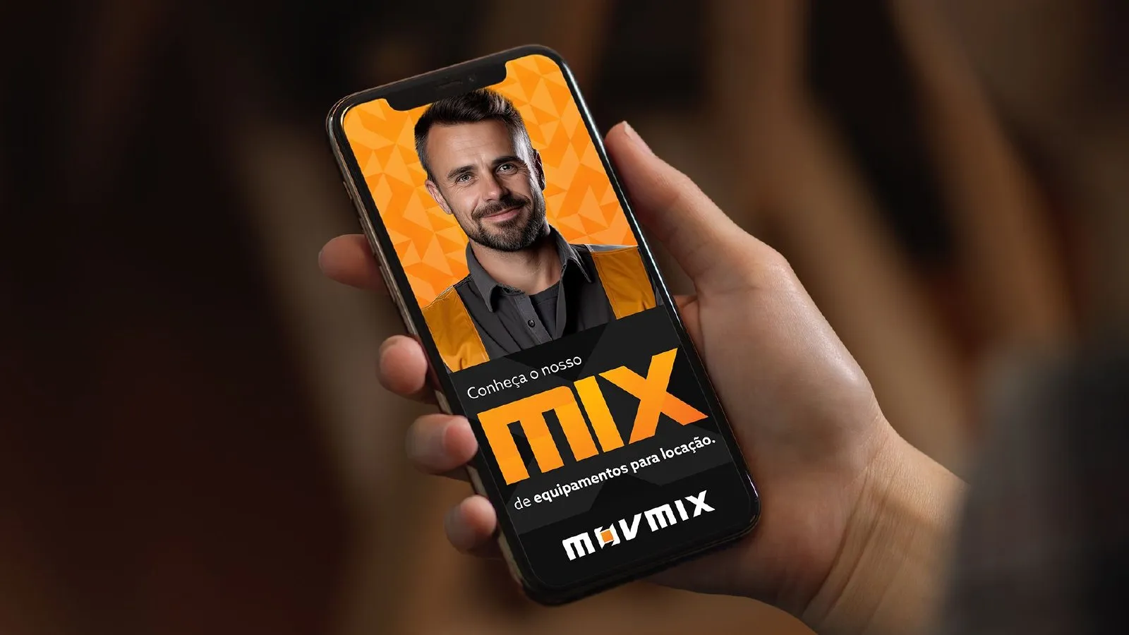
The line “Quality in motion” drives the website, billboards, social and mobile, always with real people working at height.
- Arquitetura
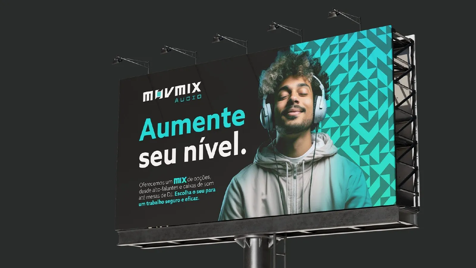
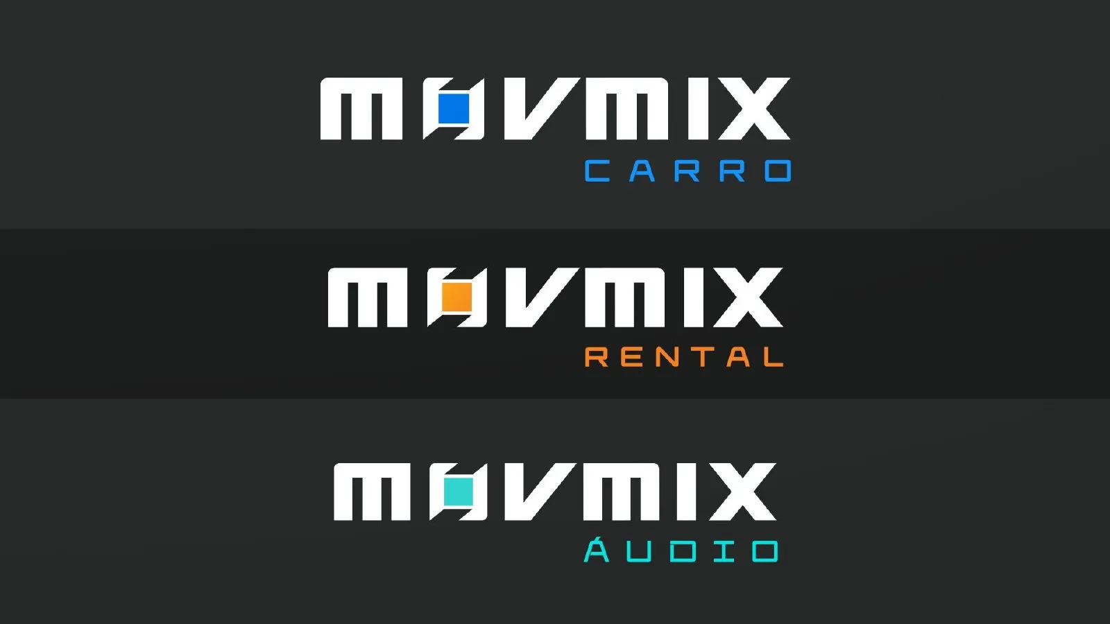
Ready for new verticals
The system already anticipates new business lines, such as MOVMIX Carro and MOVMIX Áudio, without losing brand unity.
- Máquinas
The brand on the fleet
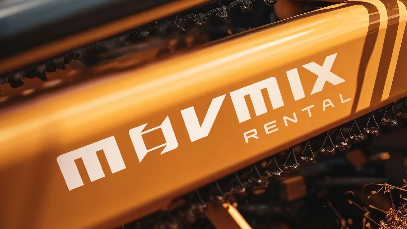
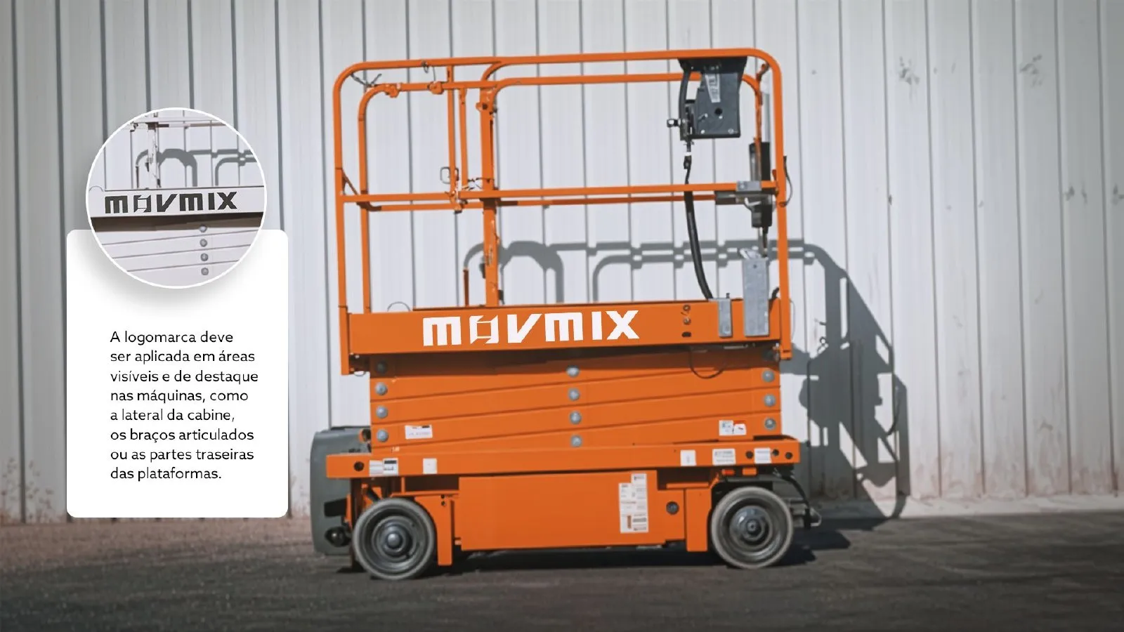
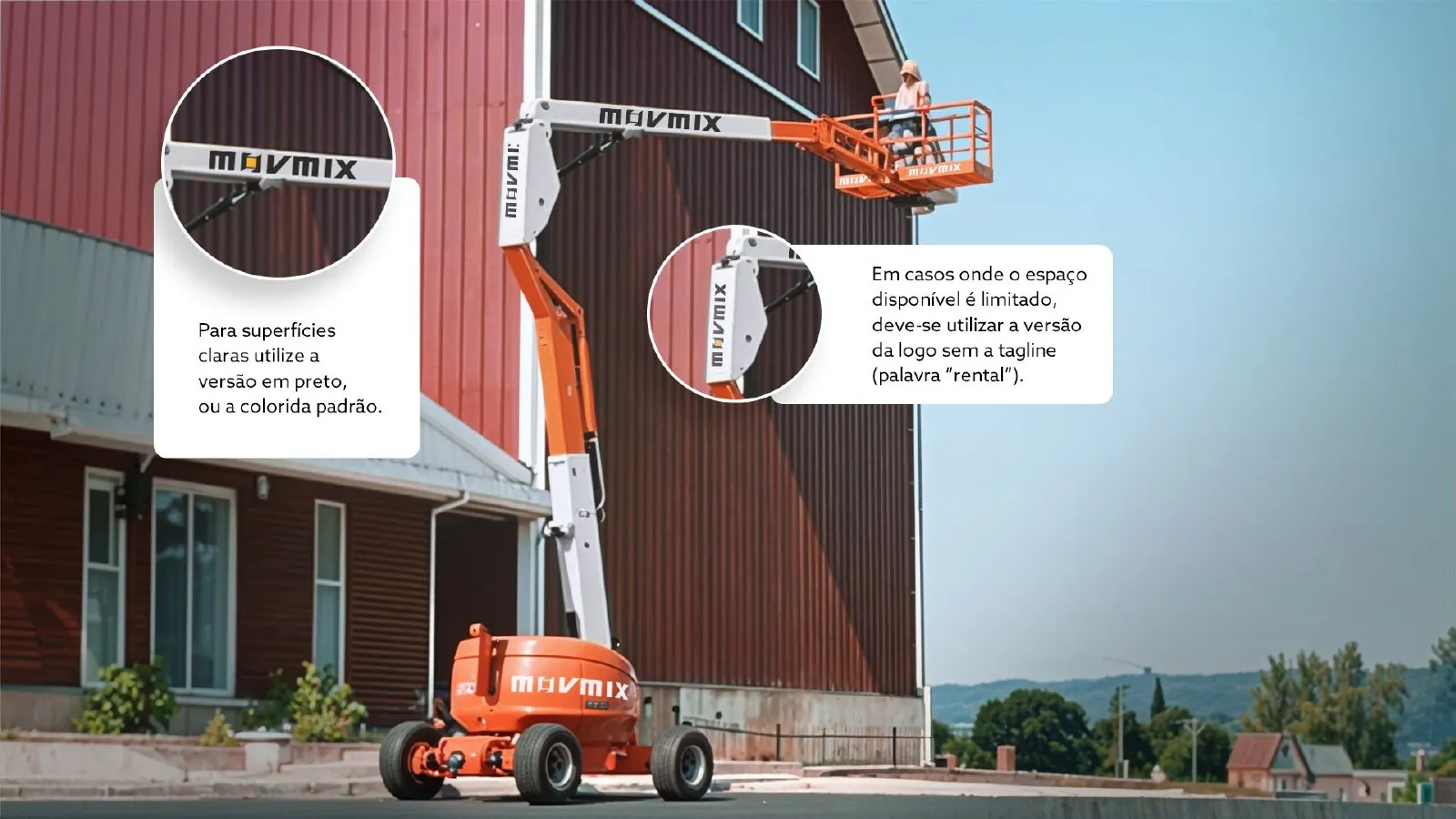
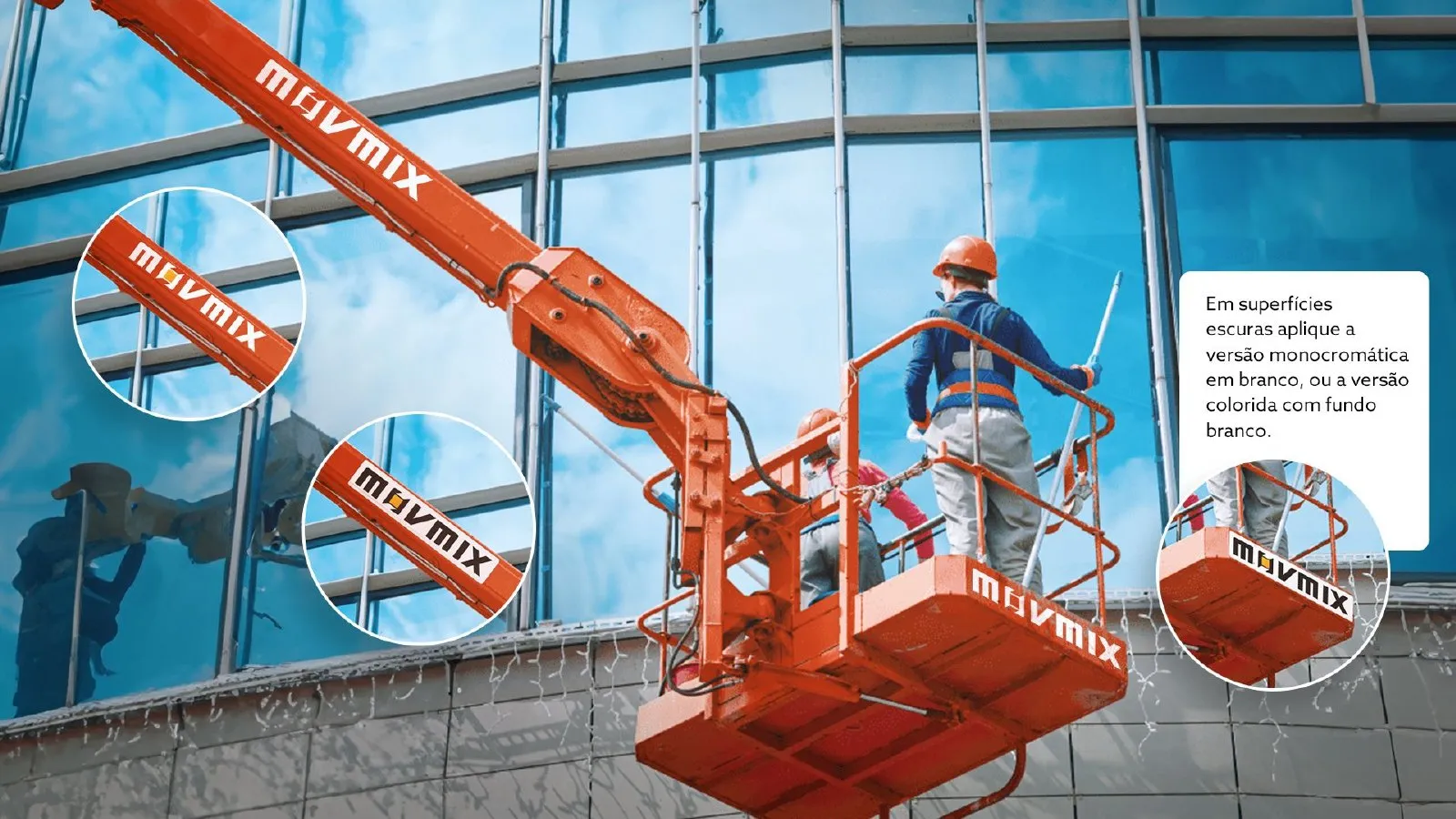
The logo applied to the aerial work platforms, MOVMIX’s most visible touchpoint on every job site.
The brand on one page
-
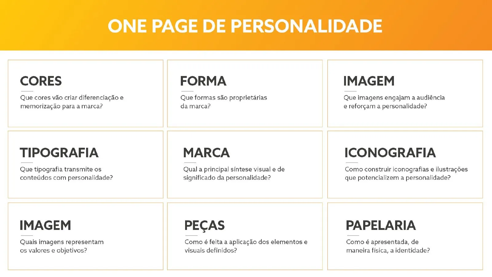
Personality one-pager: colour, form, imagery, typography, brand and iconography -
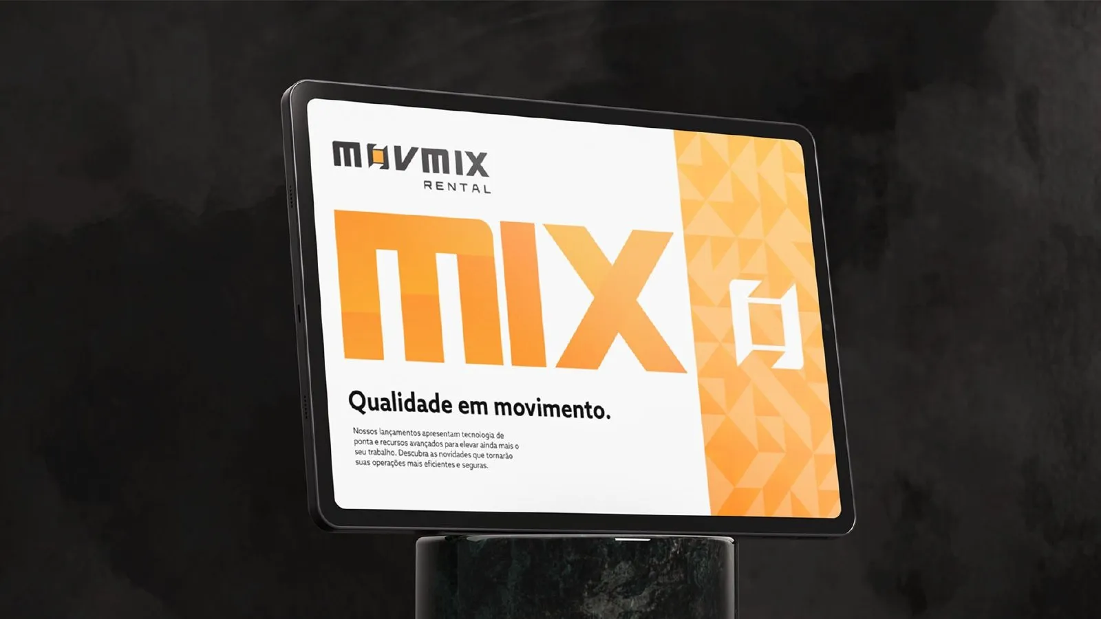
Display with the Quality in motion line -
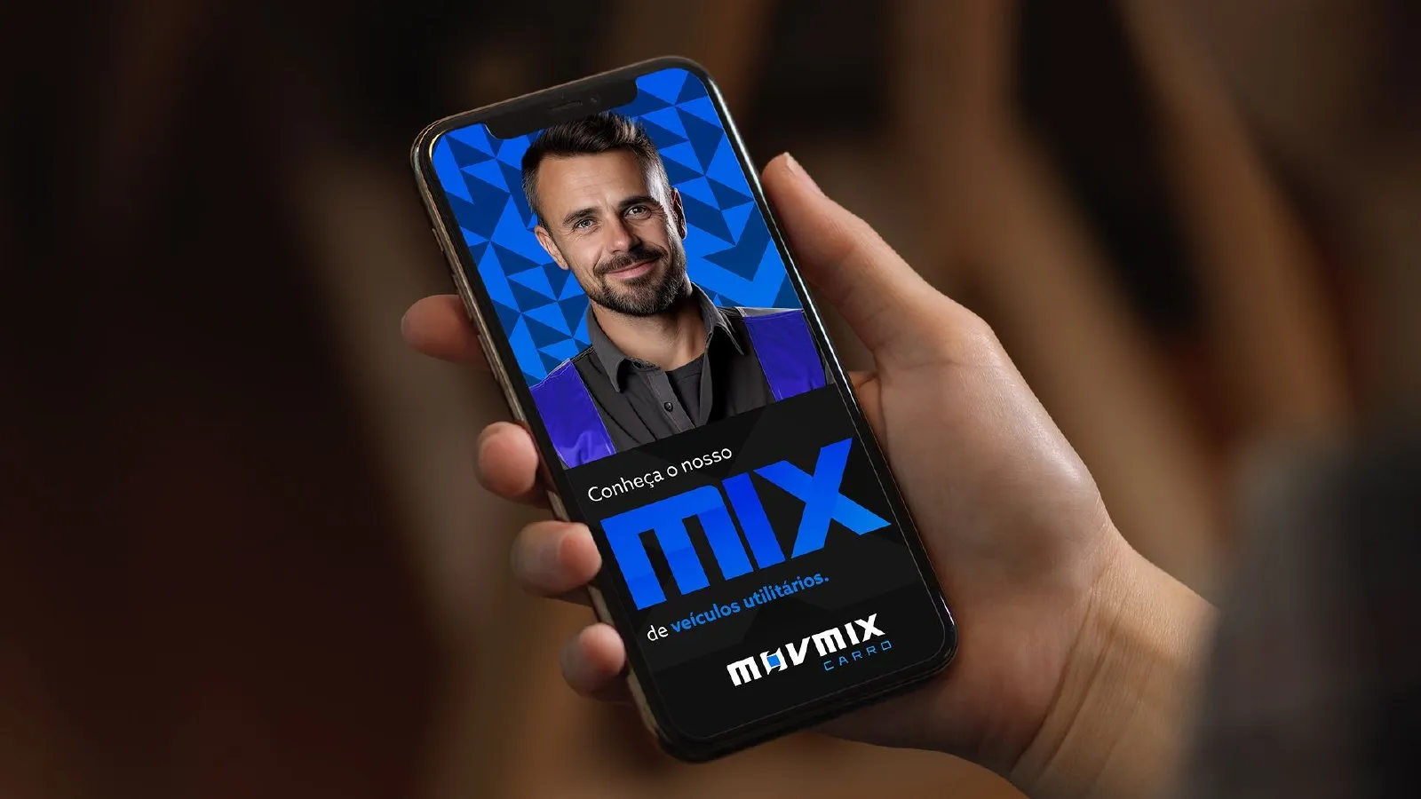
Mobile campaign -
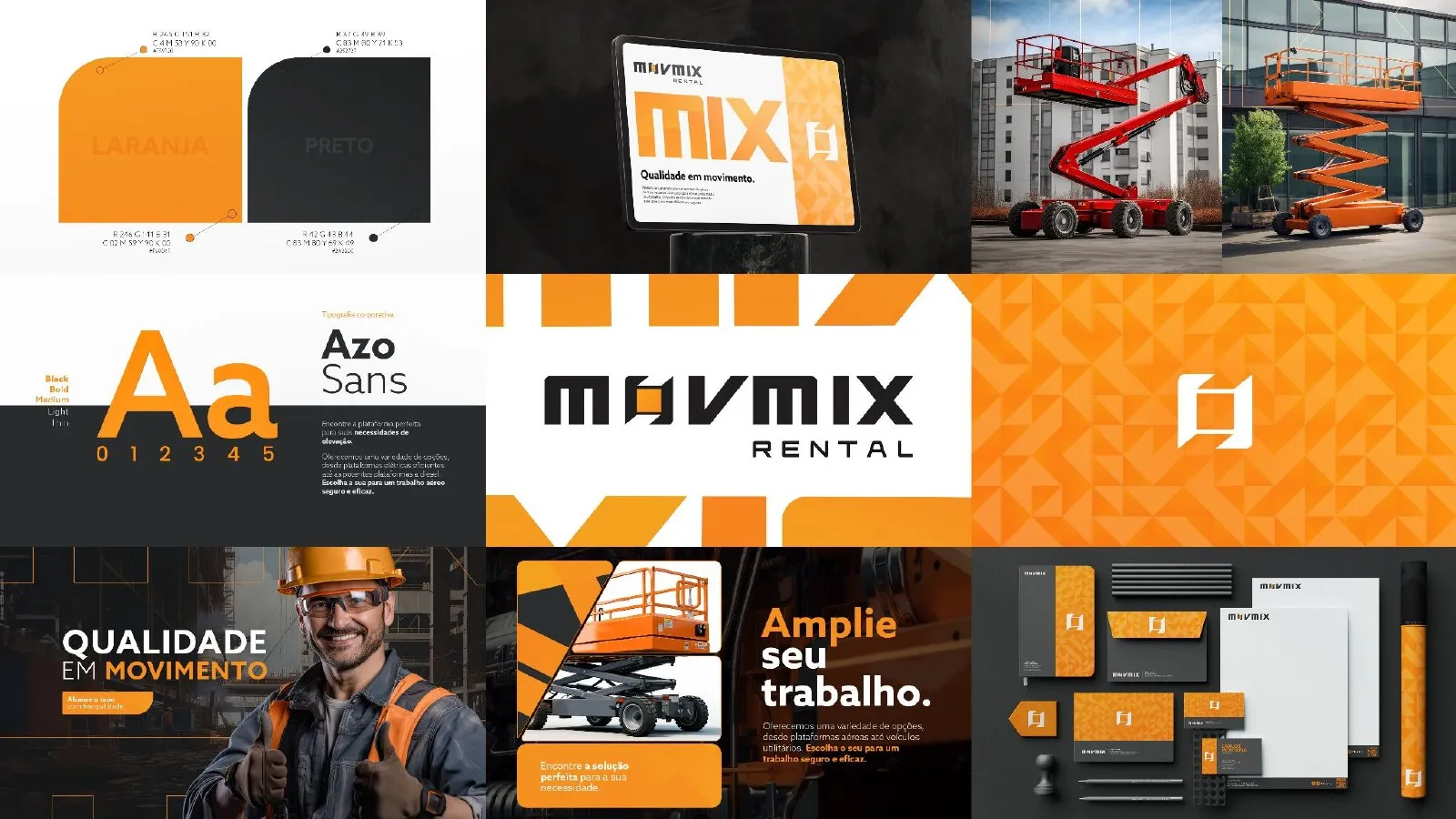
The new identity as a whole
A positioning view
Not every brand needs replacing to evolve. When the name and symbol are already recognised, a relift protects that equity and fixes what gets in the way of reading and application.
Having created the brand in 2010 made a difference: we knew the origin of every decision. That is why the relift was precise, with no rupture, and followed MOVMIX’s repositioning from forklift rental to working-at-height specialist.
- 2010
- year we created the brand
- 15
- years later, the relift
- 3
- verticals planned in the system: Rental, Carro and Áudio
Why hire the group for a project like this
In this case, BDDB.ag created the brand and came back 15 years later for the relift. In the group, brand comes with strategy and performance.
-

BDDB.agLed this case
Brand creation in 2010 and a full relift in 2025: diagnosis, redraw, visual system and applications.
Meet BDDB.ag -

OWTRA
Website, social media and digital performance so the new brand generates demand.
Meet OWTRA -

.xtrategy
Strategic planning to align brand, positioning and expansion into new verticals.
Meet .xtrategy
Has your brand kept up with your company’s growth?
Tell us the challenge. A partner will reply and outline the path, from diagnosis to relift.
← All cases