
EpiSUS · 2023 · UX · UI design · Institutional website
A government website organised around its users’ journeys, not the org chart.
UX and design for the new website of EpiSUS, the Field Epidemiology Training Programme for Brazil’s public health system (SUS), run by the Ministry of Health’s Health and Environmental Surveillance Secretariat.
- Programme
- EpiSUS · SVSA · Brazilian Ministry of Health
- Year
- 2023
- Audience
- Applicants, SUS professionals, managers and response teams
- Scope
- Information architecture, UX, UI design for 5 key pages, a colour system by level and a presentation video
- Group company
- OWTRA
The website was developed and approved, but was not launched by decision of the programme’s management.
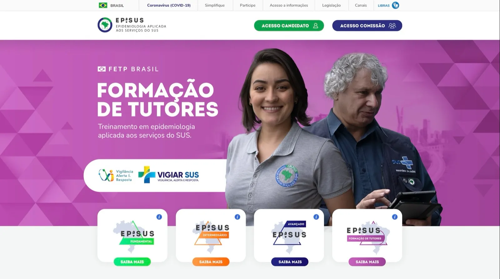
The challenge
Created in 2000, EpiSUS trains professionals to investigate outbreaks and respond to public health emergencies. There are three training levels, Fundamental, Intermediate and Advanced, plus tutor training. The Advanced level lasts two years, is full-time and on site in Brasília.
With so many audiences and levels, information got lost. Applicants needed to understand which programme fit them, managers needed to know how to request a field team, and the public needed to see what the programme has delivered to the country.
See the website in motion
The new website’s presentation, navigating the home page and the main areas.
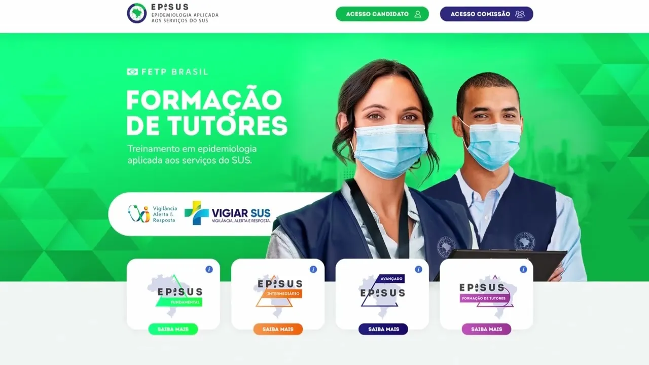
Browse the pages
The home page and the pages for each level and for applications, as approved. Switch tabs and scroll inside the screen.
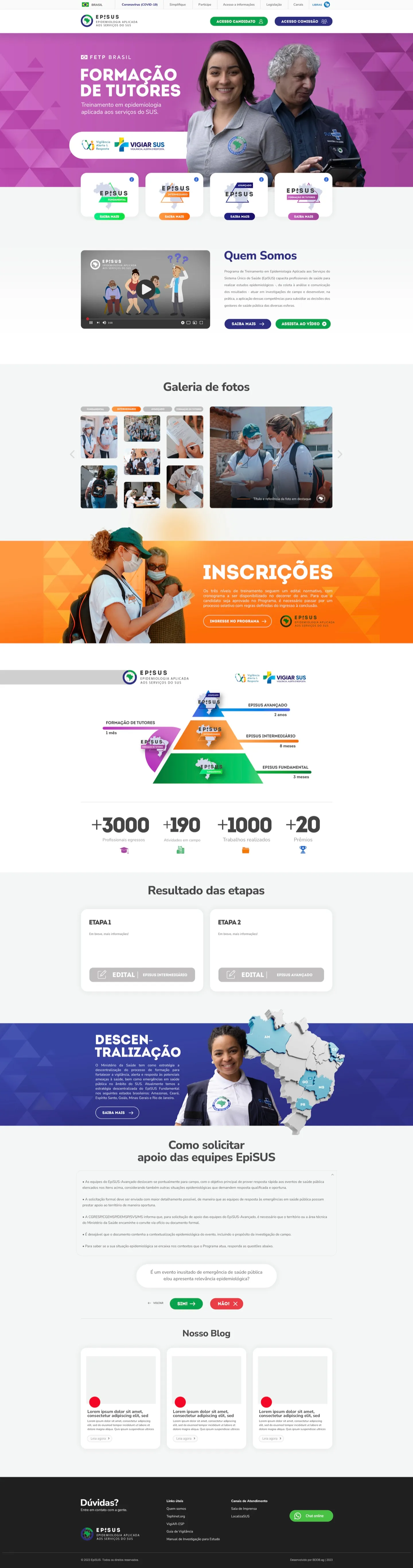
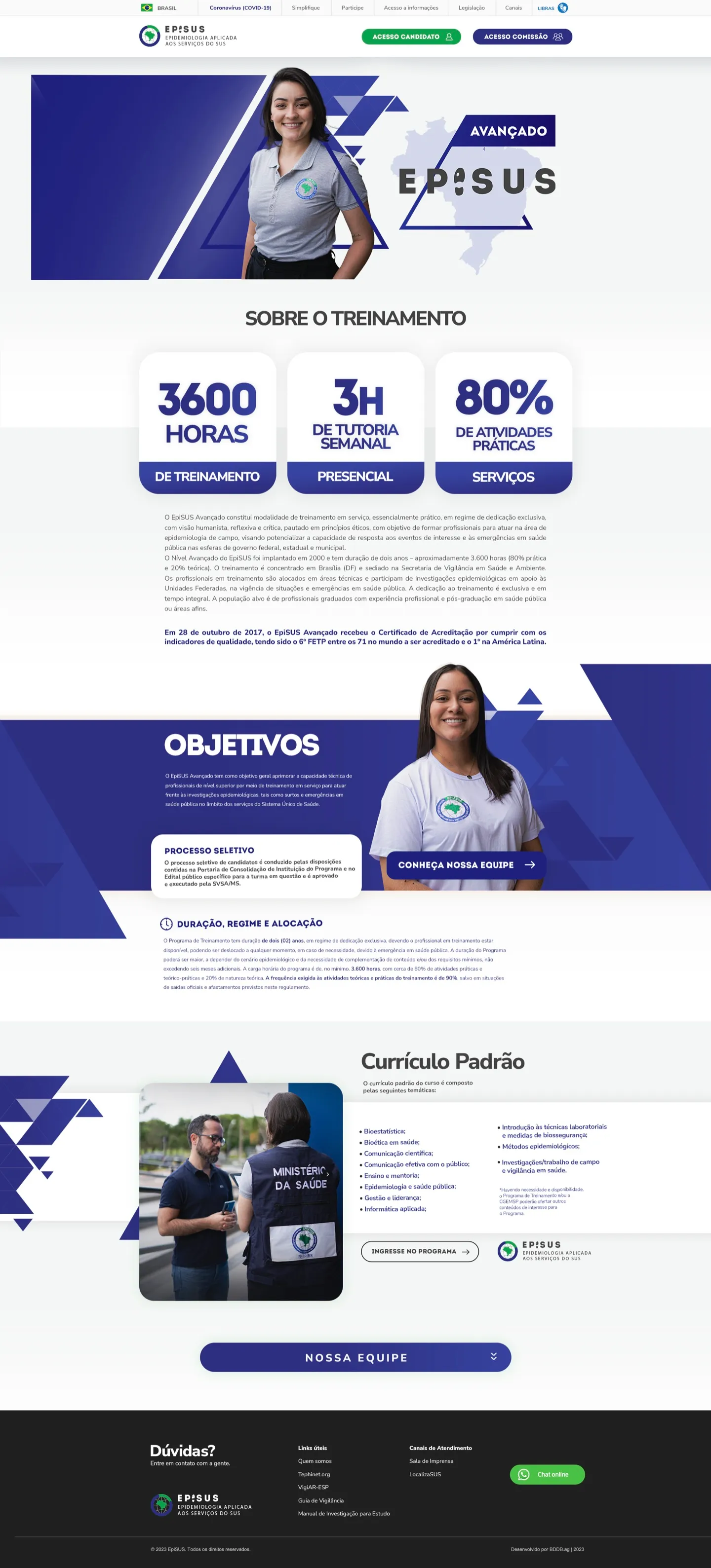
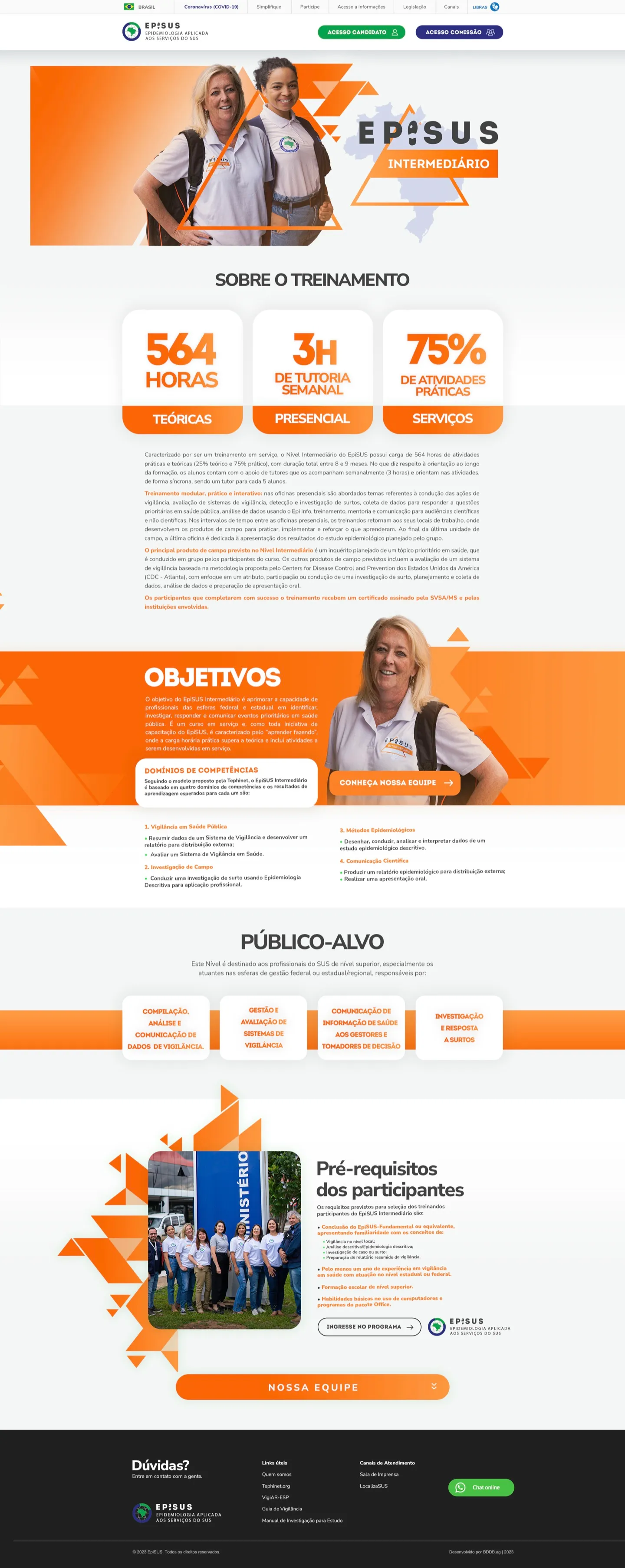
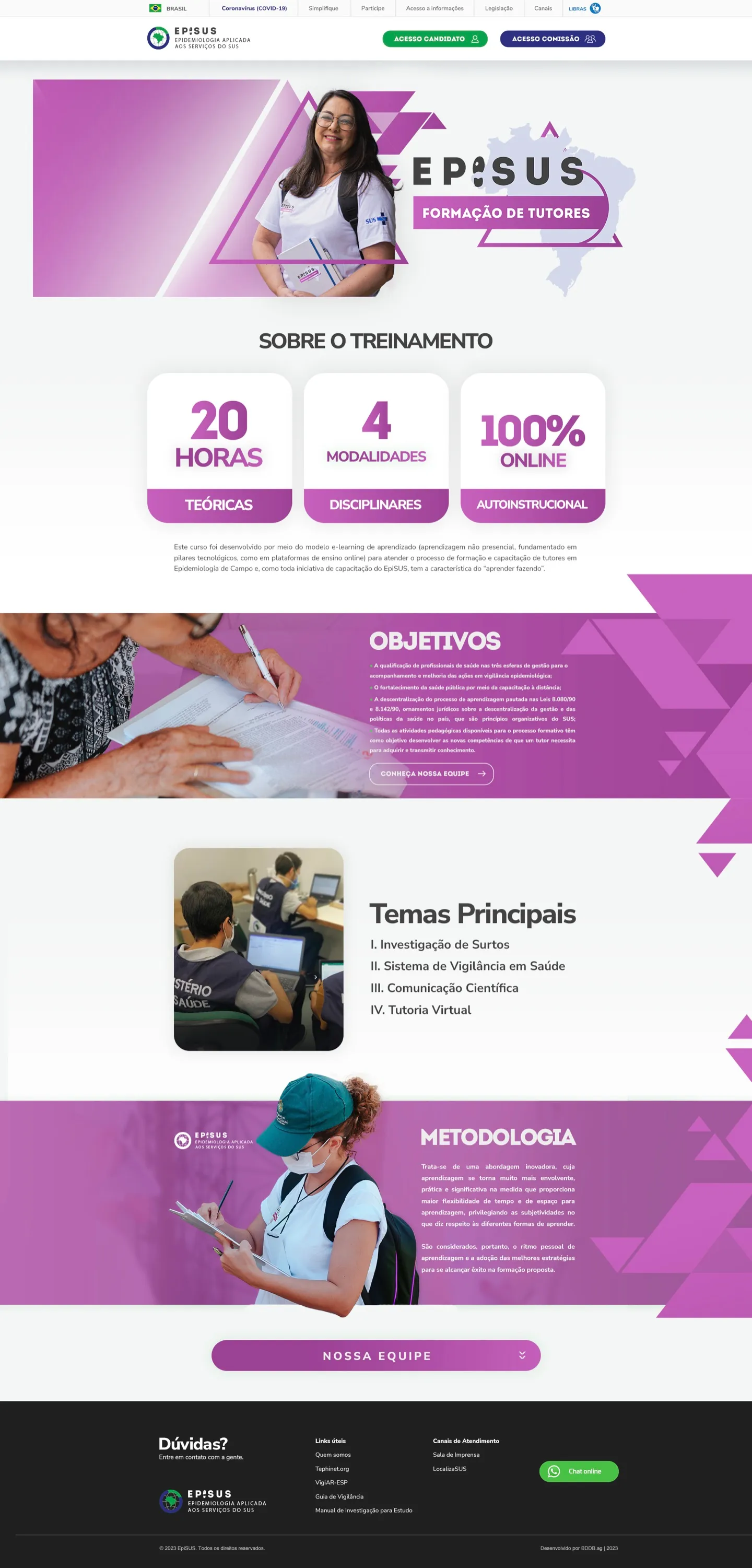
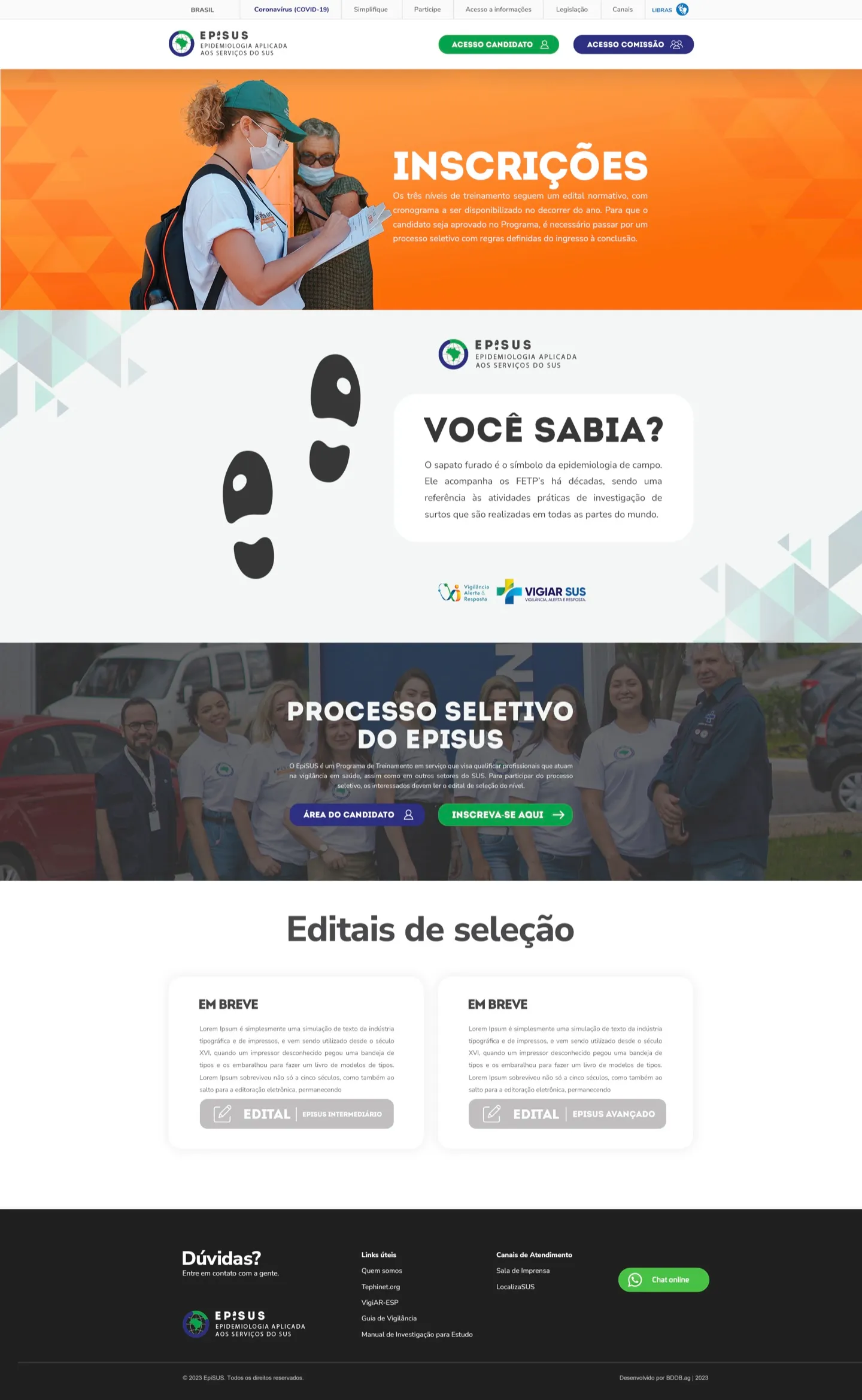
Scroll inside the screen to see the whole page
What we did
- 01
Audiences and journeys
We mapped who visits the site and what each person needs to get done: apply, follow calls, understand the levels or call in a team.
- 02
Information architecture
The home page became a script: introduction, training levels, applications, results and team support, with direct access for applicants and the committee.
- 03
A visual system by level
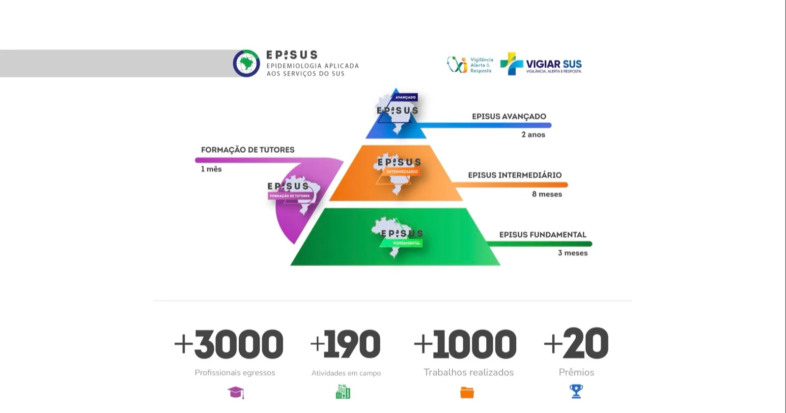
Each level got its own colour: green for Fundamental, orange for Intermediate, blue for Advanced and purple for tutor training. Visitors know where they are by colour alone.
- 04
Prototype and approval
The website was developed, presented on video and approved by the programme team.
Section by section
Each block has a clear role in the visitor’s journey.
- 01
Home page with shortcuts by level
A rotating highlight, direct access for applicants and the committee, and a card for each training level above the fold.
- 02
The levels as a pyramid
The training path in a single drawing: from Fundamental to Advanced, with tutor training alongside and the length of each stage.
- 03
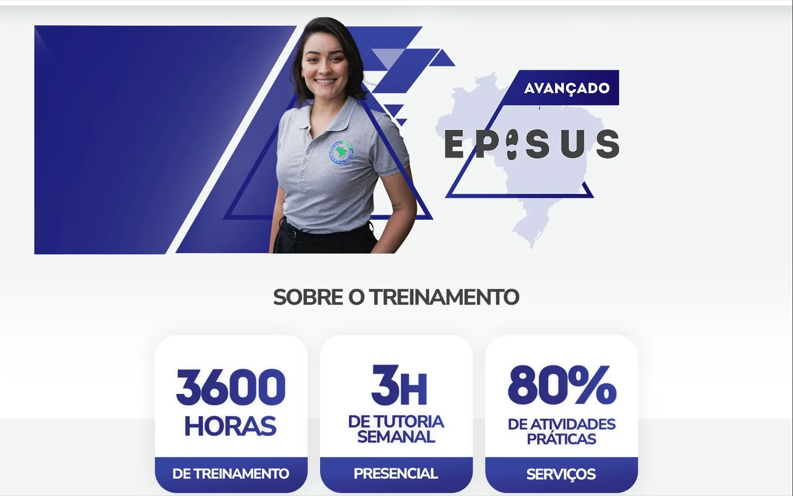
Advanced level page
The numbers that matter come first: 3,600 hours, weekly tutoring and 80% hands-on work, before the full text.
- 04
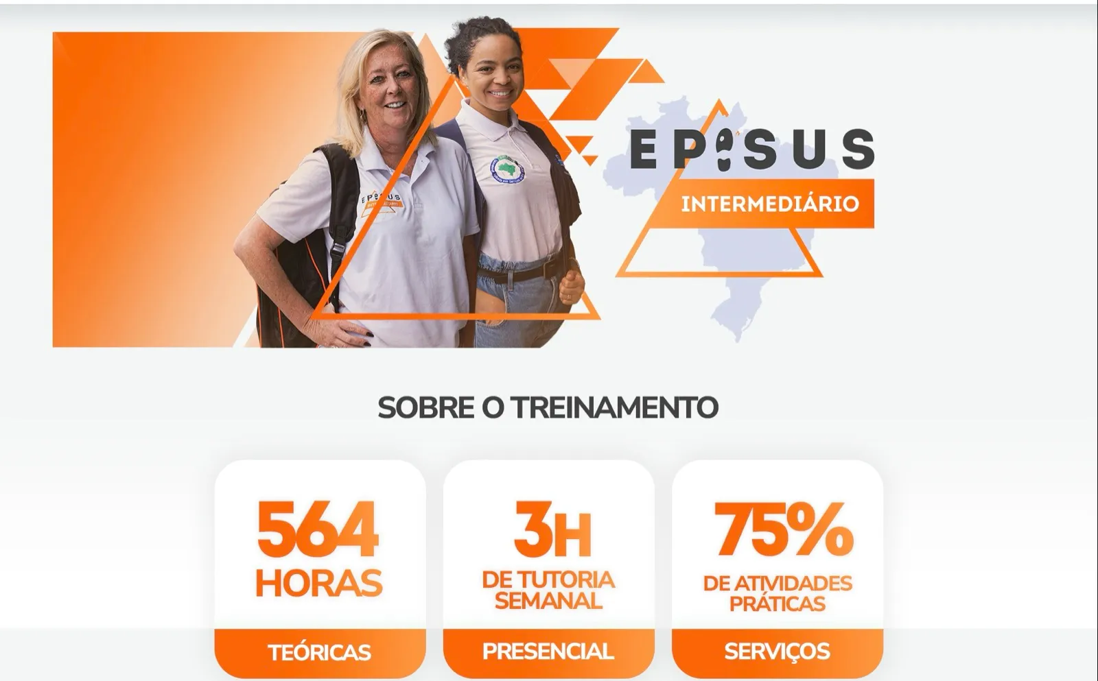
Intermediate level page
Same structure, different colour: anyone comparing levels finds information in the same place every time.
- 05
Target audience as cards
Professionals check in seconds whether the level fits them.

- 06
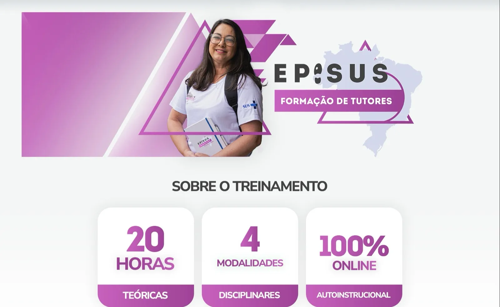
Tutor training
20 hours, four modules and fully online: distance training presented as clearly as the on-site levels.
- 07
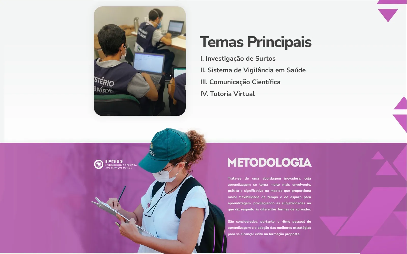
Topics and methodology
Course content in a short list and the methodology explained with a real field photo.
- 08
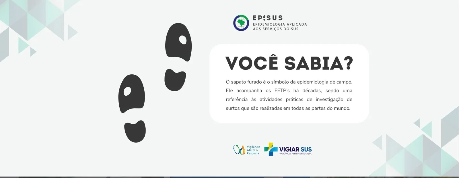
Did you know?
The worn-out shoe, the symbol of field epidemiology, connects applicants with the programme’s culture before they apply.
- 09
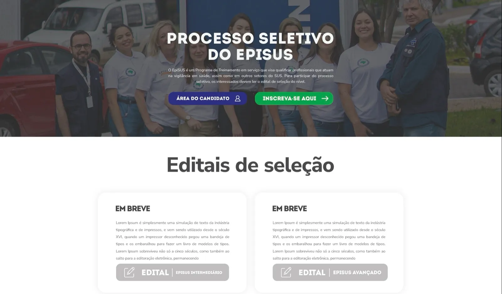
Selection process and calls
Applicant area, apply button and calls by level in one place.
- 10
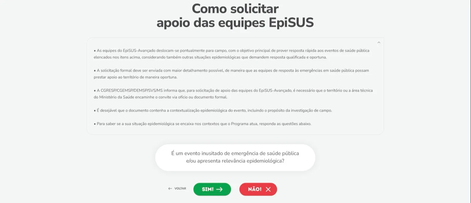
How to request support
Clear rules and a yes-or-no triage guide managers: in one click they know whether to call in the EpiSUS team.
- 11
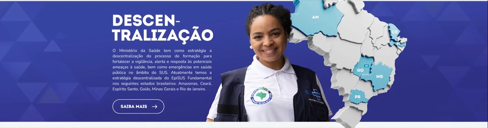
Decentralisation
The map shows the states already offering EpiSUS Fundamental.
A positioning view
Government websites tend to mirror the org chart: secretariats, departments, ordinances. Visitors don’t know where to start. Here the logic was reversed: each audience finds its own entry point on the home page.
Level colours, highlighted numbers and real field photos bring a technical programme closer to people. That strengthens the EpiSUS brand and helps attract the right professionals.
- 4
- training levels organised on the home page
- 5
- key pages designed
- 2000
- year the programme was created
Why hire the group for a project like this
In this case, OWTRA was responsible for the whole project. On institutional websites, TBS GROUP combines strategy, design and digital performance so the site gets found and used.
-

OWTRALed this case
Responsible for the whole project: information architecture, UX, page design and presentation video, with the eye of a team that works to get sites found on Google and in AI answers.
Meet OWTRA -

.xtrategy
Strategic planning. Defines audiences, messages and priorities before the first screen.
Meet .xtrategy -

BDDB.ag
Branding and design. Creates identities and visual languages that give brands and programmes personality.
Meet BDDB.ag
Does your website speak to the right people?
Tell us the challenge. A partner will reply and outline the path, from strategy to a live website.
← All cases