
TAF · 2021–2023 · Redesign · Packaging · POS · Campaigns
Follow this energy: the brand of a national manufacturer with global quality.
From the brand to the packaging, from regional catalogues to the factories, we handled all of the communication for TAF, a Santa Catarina manufacturer of polymer enclosures and electrical materials.
- Client
- TAF · polymer enclosures and electrical materials
- Factories
- Joinville and Araquari, Santa Catarina
- Scope
- Brand redesign, slogan, regional catalogues, POS, website and e-commerce UI and UX, social media, 25-year seal and campaign, films, factory environmental graphics, packaging and mascot
- Group company
- BDDB.agOWTRARISE Films
The challenge
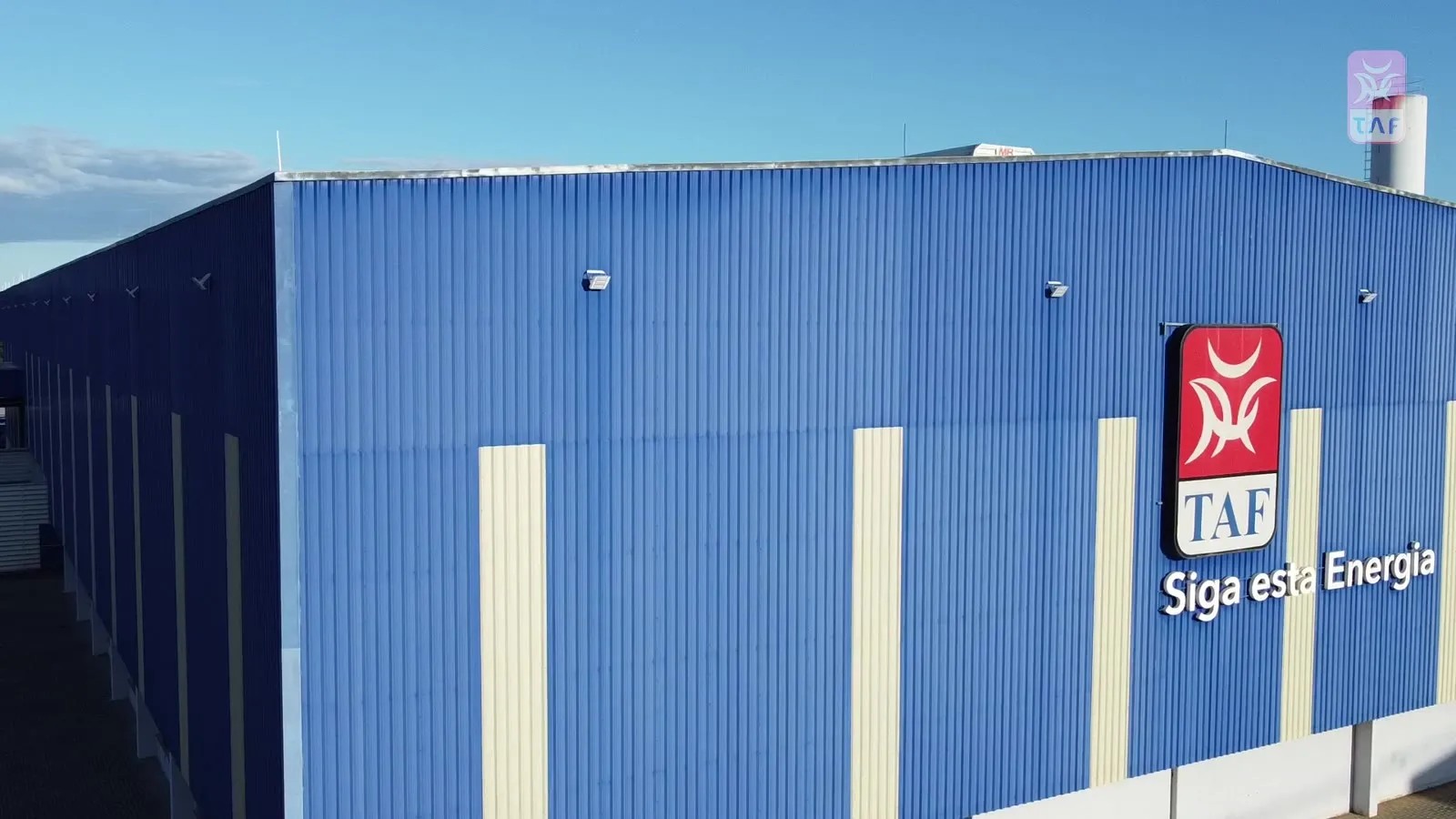
TAF had first-class products and factories, but communication that didn’t match its size. Competing with global brands, it needed to look as strong as what it delivers.
Brazil doesn’t buy the same way from north to south. Each region has its own mix, retailers and way of selling, and the brand had to work in all of them: in store, on site, on the truck and online.
TAF manifesto · Follow this energy
The manifesto sums up the brand’s new phase: from the Joinville and Araquari factories to the whole country, a national manufacturer growing on its own energy.
Planning
The whole project in one video
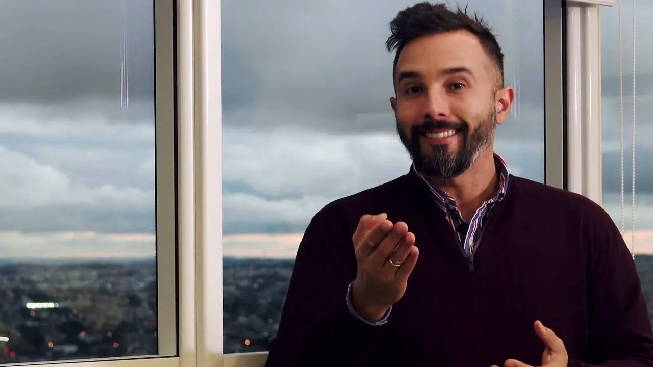
To present the communication plan to TAF, we recorded a video explaining the strategy and every front of the project, from the brand to sales actions.
Brand ident
The new brand in motion.
The ident opens videos, presentations and digital content, showing the founder’s symbol taking on its new signature.
What we did
- 01
Planning
A communication plan with fronts, audiences and priorities, presented to the board on video.
- 02
Brand
Typography redesign, slogan, ident and mascot, preserving the founder’s symbol.
- 03
Product and POS
Packaging, labels, regional catalogues and displays to win on the shelf.
- 04
Campaigns and digital
Website, e-commerce, social media, sales actions and the 25-year campaign.
Redesign: the symbol stays, the voice changes
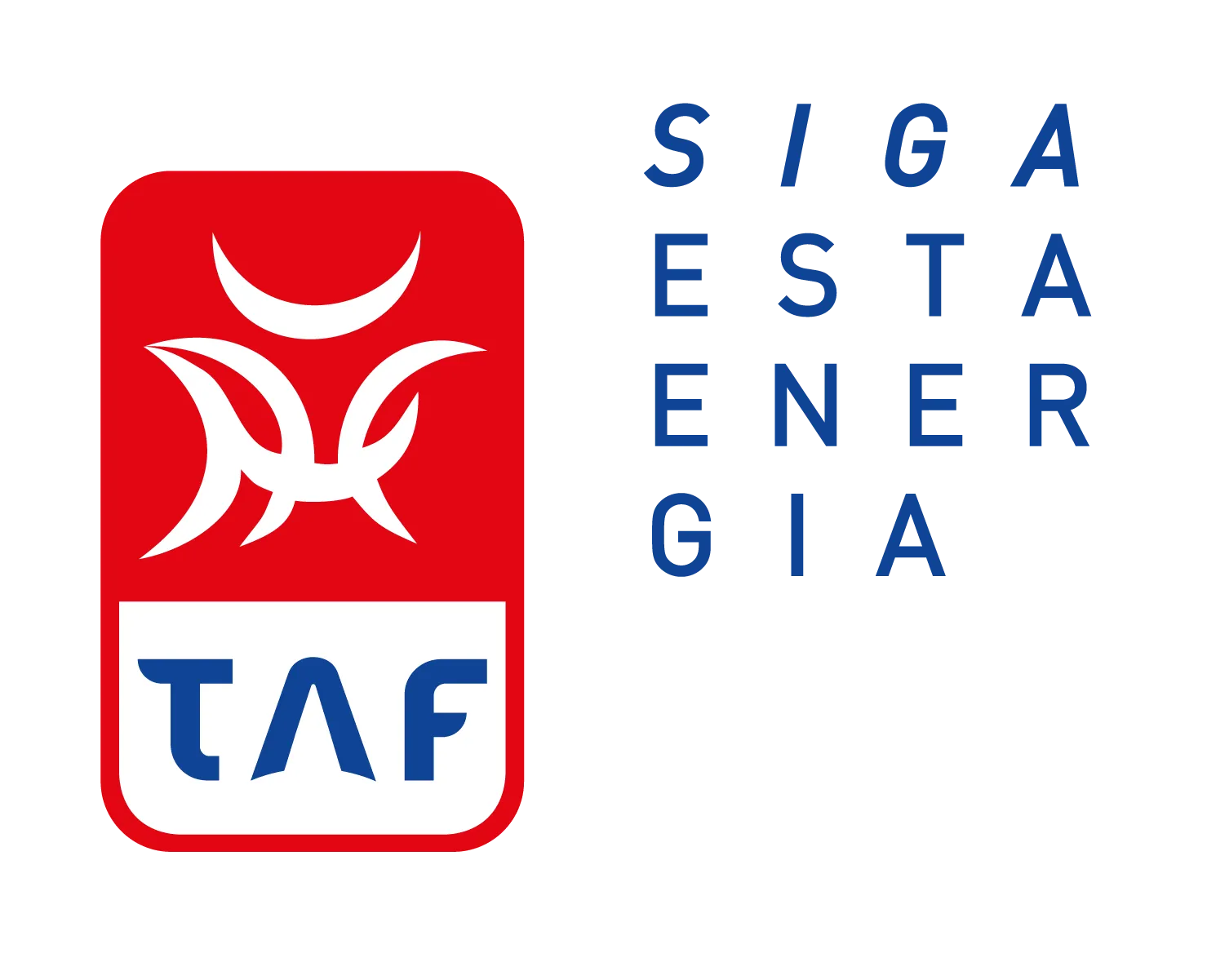
TAF’s symbol was born from an organic drawing by the founder and has been kept over the years. We respected that history: we changed only the typography, which became more modern, geometric and legible, and added the line Follow this energy.
Everything the brand touches
One identity applied with the same strength from catalogue to factory.
- Marca
Slogan: Follow this energy
We created the line that captures what TAF makes and what it wants to convey: energy in motion, present in every piece of communication.
- Catálogos
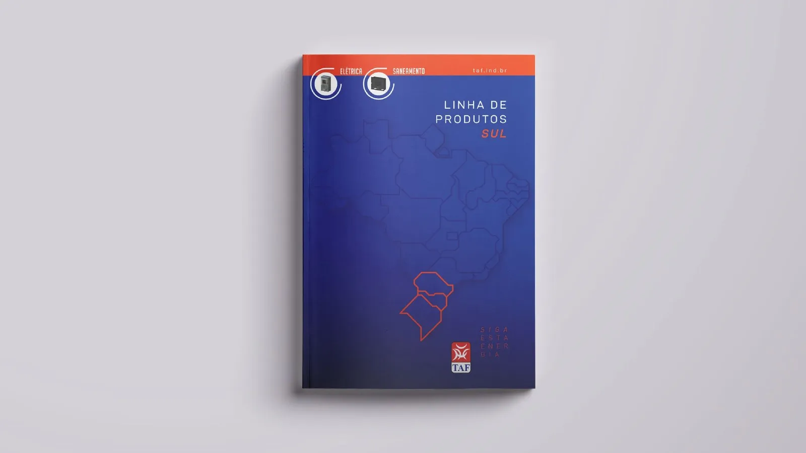
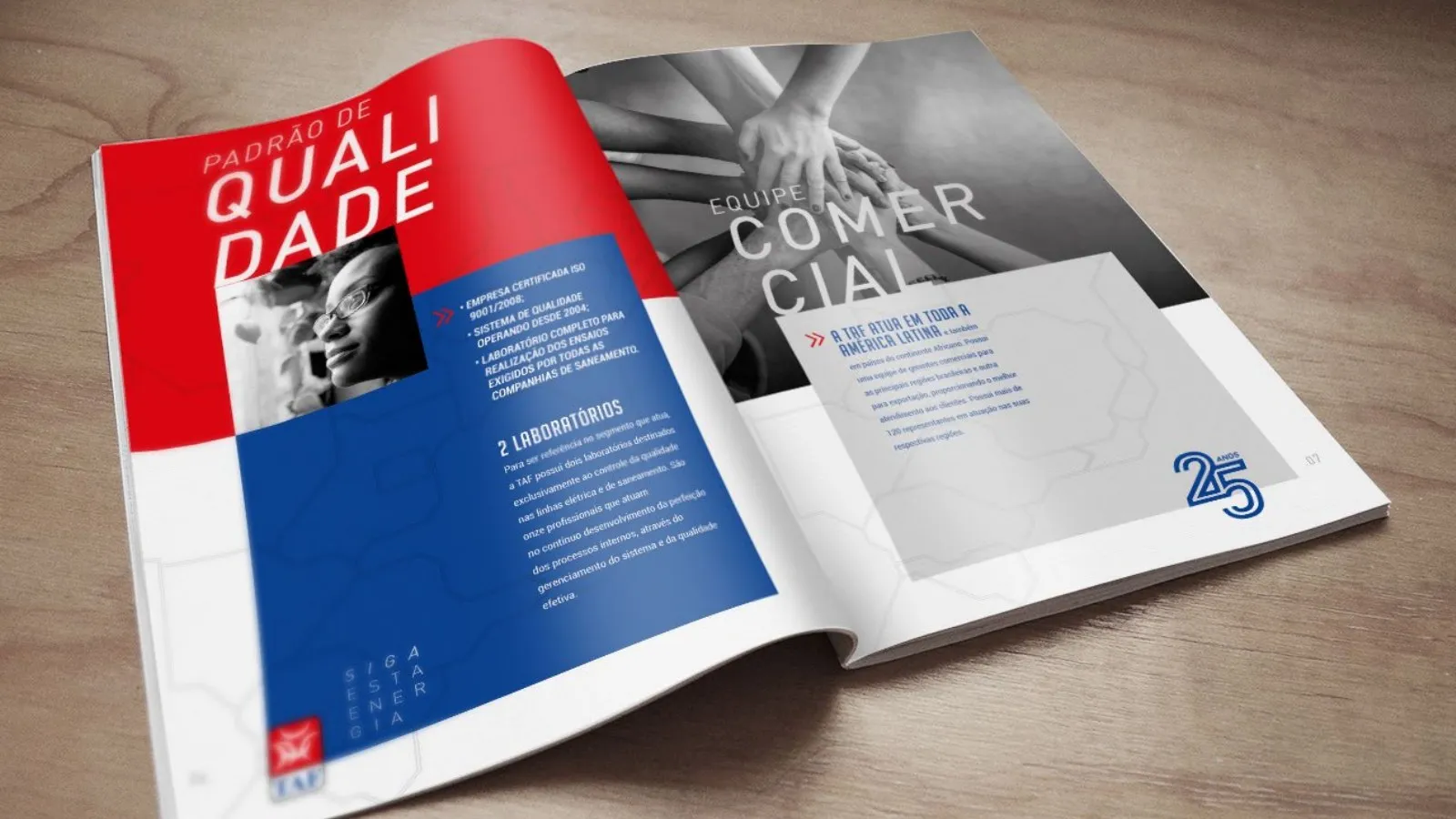
Catalogues segmented by region
Each region of the country got a catalogue with the right product mix. Sales reps take customers exactly what sells in their area.
- PDV
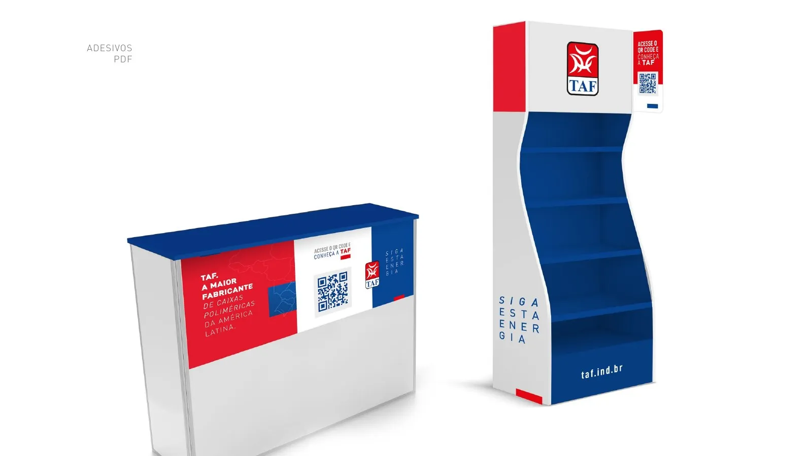
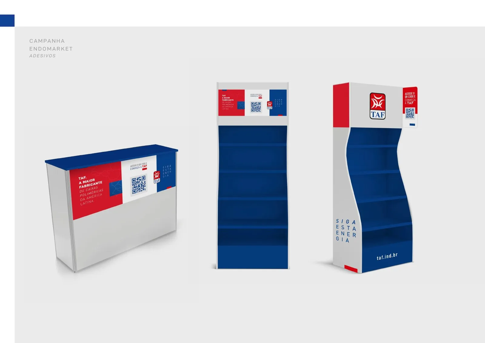
Point-of-sale actions
We redesigned displays, totems and in-store materials so the brand stands out where purchases happen.
- Campanhas
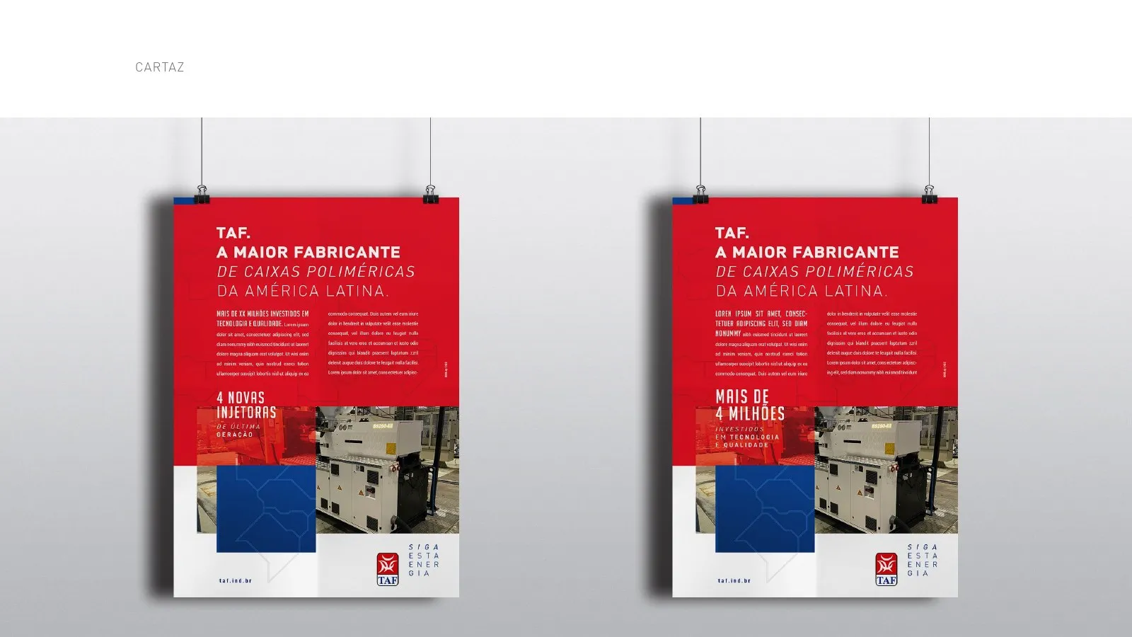
Sales campaigns
Campaigns by product line, such as injectors, with posters, digital pieces and materials for the sales team.
- Site
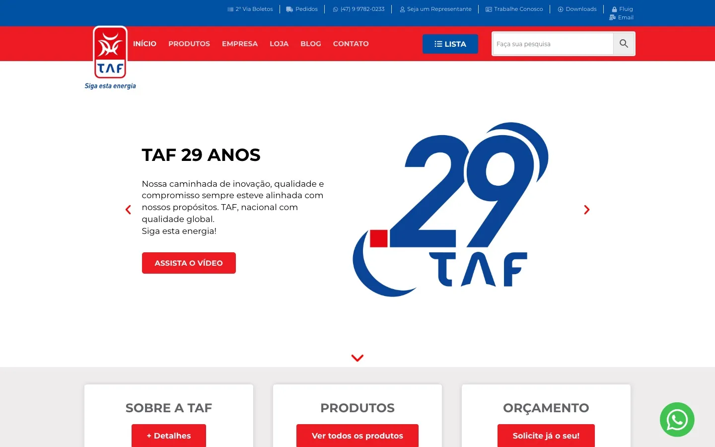
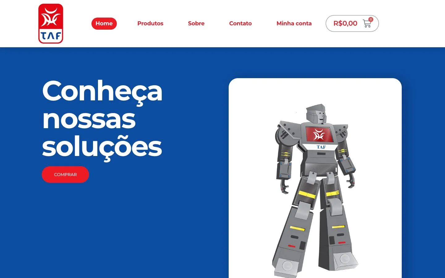
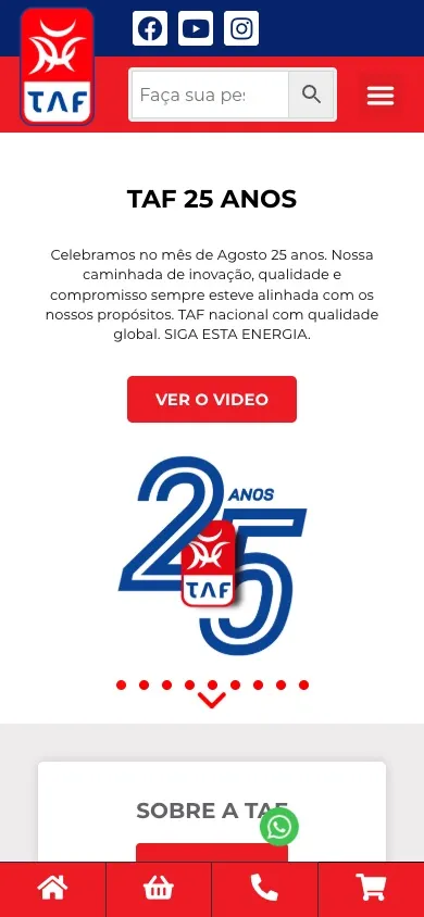
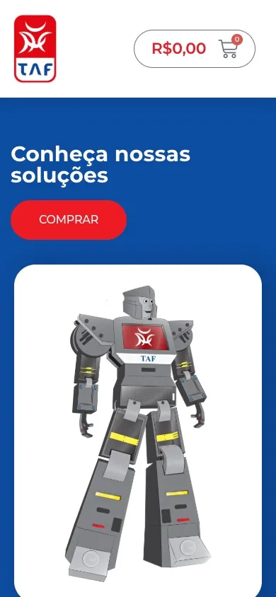
Website and e-commerce UI and UX
OWTRA created the UI and UX for the corporate website taf.ind.br and the e-commerce store tafindustria.com.br: navigation architecture, page layouts and the shopping experience, designed for reps, retailers and end consumers, on desktop and mobile.
- Social
Social media
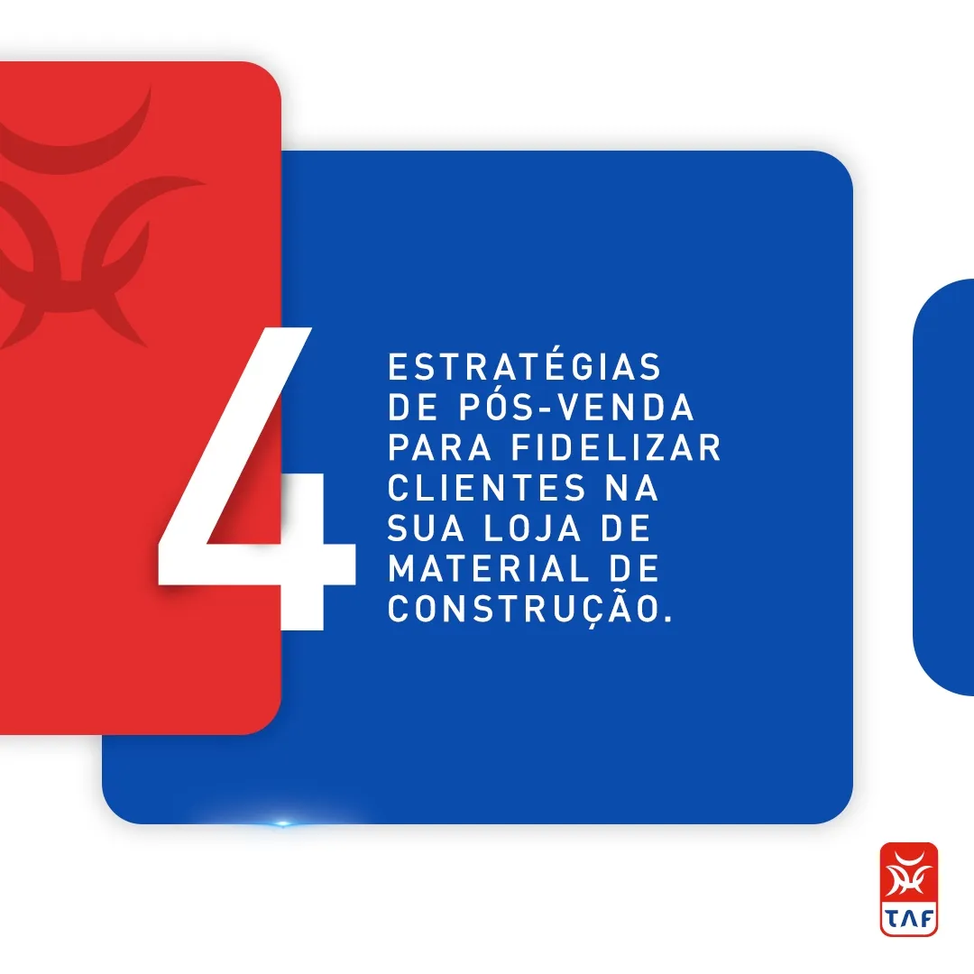
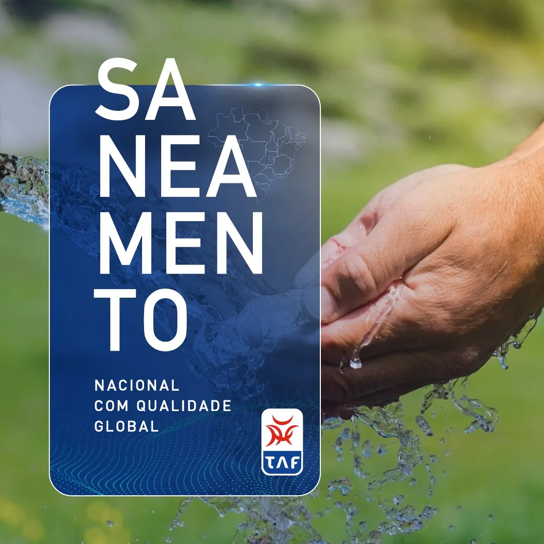
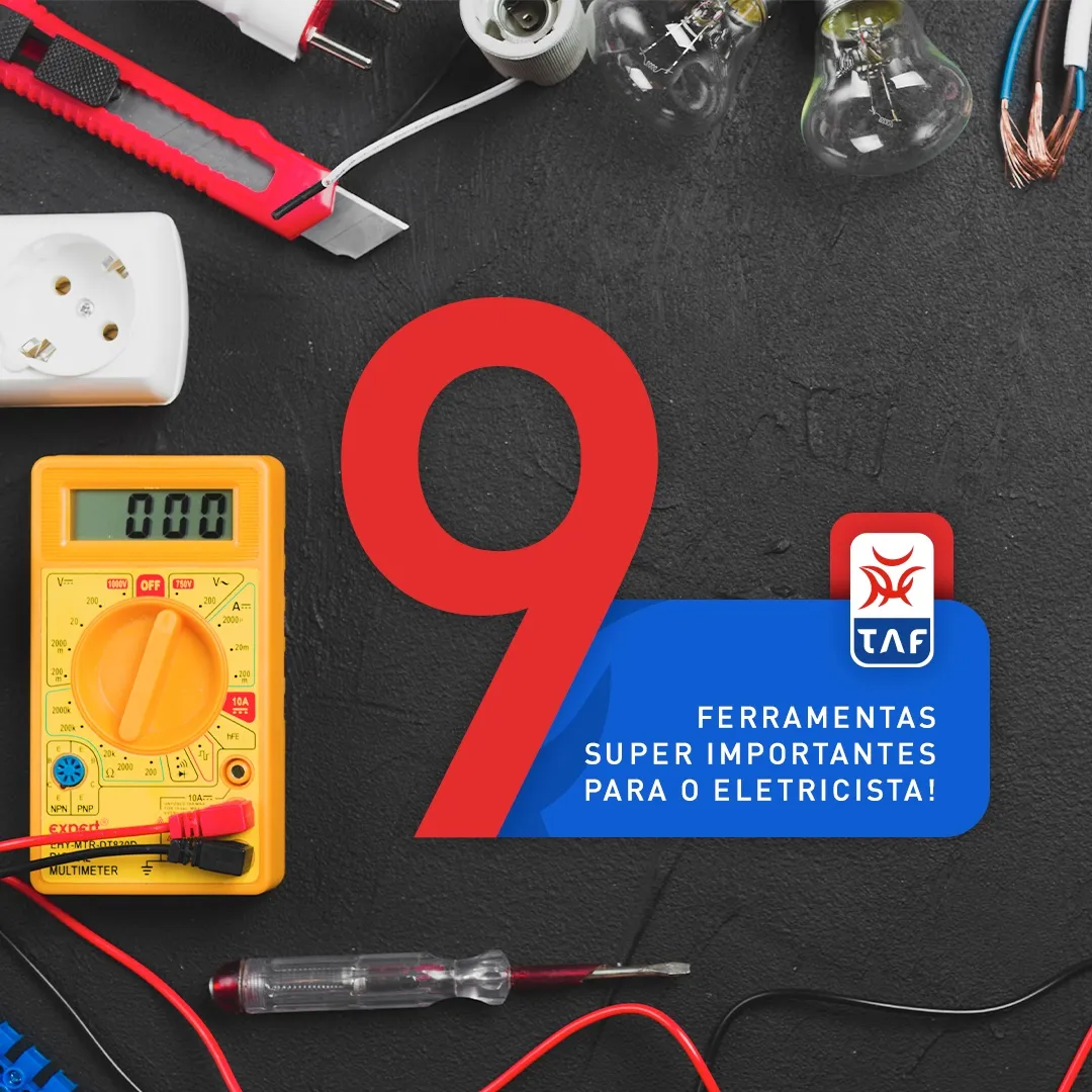
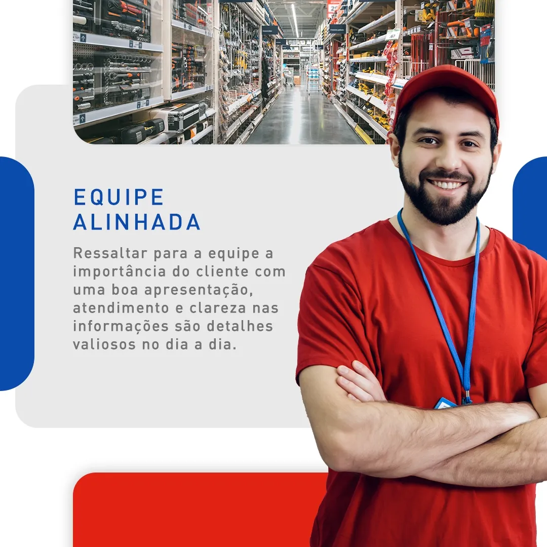
We managed TAF’s social media with useful content for retailers and electricians, such as after-sales and product tips.
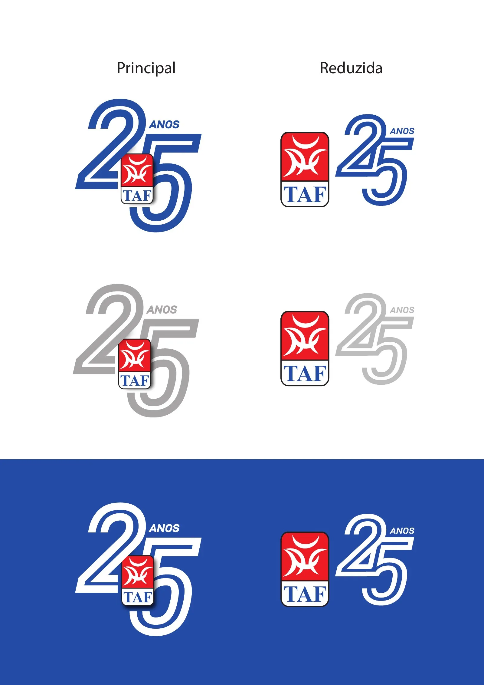
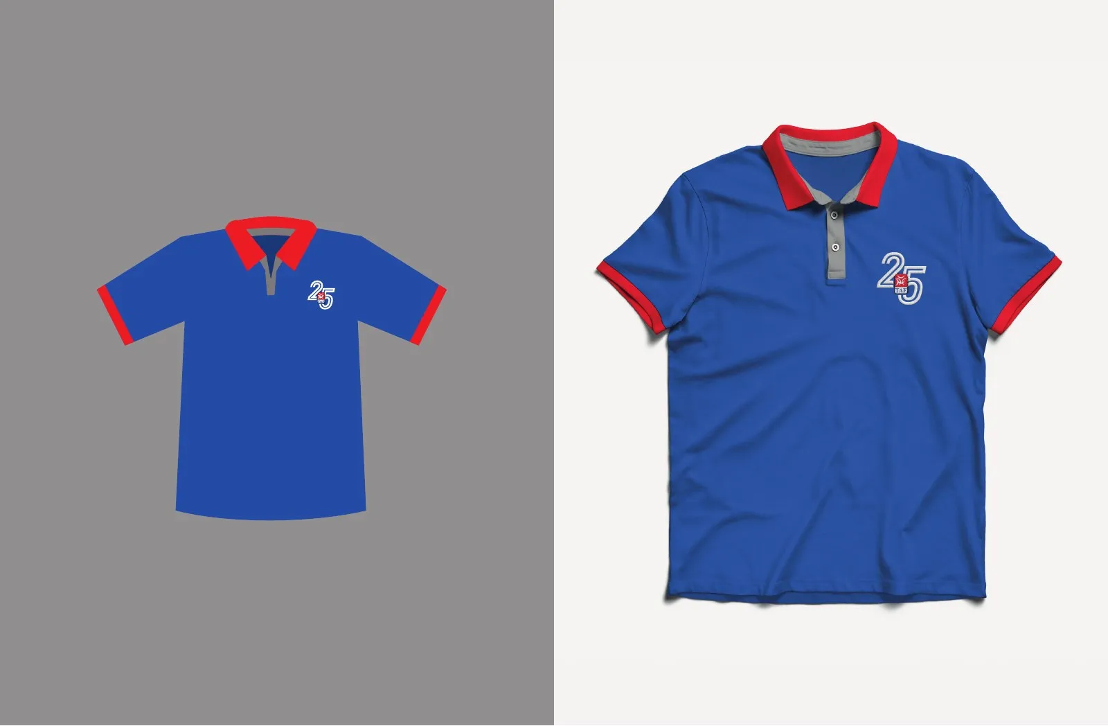
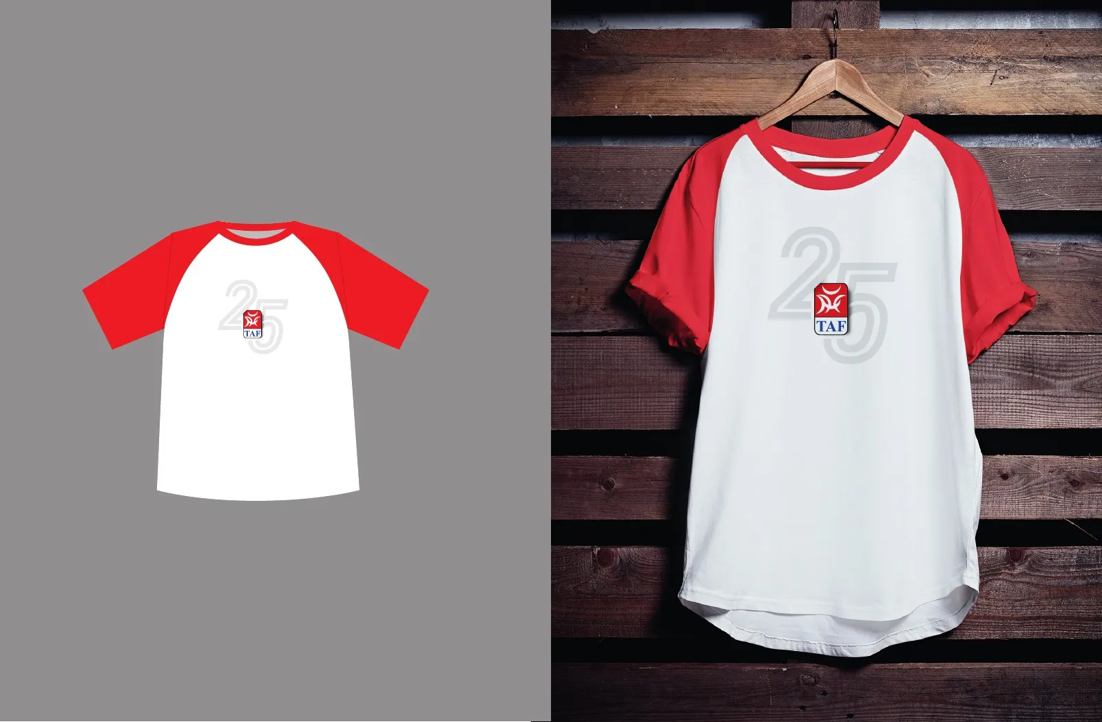
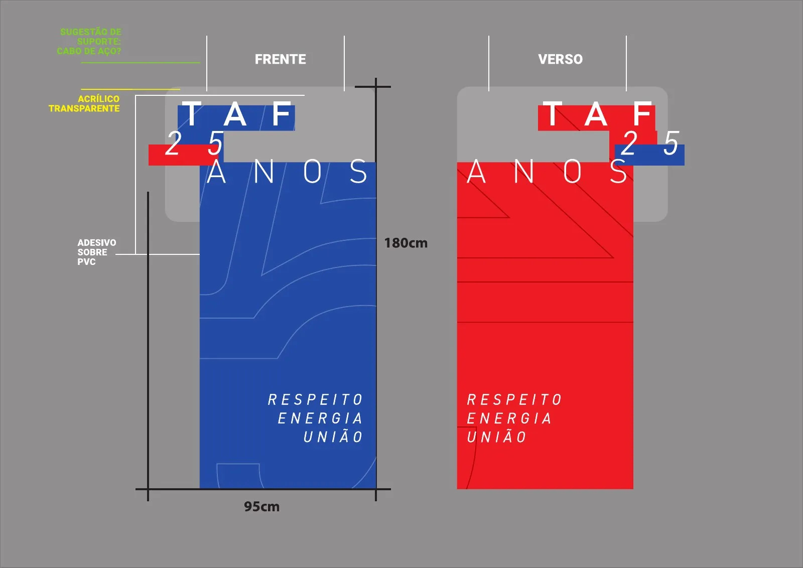
- 25 anos
25th-anniversary seal and campaign
We created the anniversary seal and the 25-year campaign, with T-shirts, promotional polos and pieces for the factories.
- Fábricas
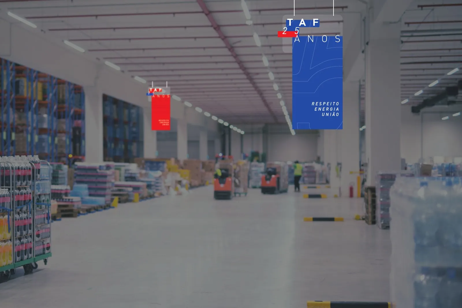
Environmental graphics in Joinville and Araquari
We brought the brand inside the Joinville and Araquari factories in Santa Catarina, with signage and pieces from the 25-year campaign.
- Embalagens
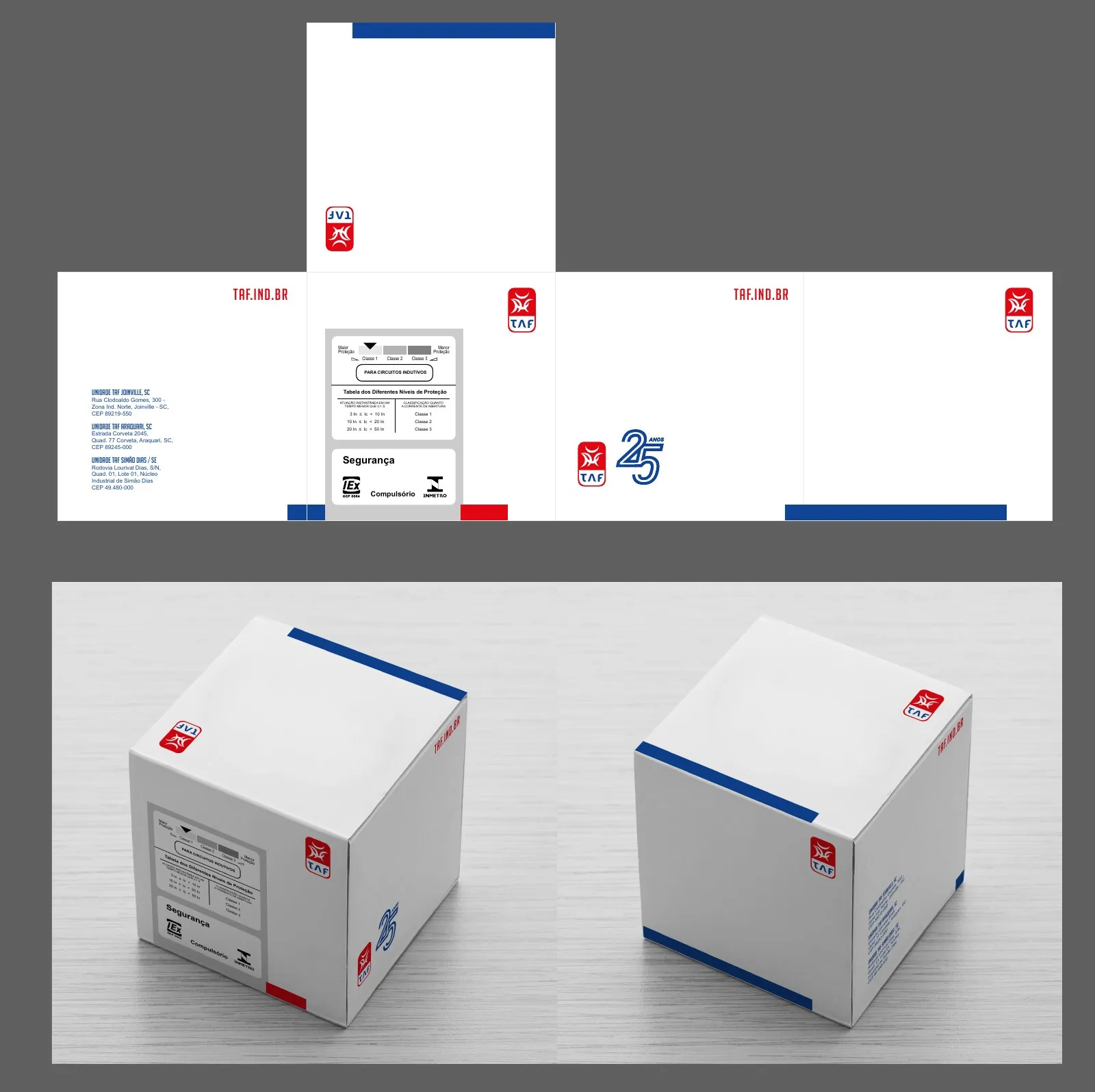
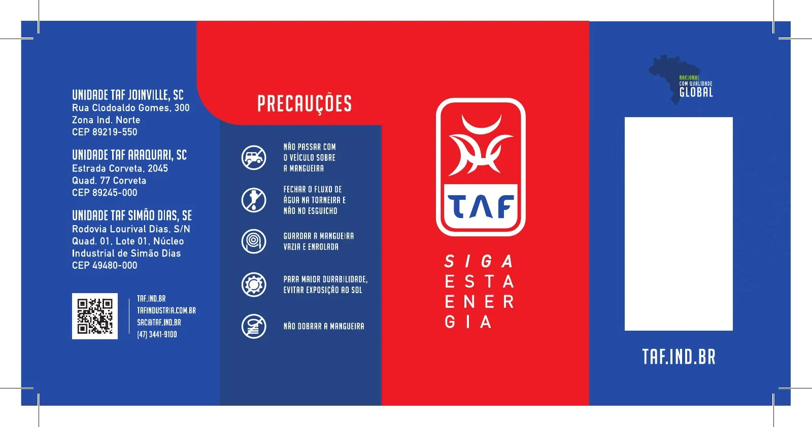
Circuit breaker packaging and labels
We created the boxes and labels for the circuit breaker line, with the new identity and clear technical information on the shelf.
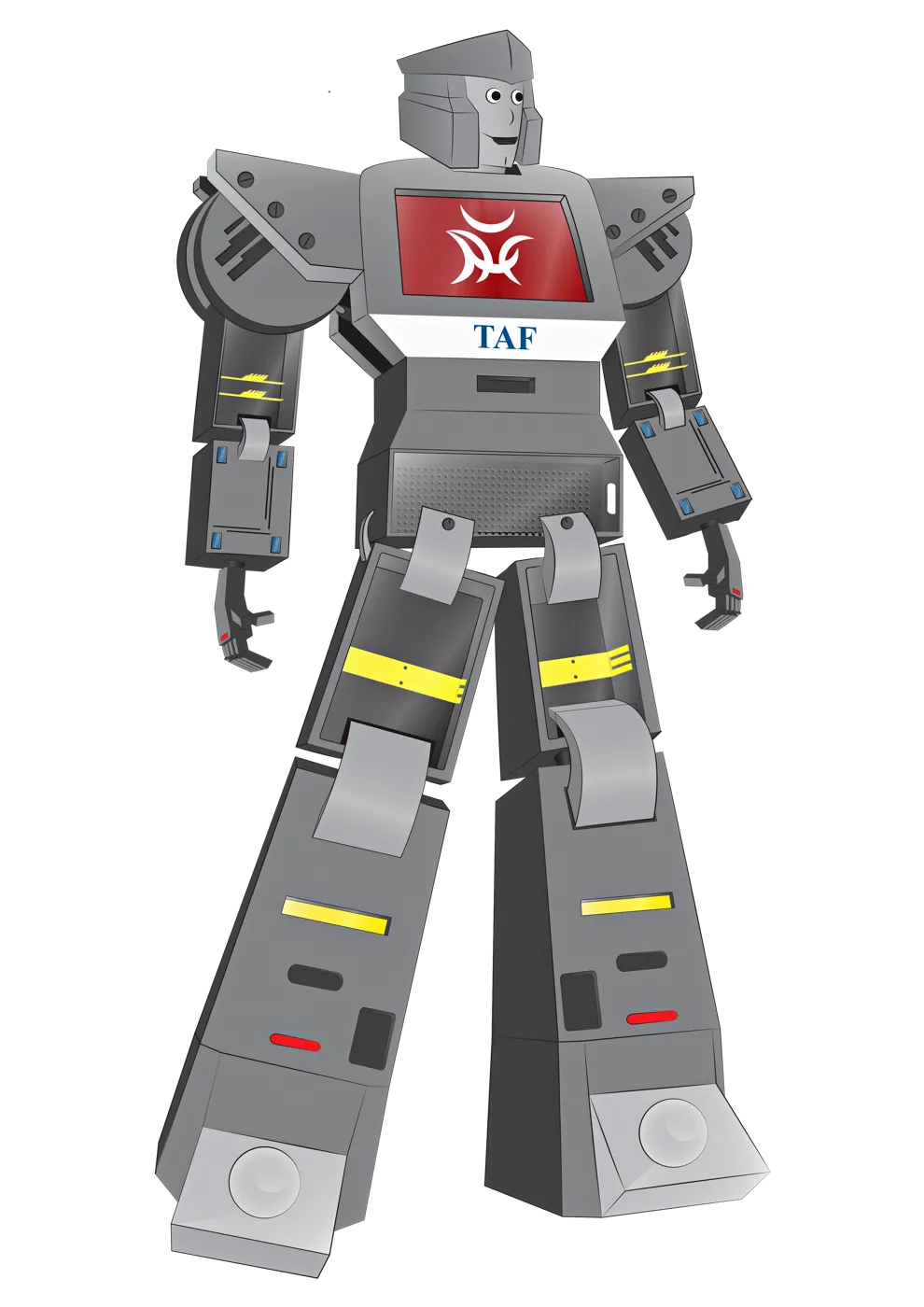
- Mascote
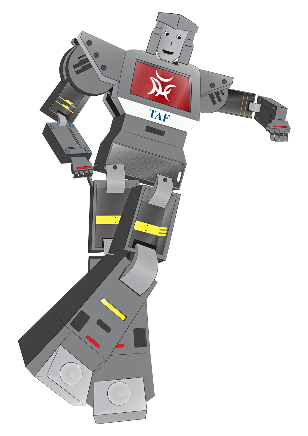
The TAF robot
A mascot that gives the brand personality at trade shows, on social media and in materials for technical audiences.
The brand on the streets, in stores and on people
-
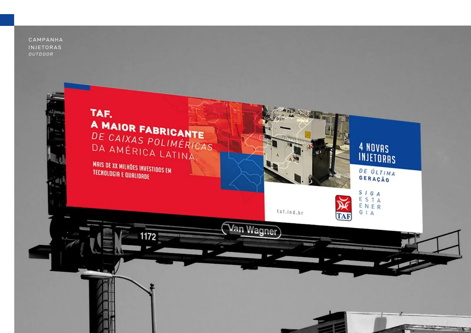
Billboard: Latin America’s largest polymer enclosure manufacturer -
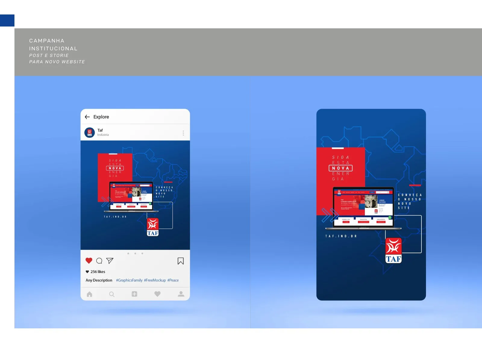
Social media on mobile -
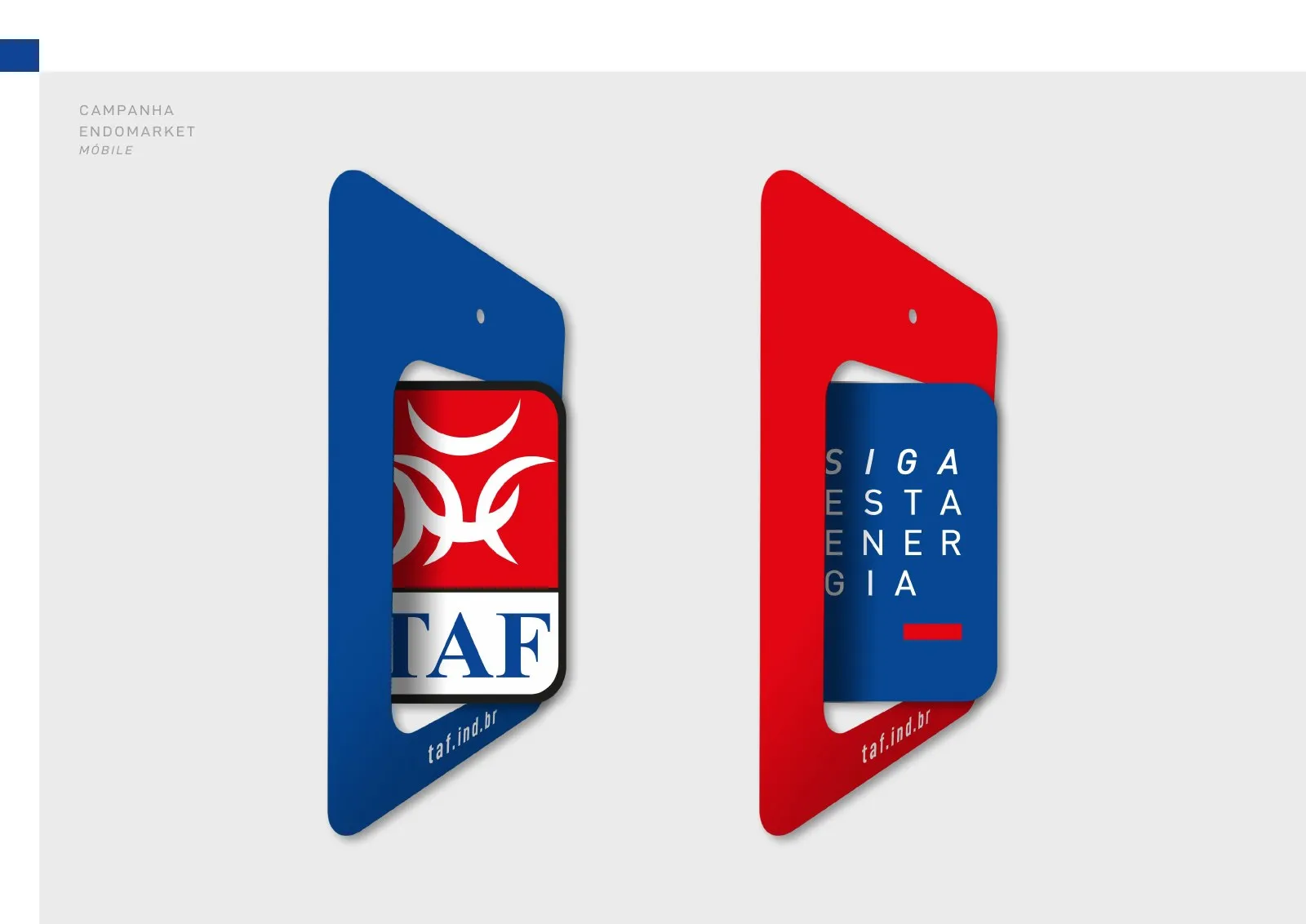
Flags and wind banners -
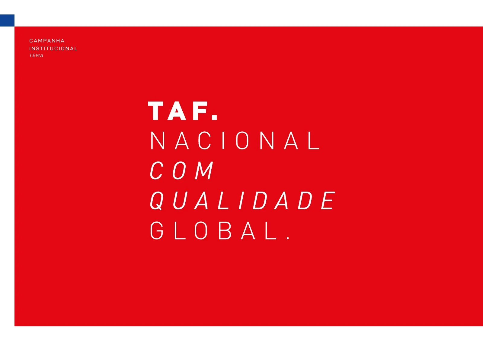
TAF. National, with global quality. -
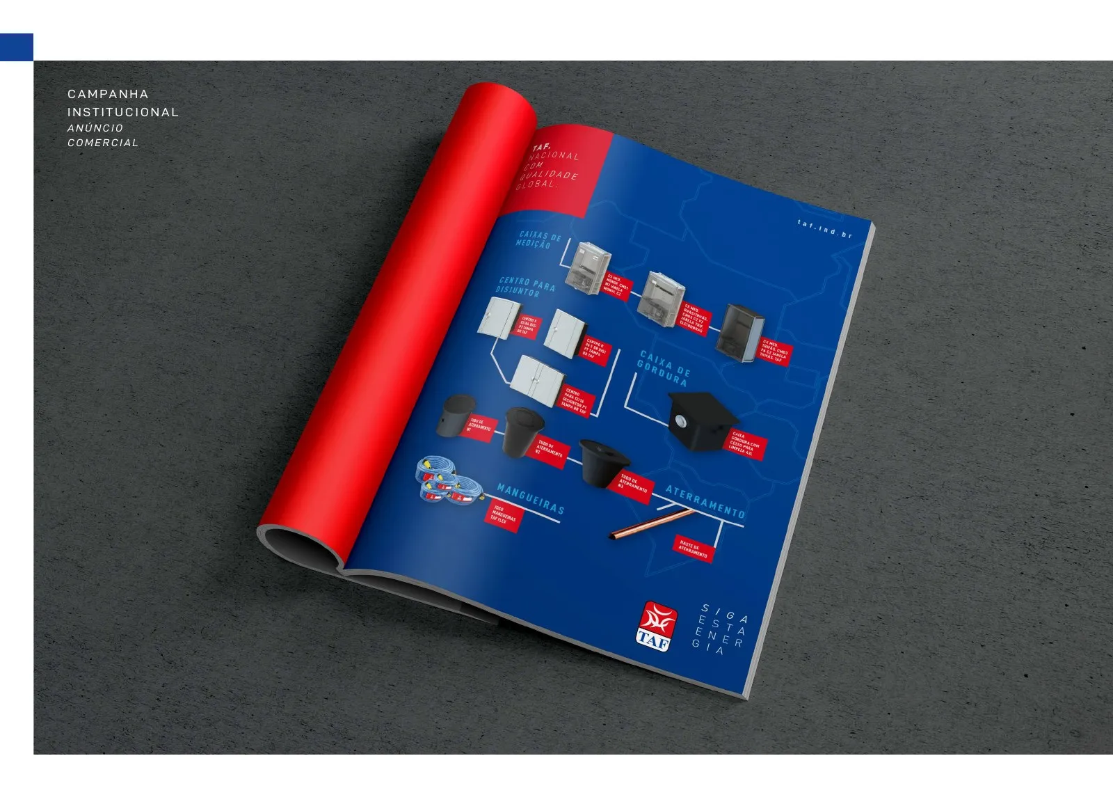
Magazine ad -
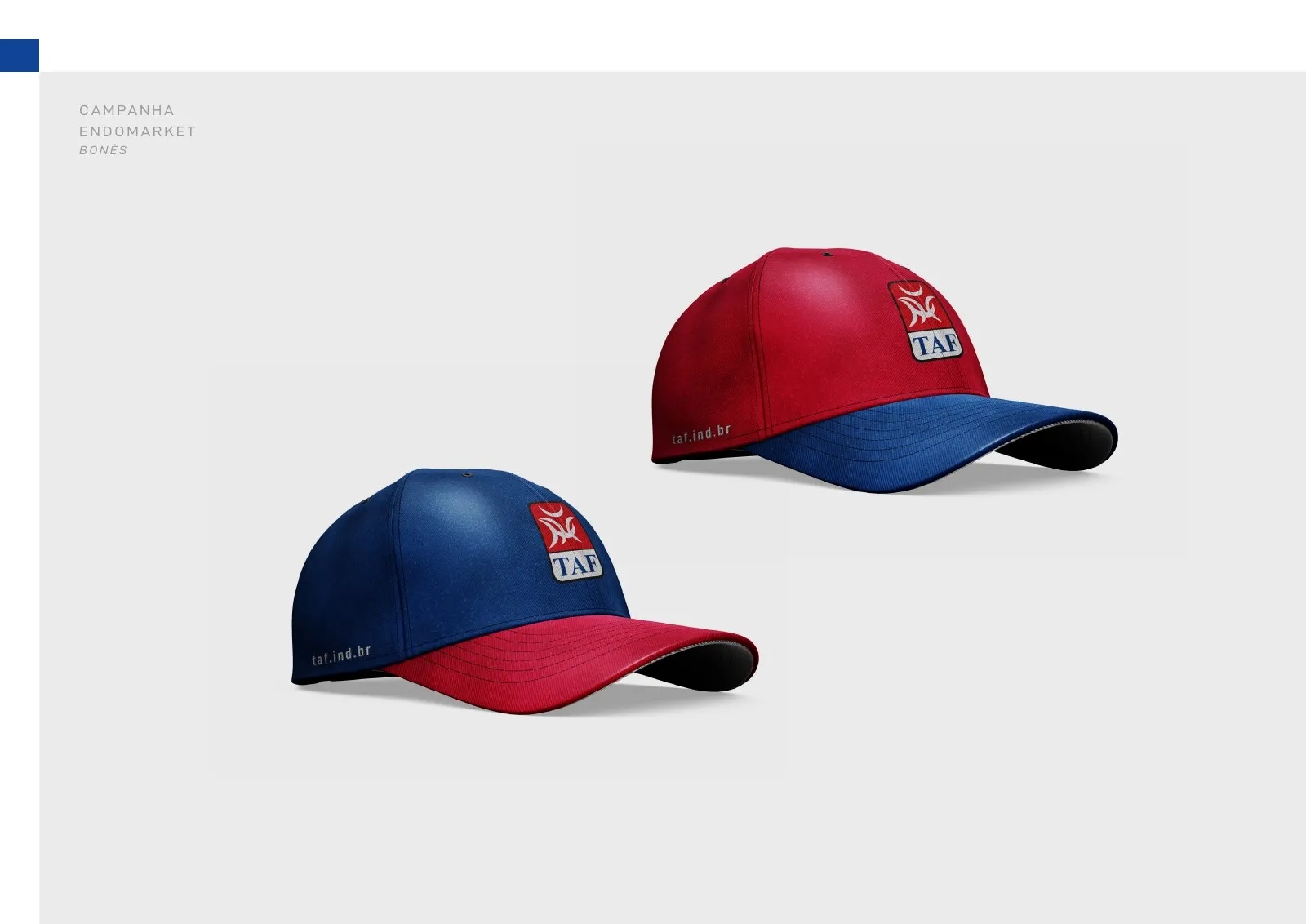
Promotional caps -
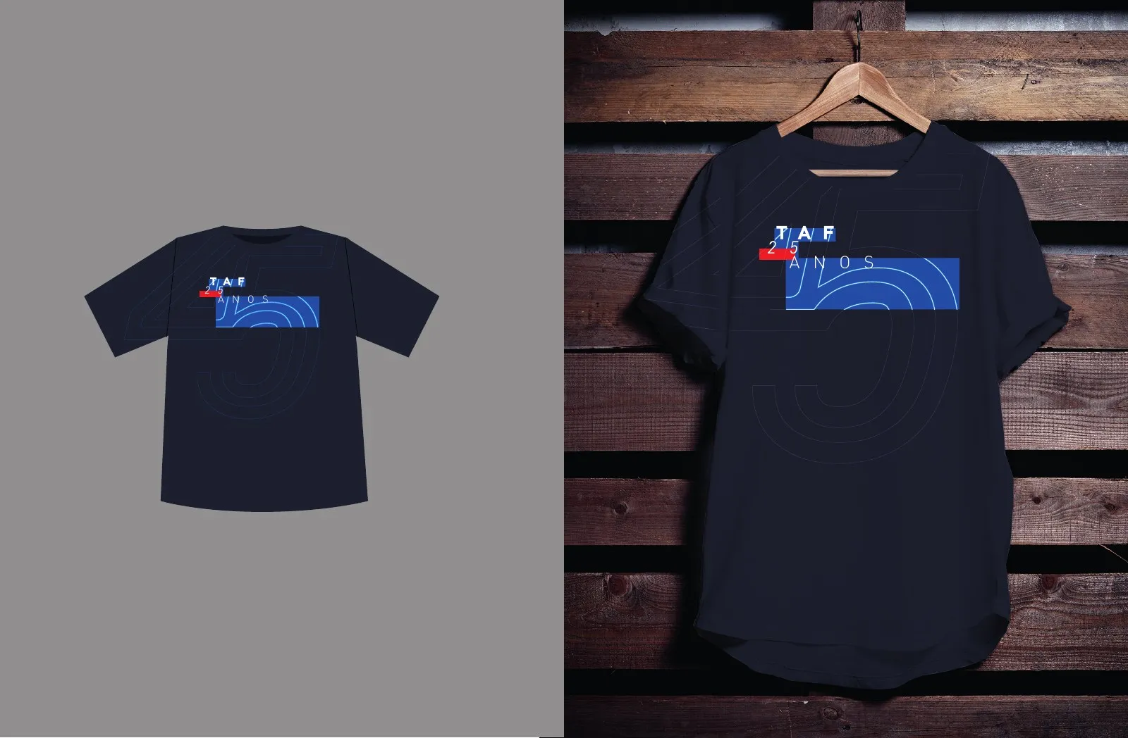
25-year campaign T-shirts -
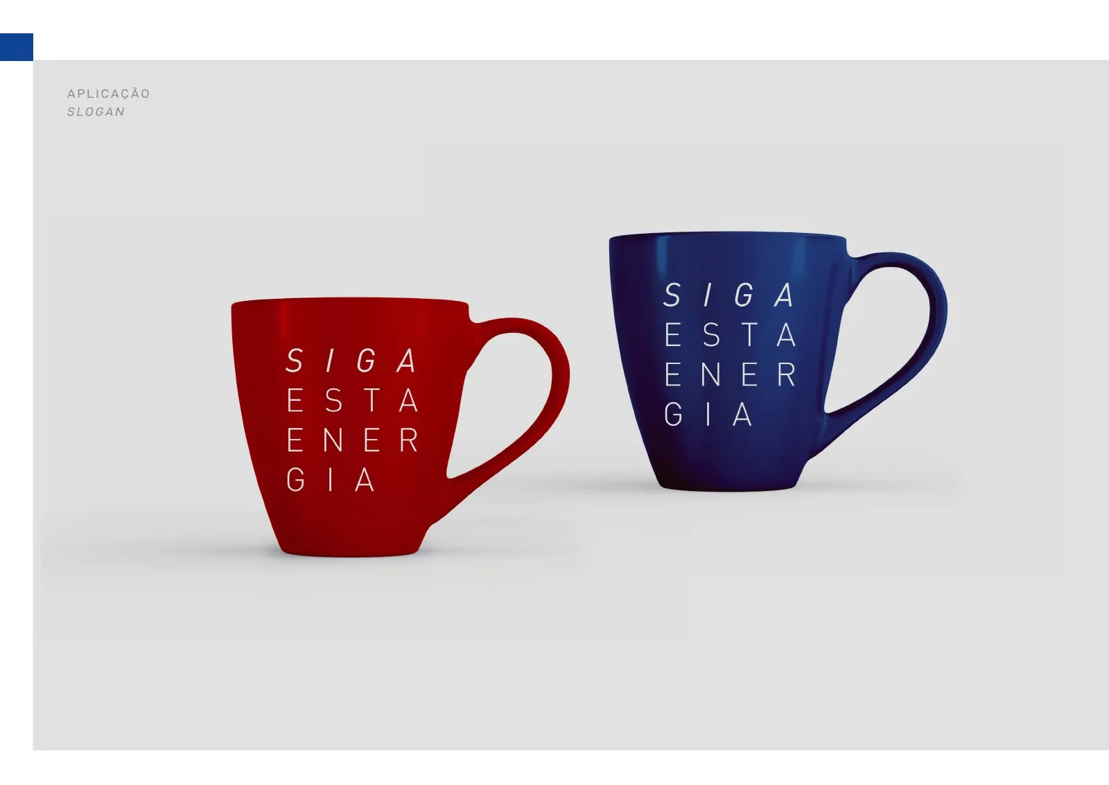
Mugs with the slogan -
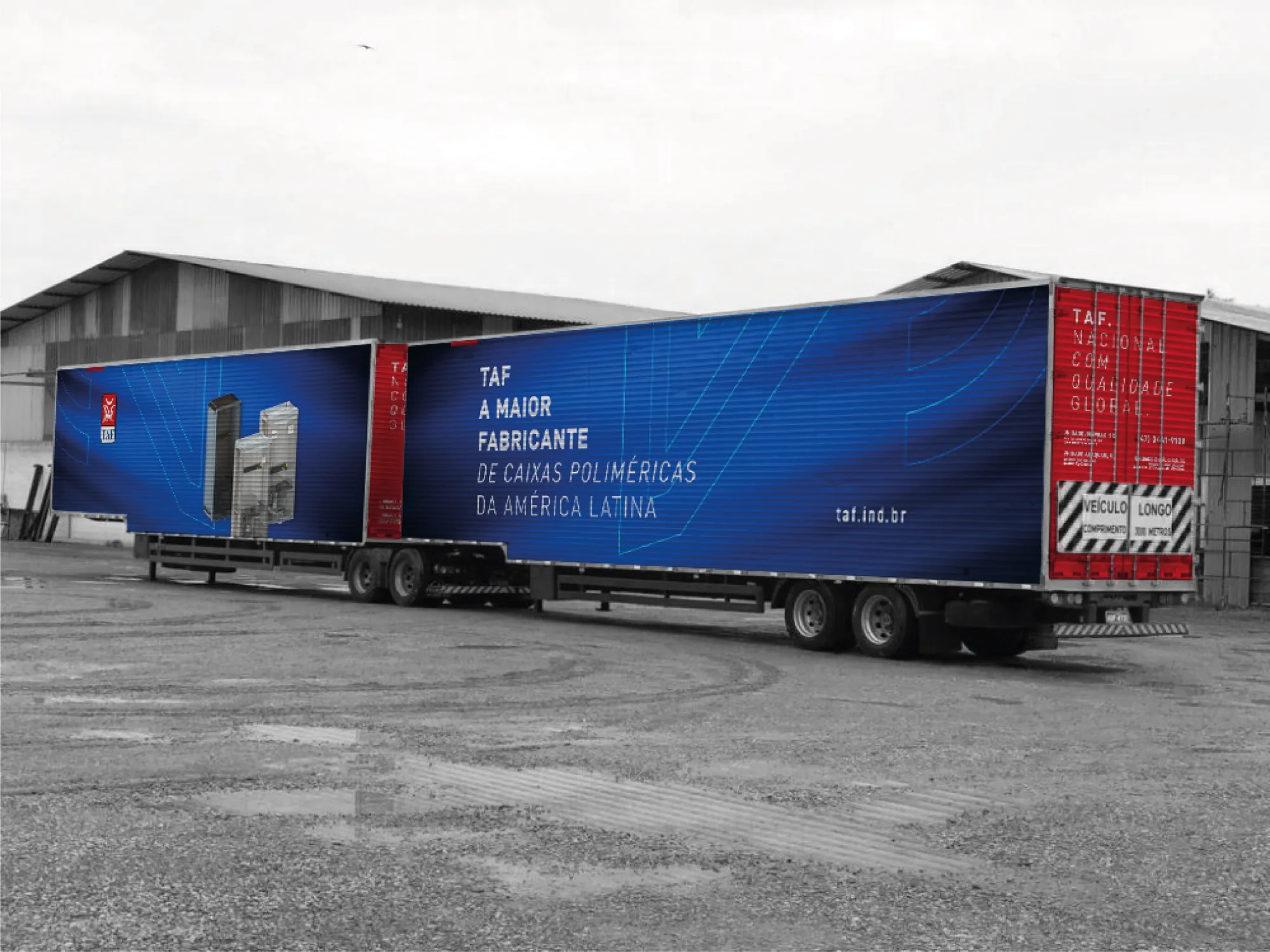
Truck: Latin America’s largest polymer enclosure manufacturer -
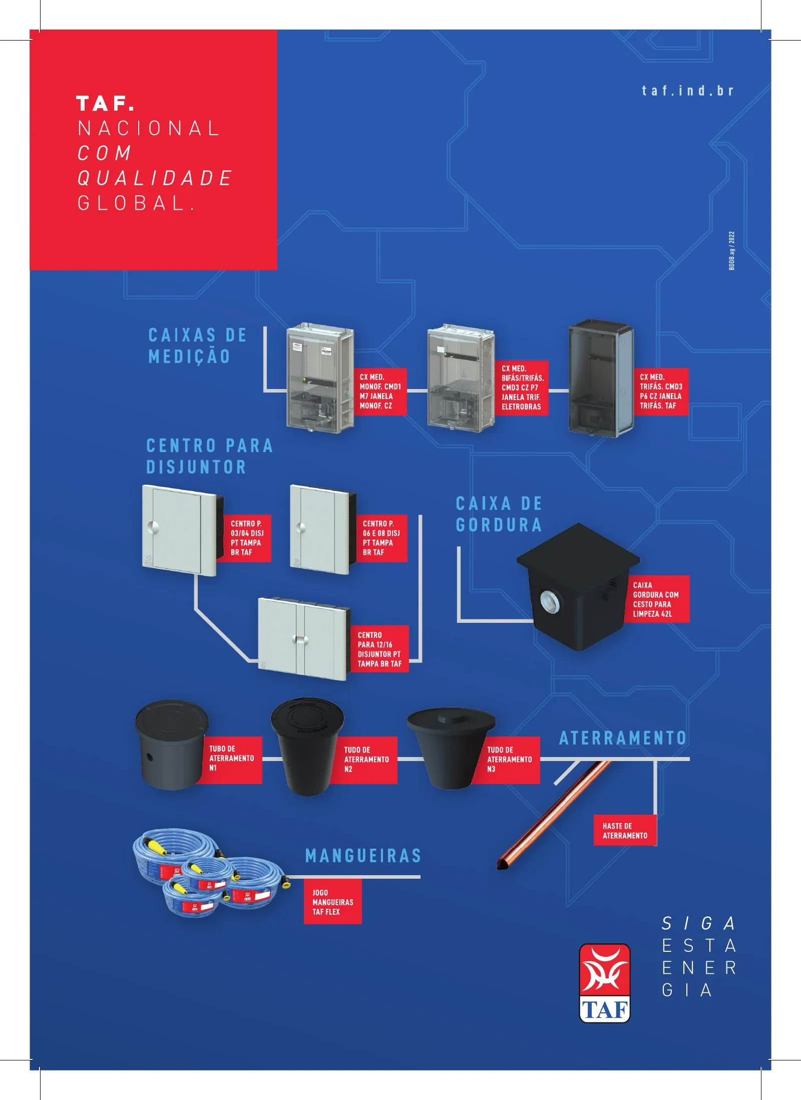
Product line ad
A positioning view
In manufacturing, a strong brand sells before the sales rep arrives. When catalogue, packaging, truck and factory speak the same language, customers see an organised, reliable and large company, and that weighs when choosing a supplier.
Redesigning without erasing history was the key strategic decision. The founder’s symbol carries recognition built over decades; the new typography and slogan updated the brand without losing that equity.
- 25
- years celebrated with a seal and campaign
- 2
- factories with environmental graphics in SC
- 10
- integrated communication fronts
Why hire the group for a project like this
In this case, three group companies worked together: BDDB.ag on brand and point of sale, OWTRA on the website and e-commerce UI and UX, and RISE Films on the films.
-

BDDB.agLed this case
Redesign, slogan, packaging, catalogues, POS, campaigns, factory graphics and mascot.
Meet BDDB.ag -

OWTRALed this case
UI and UX for the corporate website taf.ind.br and the e-commerce store tafindustria.com.br.
Meet OWTRA -

RISE FilmsLed this case
Institutional video, manifesto, brand ident and motion pieces.
Meet RISE Films
Does your company communicate its true size?
Tell us the challenge. A partner will reply and outline the path, from brand to point of sale.
← All cases